- Power BI forums
- Updates
- News & Announcements
- Get Help with Power BI
- Desktop
- Service
- Report Server
- Power Query
- Mobile Apps
- Developer
- DAX Commands and Tips
- Custom Visuals Development Discussion
- Health and Life Sciences
- Power BI Spanish forums
- Translated Spanish Desktop
- Power Platform Integration - Better Together!
- Power Platform Integrations (Read-only)
- Power Platform and Dynamics 365 Integrations (Read-only)
- Training and Consulting
- Instructor Led Training
- Dashboard in a Day for Women, by Women
- Galleries
- Community Connections & How-To Videos
- COVID-19 Data Stories Gallery
- Themes Gallery
- Data Stories Gallery
- R Script Showcase
- Webinars and Video Gallery
- Quick Measures Gallery
- 2021 MSBizAppsSummit Gallery
- 2020 MSBizAppsSummit Gallery
- 2019 MSBizAppsSummit Gallery
- Events
- Ideas
- Custom Visuals Ideas
- Issues
- Issues
- Events
- Upcoming Events
- Community Blog
- Power BI Community Blog
- Custom Visuals Community Blog
- Community Support
- Community Accounts & Registration
- Using the Community
- Community Feedback
Register now to learn Fabric in free live sessions led by the best Microsoft experts. From Apr 16 to May 9, in English and Spanish.
- Power BI forums
- Forums
- Get Help with Power BI
- DAX Commands and Tips
- Shipments and Open Order Horizon (Events in Time S...
- Subscribe to RSS Feed
- Mark Topic as New
- Mark Topic as Read
- Float this Topic for Current User
- Bookmark
- Subscribe
- Printer Friendly Page
- Mark as New
- Bookmark
- Subscribe
- Mute
- Subscribe to RSS Feed
- Permalink
- Report Inappropriate Content
Shipments and Open Order Horizon (Events in Time Scenario?)
Hello,
I am struggling to come up with the correct DAX calculation and am coming to the forums for some guidance.
Tables:
- Sales: regular sales table showing historical sales and refreshed each week.
- Backlog: table of open order snapshots (weekly, going back two years). Is refreshed each week at the same time of refresh as the Sales table.
- Dates: Traditional Calendar table spanning contigous dates and includes additive columns such as WeekOfQuarter,Year-Qtr, etc.
Joins:
- Sales[InvoiceDate]: Dates[Date] (many:1)
- Backlog[EstShipDate]: Dates[Date] (many:1)
Measures:
- Sales= Sum([SalesRevenue])
- Backlog= Sum([BacklogRevenue])
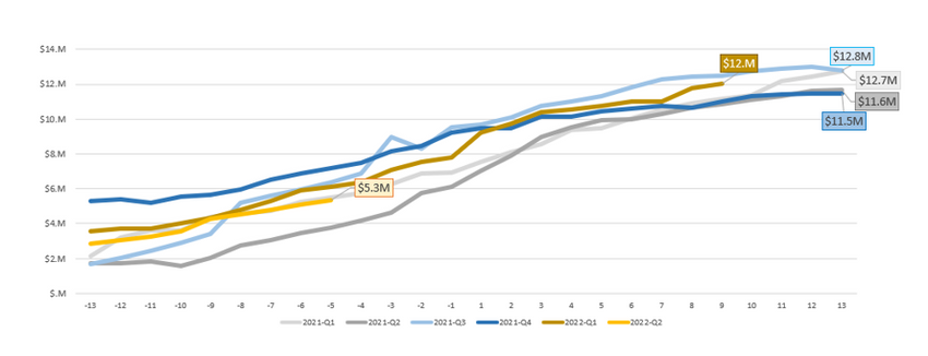
What I would like to visualize is how the Open Orders grow 13 weeks from the start of each quarter, and how Sales+Backlog trend during the quarter, basically over a 26-week period. Finally, I would like to view prior quarters for their 26-week period to ultimately show trend quarter over quarter for the 26-week period.
I have prepared this chart in Excel with the data I have to give a sense of what I am looking for.
Any help will greatly be appreciated.
- Mark as New
- Bookmark
- Subscribe
- Mute
- Subscribe to RSS Feed
- Permalink
- Report Inappropriate Content
You are using the terms "Open Orders" and "Backlog" - are these synonymous in your case?
Please provide sanitized sample data that fully covers your issue. If you paste the data into a table in your post or use one of the file services it will be easier to work with. Avoid posting screenshots of your source data if possible.
Please show the expected outcome based on the sample data you provided. Screenshots of the expected outcome are ok.
https://community.powerbi.com/t5/Desktop/How-to-Get-Your-Question-Answered-Quickly/m-p/1447523
- Mark as New
- Bookmark
- Subscribe
- Mute
- Subscribe to RSS Feed
- Permalink
- Report Inappropriate Content
@mwilliamsjr ,
Can you share sample data and sample output in table format? Or a sample pbix after removing sensitive data.
Microsoft Power BI Learning Resources, 2023 !!
Learn Power BI - Full Course with Dec-2022, with Window, Index, Offset, 100+ Topics !!
Did I answer your question? Mark my post as a solution! Appreciate your Kudos !! Proud to be a Super User! !!
- Mark as New
- Bookmark
- Subscribe
- Mute
- Subscribe to RSS Feed
- Permalink
- Report Inappropriate Content
Hi and thank you for your response.
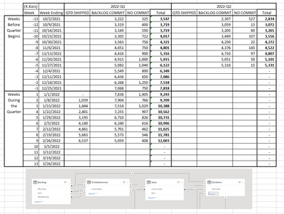
The table in the linked file is a subset of the data that is shown in the chart from my initial post. The chart is based on the total column. The Backlog and sales are two different tables, and the backlog is snapshotted each week and added to the Backlog table.
My original thought was to use the USERELATIONSHIP function using the DAX below, but I think this is half the equation.
Just in case you cannot get to the file, I am including the snapshot.
- Mark as New
- Bookmark
- Subscribe
- Mute
- Subscribe to RSS Feed
- Permalink
- Report Inappropriate Content
Hi @mwilliamsjr ,
I can't access your files because I don't have a Google account... You can refer the following thread to upload the file in the community. Please note that exclude any sensitive info in your sharing file.
How to upload PBI in Community
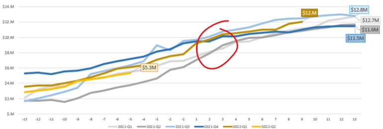
Do you want to create the following line chart by quarters? What's the calculation logic of these line values?
Best Regards
If this post helps, then please consider Accept it as the solution to help the other members find it more quickly.
Helpful resources

Microsoft Fabric Learn Together
Covering the world! 9:00-10:30 AM Sydney, 4:00-5:30 PM CET (Paris/Berlin), 7:00-8:30 PM Mexico City

Power BI Monthly Update - April 2024
Check out the April 2024 Power BI update to learn about new features.

| User | Count |
|---|---|
| 47 | |
| 26 | |
| 19 | |
| 14 | |
| 10 |
| User | Count |
|---|---|
| 57 | |
| 49 | |
| 44 | |
| 18 | |
| 18 |


