- Power BI forums
- Updates
- News & Announcements
- Get Help with Power BI
- Desktop
- Service
- Report Server
- Power Query
- Mobile Apps
- Developer
- DAX Commands and Tips
- Custom Visuals Development Discussion
- Health and Life Sciences
- Power BI Spanish forums
- Translated Spanish Desktop
- Power Platform Integration - Better Together!
- Power Platform Integrations (Read-only)
- Power Platform and Dynamics 365 Integrations (Read-only)
- Training and Consulting
- Instructor Led Training
- Dashboard in a Day for Women, by Women
- Galleries
- Community Connections & How-To Videos
- COVID-19 Data Stories Gallery
- Themes Gallery
- Data Stories Gallery
- R Script Showcase
- Webinars and Video Gallery
- Quick Measures Gallery
- 2021 MSBizAppsSummit Gallery
- 2020 MSBizAppsSummit Gallery
- 2019 MSBizAppsSummit Gallery
- Events
- Ideas
- Custom Visuals Ideas
- Issues
- Issues
- Events
- Upcoming Events
- Community Blog
- Power BI Community Blog
- Custom Visuals Community Blog
- Community Support
- Community Accounts & Registration
- Using the Community
- Community Feedback
Register now to learn Fabric in free live sessions led by the best Microsoft experts. From Apr 16 to May 9, in English and Spanish.
- Power BI forums
- Forums
- Get Help with Power BI
- DAX Commands and Tips
- Re: Resource capacity tracking for time card repor...
- Subscribe to RSS Feed
- Mark Topic as New
- Mark Topic as Read
- Float this Topic for Current User
- Bookmark
- Subscribe
- Printer Friendly Page
- Mark as New
- Bookmark
- Subscribe
- Mute
- Subscribe to RSS Feed
- Permalink
- Report Inappropriate Content
Resource capacity tracking for time card reporting
Hello everyone,
I have a visual that I am stuck on creating
I have some requirements that look like this:
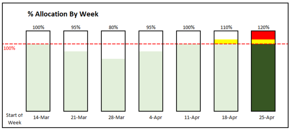
- Provide a stacked bar chart that tracks our team's "capacity %" over time
- Provide the data by Month
- Any month that is at or below 100% capacity make a green bar
- If a month is between 100% - 110% make the range for this yellow
- Make the range for any bar with over 110% capacity red
- Bonus requirement, if I can make the most recent time frame a darker shade of Green by using some dax in the conditional formatting.
- Add a red constant line (I know how to do this piece)
Here is a visual I mocked up in Excel to give you an idea of what I am going for:
I have a table called 'Worklogs' that looks like this:
| Time Entry Date | Team Member | Time Entry Logged Time | Task # | % Time Spent on Task / Day |
| 5/2/2022 | Zach Osborn | 8 | ABC | 100% |
| 4/29/2022 | Jim Brothers | 2 | RTK | 25% |
| 4/22/2022 | Jeffrey Toole | 4 | DEF | 50% |
| 4/22/2022 | John Gordon | 2 | DEF | 25% |
| 3/20/2022 | Lex Luther | 8 | GHI | 100% |
Currently I am stuck on adding the column to correctly calculate the resource capacity. I added a column that would divide each line's "Time Entry Logged Time" by 8 to give me a % by day (see "Time Spent on Task / Day" column above), but I know doing it this way is not correct since the order of operations would be off to provide the correct number.
The formula to accuratly show resource capacity would be something like this; Sum Total of Time Entry Logged Time/(# of workdays in a month * 😎
Also, I am not sure how to deal with adding the 2 extra colors as a % of the total.
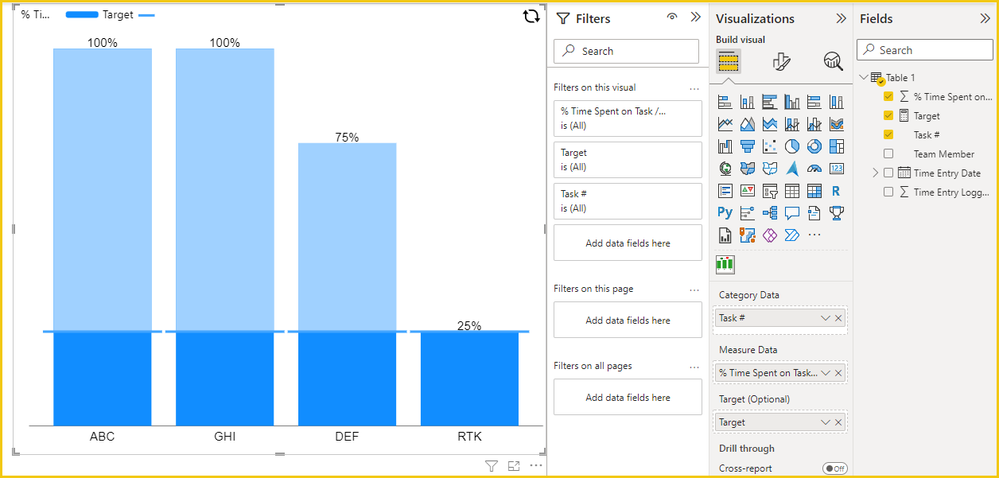
Here is what my current visual looks like:
Thank you!
- Mark as New
- Bookmark
- Subscribe
- Mute
- Subscribe to RSS Feed
- Permalink
- Report Inappropriate Content
Hi @NB689 ,
Unfortunately, a single bar cannot be colored in sections.
Try using some custom visual, I did some tests and can only set a target line, hope this helps you.
Best Regards,
Gao
Community Support Team
If there is any post helps, then please consider Accept it as the solution to help the other members find it more quickly. If I misunderstand your needs or you still have problems on it, please feel free to let us know. Thanks a lot!
How to get your questions answered quickly -- How to provide sample data
- Mark as New
- Bookmark
- Subscribe
- Mute
- Subscribe to RSS Feed
- Permalink
- Report Inappropriate Content
Please show a mockup of your expected result based on your provided sample data.
Helpful resources

Microsoft Fabric Learn Together
Covering the world! 9:00-10:30 AM Sydney, 4:00-5:30 PM CET (Paris/Berlin), 7:00-8:30 PM Mexico City

Power BI Monthly Update - April 2024
Check out the April 2024 Power BI update to learn about new features.

| User | Count |
|---|---|
| 49 | |
| 26 | |
| 21 | |
| 16 | |
| 12 |
| User | Count |
|---|---|
| 57 | |
| 49 | |
| 44 | |
| 19 | |
| 18 |


