- Power BI forums
- Updates
- News & Announcements
- Get Help with Power BI
- Desktop
- Service
- Report Server
- Power Query
- Mobile Apps
- Developer
- DAX Commands and Tips
- Custom Visuals Development Discussion
- Health and Life Sciences
- Power BI Spanish forums
- Translated Spanish Desktop
- Power Platform Integration - Better Together!
- Power Platform Integrations (Read-only)
- Power Platform and Dynamics 365 Integrations (Read-only)
- Training and Consulting
- Instructor Led Training
- Dashboard in a Day for Women, by Women
- Galleries
- Community Connections & How-To Videos
- COVID-19 Data Stories Gallery
- Themes Gallery
- Data Stories Gallery
- R Script Showcase
- Webinars and Video Gallery
- Quick Measures Gallery
- 2021 MSBizAppsSummit Gallery
- 2020 MSBizAppsSummit Gallery
- 2019 MSBizAppsSummit Gallery
- Events
- Ideas
- Custom Visuals Ideas
- Issues
- Issues
- Events
- Upcoming Events
- Community Blog
- Power BI Community Blog
- Custom Visuals Community Blog
- Community Support
- Community Accounts & Registration
- Using the Community
- Community Feedback
Register now to learn Fabric in free live sessions led by the best Microsoft experts. From Apr 16 to May 9, in English and Spanish.
- Power BI forums
- Forums
- Get Help with Power BI
- DAX Commands and Tips
- Period that had biggest spike
- Subscribe to RSS Feed
- Mark Topic as New
- Mark Topic as Read
- Float this Topic for Current User
- Bookmark
- Subscribe
- Printer Friendly Page
- Mark as New
- Bookmark
- Subscribe
- Mute
- Subscribe to RSS Feed
- Permalink
- Report Inappropriate Content
Period that had biggest spike
Hey
What Dax formula can i have that shows me the period with biggest spike in a visual?
Say i have a chart that shows me the months sale % by day
i want to be able to look at the % each and if it has increased day on day, get that start and period before it drops back but get the max period in that month
i hope this makes sense
I dont have an example file to share but i can put a random file together just shows % sales by date
thank you
Solved! Go to Solution.
- Mark as New
- Bookmark
- Subscribe
- Mute
- Subscribe to RSS Feed
- Permalink
- Report Inappropriate Content
Hi,
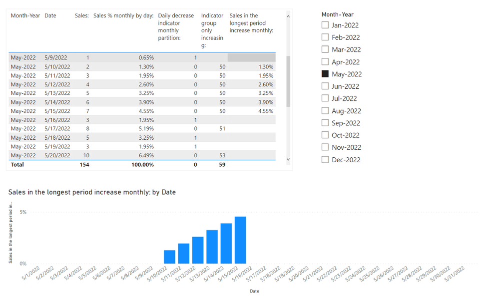
I am not sure if I understood your question correctly, but please check the below picture and the attached pbix file.
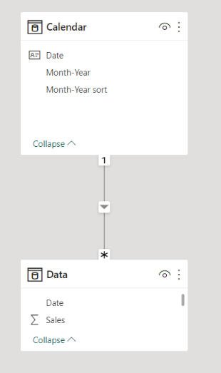
I tried to create a sample pbix file like below, and I hope the below can provide some ideas on how to create a solution for your data model. All measures are in the pbix file.
If this post helps, then please consider accepting it as the solution to help other members find it faster, and give a big thumbs up.
- Mark as New
- Bookmark
- Subscribe
- Mute
- Subscribe to RSS Feed
- Permalink
- Report Inappropriate Content
Thank you for getting back to me...i will give that a go when i have access to open the file but looking at the picture it looks like it is what im after
i would then need to get a text combined measure so i can use in a title to say that the longest period where we had daily consecutive increase was from 10/05 to 15/05 increasing from 1.30% to 4.55% (increase of 3.25%)
will this work even if i didnt select a month so it gives me the longest period in the whole year or the filtered context?
thank you once again
really appreciate this
- Mark as New
- Bookmark
- Subscribe
- Mute
- Subscribe to RSS Feed
- Permalink
- Report Inappropriate Content
Hi,
Thank you for your feedback.
If possible, please share how your desired outcome of the visualization looks like when not selecting month-year from the slicer and shows the chart from 1-1-2022 to 12-31-2022.
Thank you.
If this post helps, then please consider accepting it as the solution to help other members find it faster, and give a big thumbs up.
- Mark as New
- Bookmark
- Subscribe
- Mute
- Subscribe to RSS Feed
- Permalink
- Report Inappropriate Content
Hi
I had a look at your attachment and it looks like it gives the longest period per month if i select no months which is fine and i can use this for a different visual to show longest period per month
I guess what i would also need is to have the ability to see the longest period in the whole year and also have the title to show the start and end period/date of that longest period
Thank you once again
- Mark as New
- Bookmark
- Subscribe
- Mute
- Subscribe to RSS Feed
- Permalink
- Report Inappropriate Content
Hi,
I am not sure if I understood your question correctly, but please check the below picture and the attached pbix file.
I tried to create a sample pbix file like below, and I hope the below can provide some ideas on how to create a solution for your data model. All measures are in the pbix file.
If this post helps, then please consider accepting it as the solution to help other members find it faster, and give a big thumbs up.
Helpful resources

Microsoft Fabric Learn Together
Covering the world! 9:00-10:30 AM Sydney, 4:00-5:30 PM CET (Paris/Berlin), 7:00-8:30 PM Mexico City

Power BI Monthly Update - April 2024
Check out the April 2024 Power BI update to learn about new features.

| User | Count |
|---|---|
| 47 | |
| 26 | |
| 19 | |
| 14 | |
| 10 |
| User | Count |
|---|---|
| 58 | |
| 50 | |
| 44 | |
| 19 | |
| 19 |


