- Power BI forums
- Updates
- News & Announcements
- Get Help with Power BI
- Desktop
- Service
- Report Server
- Power Query
- Mobile Apps
- Developer
- DAX Commands and Tips
- Custom Visuals Development Discussion
- Health and Life Sciences
- Power BI Spanish forums
- Translated Spanish Desktop
- Power Platform Integration - Better Together!
- Power Platform Integrations (Read-only)
- Power Platform and Dynamics 365 Integrations (Read-only)
- Training and Consulting
- Instructor Led Training
- Dashboard in a Day for Women, by Women
- Galleries
- Community Connections & How-To Videos
- COVID-19 Data Stories Gallery
- Themes Gallery
- Data Stories Gallery
- R Script Showcase
- Webinars and Video Gallery
- Quick Measures Gallery
- 2021 MSBizAppsSummit Gallery
- 2020 MSBizAppsSummit Gallery
- 2019 MSBizAppsSummit Gallery
- Events
- Ideas
- Custom Visuals Ideas
- Issues
- Issues
- Events
- Upcoming Events
- Community Blog
- Power BI Community Blog
- Custom Visuals Community Blog
- Community Support
- Community Accounts & Registration
- Using the Community
- Community Feedback
Register now to learn Fabric in free live sessions led by the best Microsoft experts. From Apr 16 to May 9, in English and Spanish.
- Power BI forums
- Forums
- Get Help with Power BI
- DAX Commands and Tips
- Re: Overlaying a bell curve on a histogram using D...
- Subscribe to RSS Feed
- Mark Topic as New
- Mark Topic as Read
- Float this Topic for Current User
- Bookmark
- Subscribe
- Printer Friendly Page
- Mark as New
- Bookmark
- Subscribe
- Mute
- Subscribe to RSS Feed
- Permalink
- Report Inappropriate Content
Overlaying a bell curve on a histogram using DAX
Hi all! Noob here, so apologize if a similar thread already exists! 🙂
I'm stuck with the following issue:
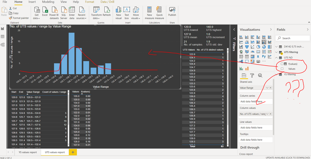
As you can see in the 1st pic. below I've plotted a histogram using a line & clustered chart. So far, all good.
Now if try to plot the Gaussian Distribution on the same graph, I get errors saying there needs to be a relationship between the columns.
I tried linking my "f(values)" column from the "UTS ND" table to the calculated column of "Start" from my "UTS filtering" table as it seemed the logical thing to do using a 1 to Many relationship, but the program doesn't allow because of a circular dependency.
Had anyone else experienced a similar issue before? If so, how did you manage to overcome it?
This is a job-related task that I've been struggling with for the past few days & I've ran out of ideas. :'(
Thank you for every little bit of information!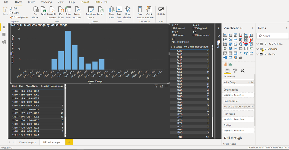

Solved! Go to Solution.
- Mark as New
- Bookmark
- Subscribe
- Mute
- Subscribe to RSS Feed
- Permalink
- Report Inappropriate Content
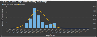
I looked at your pbix. I think the best way to do this is to add another calculated column to your Number Filtering 2 table to calculate the normal distribution value for that range using an expression like this one.
NormDist =
VAR avgval = ( 'Number filtering 2'[Start] + 'Number filtering 2'[End] ) / 2
VAR mean =
    AVERAGE ( 'D4142 0,75 inch 2020'[UTS Values] )
VAR std =
    STDEV.P ( 'D4142 0,75 inch 2020'[UTS Values] )
VAR nd =
    NORM.DIST ( avgval, mean, std, 0 )
RETURN
    nd
You can then add that to your visual to get the below.
Does that get you what you need?
If this works for you, please mark it as the solution. Kudos are appreciated too. Please let me know if not.
Regards,
Pat
Did I answer your question? Mark my post as a solution! Kudos are also appreciated!
To learn more about Power BI, follow me on Twitter or subscribe on YouTube.
@mahoneypa HoosierBI on YouTube
- Mark as New
- Bookmark
- Subscribe
- Mute
- Subscribe to RSS Feed
- Permalink
- Report Inappropriate Content
Hi @mahoneypat how did you overlay the distribution directly into the histogram? Where can I inject the distribution curve and what histogram app visual did you use? Im quite new to powerbi and tempted to just use python at this point.
- Mark as New
- Bookmark
- Subscribe
- Mute
- Subscribe to RSS Feed
- Permalink
- Report Inappropriate Content
@nrose I looked for the original file to share it here, but I must have deleted it. The link to the file shared here is no longer valid either. However, I added the provided calculated column, and then I probably just used the line and clustered column chart (one of the native visuals).
Pat
Did I answer your question? Mark my post as a solution! Kudos are also appreciated!
To learn more about Power BI, follow me on Twitter or subscribe on YouTube.
@mahoneypa HoosierBI on YouTube
- Mark as New
- Bookmark
- Subscribe
- Mute
- Subscribe to RSS Feed
- Permalink
- Report Inappropriate Content
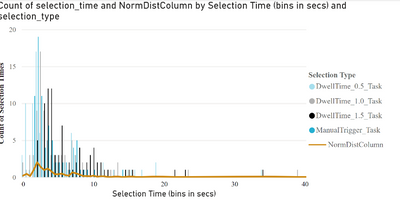
I tried using your formula and got this. Its bimodal and very small amplitudes. Is it because Im categorizing @mahoneypat ?
- Mark as New
- Bookmark
- Subscribe
- Mute
- Subscribe to RSS Feed
- Permalink
- Report Inappropriate Content
Do you have the distribution data in a separate table? The expression above is a calculated column, and the avgval variable is just the average value on a given row. The next two variables calculate the average and stdev of the values in the other table (your distribution). The Norm.Dist then returns a value (from 0 to 1) on where the average on that row falls in that distribution.
Of course, you could use the values from the original column (instead of having a 2nd table) to get the gaussian from their avg and stdev.
Pat
Did I answer your question? Mark my post as a solution! Kudos are also appreciated!
To learn more about Power BI, follow me on Twitter or subscribe on YouTube.
@mahoneypa HoosierBI on YouTube
- Mark as New
- Bookmark
- Subscribe
- Mute
- Subscribe to RSS Feed
- Permalink
- Report Inappropriate Content
Pat thanks for the quick responses.
Im unsure, do I need to generate the distribution data?
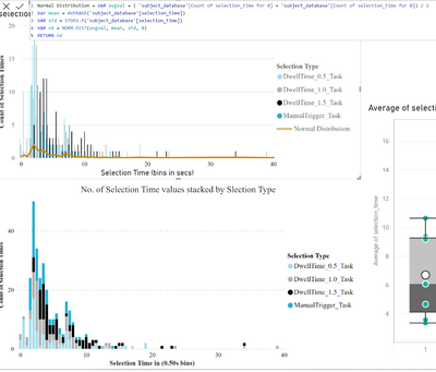
Here is the formula I used to create a calculated column:
Do I just set the avgvalue to the currentcolumn?
- Mark as New
- Bookmark
- Subscribe
- Mute
- Subscribe to RSS Feed
- Permalink
- Report Inappropriate Content
I think I might understand, did you add this as a measure or column in Power BI
What exactly is the `avgval ` in your variable. Is that just the column range?
- Mark as New
- Bookmark
- Subscribe
- Mute
- Subscribe to RSS Feed
- Permalink
- Report Inappropriate Content
@mahoneypat hi there. Eventually yesterday after I sent you the link I've figured out myself after I've created a measure in the main table for my normal distribution & plotted it in my graph on the secondary Y axis.
Your approach works just fine, too!
Thank you to all of you for the suggestions. ^_^
The moderators can close the thread now! 😄
- Mark as New
- Bookmark
- Subscribe
- Mute
- Subscribe to RSS Feed
- Permalink
- Report Inappropriate Content
If you can provide a link to your pbix, I'm sure this is doable. You can also use TREATAS() to pass the filter from one table to the other (e.g., to get the x value to go into the gaussian calculation for that category).
https://www.sqlbi.com/articles/propagate-filters-using-treatas-in-dax/
If this works for you, please mark it as the solution. Kudos are appreciated too. Please let me know if not.
Regards,
Pat
Did I answer your question? Mark my post as a solution! Kudos are also appreciated!
To learn more about Power BI, follow me on Twitter or subscribe on YouTube.
@mahoneypa HoosierBI on YouTube
- Mark as New
- Bookmark
- Subscribe
- Mute
- Subscribe to RSS Feed
- Permalink
- Report Inappropriate Content
@mahoneypat here's the link to the file: https://drive.google.com/file/d/1U3TI-SkTyC8CuP2zzs-Js66qJUEV4j33/view?usp=sharing
If you have time & can have a look at it.... 😄
- Mark as New
- Bookmark
- Subscribe
- Mute
- Subscribe to RSS Feed
- Permalink
- Report Inappropriate Content
- Mark as New
- Bookmark
- Subscribe
- Mute
- Subscribe to RSS Feed
- Permalink
- Report Inappropriate Content
What's the point of P3? You could put the same value in the column and line sinks, but all it would do is showing the same information in a different format?
- Mark as New
- Bookmark
- Subscribe
- Mute
- Subscribe to RSS Feed
- Permalink
- Report Inappropriate Content
So instead of that table, I want to show on the graph the bell curve alongside with the bar chart I've already plotted.
P2 was like an intermediate step.
- Mark as New
- Bookmark
- Subscribe
- Mute
- Subscribe to RSS Feed
- Permalink
- Report Inappropriate Content
@Anonymous Seems like you would want to use NORM.DIST.
Since I see you are a New Member, Please first check if your issue is a common issue listed here: https://community.powerbi.com/t5/Community-Blog/Before-You-Post-Read-This/ba-p/1116882
Also, please see this post regarding How to Get Your Question Answered Quickly: https://community.powerbi.com/t5/Community-Blog/How-to-Get-Your-Question-Answered-Quickly/ba-p/38490
The most important parts are:
1. Sample data as text, use the table tool in the editing bar
2. Expected output from sample data
3. Explanation in words of how to get from 1. to 2.
@ me in replies or I'll lose your thread!!!
Instead of a Kudo, please vote for this idea
Become an expert!: Enterprise DNA
External Tools: MSHGQM
YouTube Channel!: Microsoft Hates Greg
Latest book!: The Definitive Guide to Power Query (M)
DAX is easy, CALCULATE makes DAX hard...
Helpful resources

Microsoft Fabric Learn Together
Covering the world! 9:00-10:30 AM Sydney, 4:00-5:30 PM CET (Paris/Berlin), 7:00-8:30 PM Mexico City

Power BI Monthly Update - April 2024
Check out the April 2024 Power BI update to learn about new features.

| User | Count |
|---|---|
| 49 | |
| 26 | |
| 21 | |
| 16 | |
| 12 |
| User | Count |
|---|---|
| 57 | |
| 49 | |
| 44 | |
| 19 | |
| 18 |
