- Power BI forums
- Updates
- News & Announcements
- Get Help with Power BI
- Desktop
- Service
- Report Server
- Power Query
- Mobile Apps
- Developer
- DAX Commands and Tips
- Custom Visuals Development Discussion
- Health and Life Sciences
- Power BI Spanish forums
- Translated Spanish Desktop
- Power Platform Integration - Better Together!
- Power Platform Integrations (Read-only)
- Power Platform and Dynamics 365 Integrations (Read-only)
- Training and Consulting
- Instructor Led Training
- Dashboard in a Day for Women, by Women
- Galleries
- Community Connections & How-To Videos
- COVID-19 Data Stories Gallery
- Themes Gallery
- Data Stories Gallery
- R Script Showcase
- Webinars and Video Gallery
- Quick Measures Gallery
- 2021 MSBizAppsSummit Gallery
- 2020 MSBizAppsSummit Gallery
- 2019 MSBizAppsSummit Gallery
- Events
- Ideas
- Custom Visuals Ideas
- Issues
- Issues
- Events
- Upcoming Events
- Community Blog
- Power BI Community Blog
- Custom Visuals Community Blog
- Community Support
- Community Accounts & Registration
- Using the Community
- Community Feedback
Register now to learn Fabric in free live sessions led by the best Microsoft experts. From Apr 16 to May 9, in English and Spanish.
- Subscribe to RSS Feed
- Mark Topic as New
- Mark Topic as Read
- Float this Topic for Current User
- Bookmark
- Subscribe
- Printer Friendly Page
- Mark as New
- Bookmark
- Subscribe
- Mute
- Subscribe to RSS Feed
- Permalink
- Report Inappropriate Content
If IS BLANK
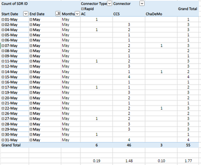
I think I need to add IF IS BLANK function as "0" but not sure how to do this.

Any suggestions, advise woulld be very much apreciated.
Thank you,
J
Solved! Go to Solution.
- Mark as New
- Bookmark
- Subscribe
- Mute
- Subscribe to RSS Feed
- Permalink
- Report Inappropriate Content
I don't know the visual, therefore it's hard for me to troubleshoot, especially that I don't have access to the data.
But you can try to do it the right way, which means not using the fact table to slice and dice. Instead, use the dimensions only on your visuals as it should be. And change the measure to:
SDR ID average per CP ID average per Day =
AVERAGEX(
    VALUES( 'Dates'[Date] ),
    [SDR ID average per CP ID] + 0
)
You should never put any colums from your fact table on the canvas. There's only one case where this is admissible: if you have a degenerate dimension stored in the fact table. But I don't think you do as it's a very rare occurence.
If the above does not work, then I'm afraid you'll have to make your file available (maybe with fake data but it should demonstrate the issue, obviously).
- Mark as New
- Bookmark
- Subscribe
- Mute
- Subscribe to RSS Feed
- Permalink
- Report Inappropriate Content
You don't need to explicitly call CALCULATE for a measure, that is done implicitly whenever a measure is called.
Rather then IF ISBLANK you can use COALESCE, like
SDR ID average per CP ID average per Day =
AVERAGEX (
    VALUES ( 'FACT TABLE'[Start Date] ),
    COALESCE ( [SDR ID average per CP ID], 0 )
)- Mark as New
- Bookmark
- Subscribe
- Mute
- Subscribe to RSS Feed
- Permalink
- Report Inappropriate Content
Hi johnt75,
Thank you very much for your advise, I would think that would solve it all but it didn't.
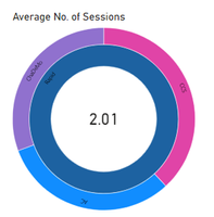
If you look at the visualisation, the outside circless calculate the averages, but the inner circle instead of averaginging the three it sums them up?
Any idea how to fix this?
- Mark as New
- Bookmark
- Subscribe
- Mute
- Subscribe to RSS Feed
- Permalink
- Report Inappropriate Content
Sorry, I'm not familiar with that visual so I don't know what its doing or what settings you may be able to change
- Mark as New
- Bookmark
- Subscribe
- Mute
- Subscribe to RSS Feed
- Permalink
- Report Inappropriate Content
Hi johnt75,
The visual is irrelevant. I have also used one of the standard visualisations, and it does the same; For some reason I don't get the average of the total.
Even using the Donut. The table has got the correct values, but when I hoover over Ultra-Rapid or Rapid the number that is showing is 4.34 for Ultra-Rapid and 2.47 for Rapid - these are not averages. It should be 2.61 and 1.44 respectfully.
- Mark as New
- Bookmark
- Subscribe
- Mute
- Subscribe to RSS Feed
- Permalink
- Report Inappropriate Content
// Just so you know, you should never have a model
// with just one table. If you do, you'll be facing
// issues you will either 1) not be able to explain
// or 2) have issues you'll never be aware of (wrong
// calculations). Just a warning from an old timer.

// If you want to include blanks as well as 0's, it's
// enough to add 0 to your measure. Measures don't
// need to be wrapped in CALCULATE since the engine
// does it automatically for you.

SDR ID average per CP ID average per Day =
AVERAGEX(
    VALUES( 'FACT TABLE'[Start Date] ),
    [SDR ID average per CP ID] + 0
)
If you want to build correct (meaning: no hidden gotchas) models, please stick to these guidelines: Understand star schema and the importance for Power BI - Power BI (bing.com)
- Mark as New
- Bookmark
- Subscribe
- Mute
- Subscribe to RSS Feed
- Permalink
- Report Inappropriate Content
Hi daXtreme,
Thank you very much for your advise,; I do have additional tables: Calendar table and Dim table; For this problem I am using the Fact Table and my Calendar Table.
I would think that your function would solve it all but it didn't.
If you look at the visualisation, and using your, or my formula (receiving same results);
The outside circless calculate the averages, but the inner circle instead of averaginging the three, it sums them up instead.
Any idea how to fix this?
- Mark as New
- Bookmark
- Subscribe
- Mute
- Subscribe to RSS Feed
- Permalink
- Report Inappropriate Content
I don't know the visual, therefore it's hard for me to troubleshoot, especially that I don't have access to the data.
But you can try to do it the right way, which means not using the fact table to slice and dice. Instead, use the dimensions only on your visuals as it should be. And change the measure to:
SDR ID average per CP ID average per Day =
AVERAGEX(
    VALUES( 'Dates'[Date] ),
    [SDR ID average per CP ID] + 0
)
You should never put any colums from your fact table on the canvas. There's only one case where this is admissible: if you have a degenerate dimension stored in the fact table. But I don't think you do as it's a very rare occurence.
If the above does not work, then I'm afraid you'll have to make your file available (maybe with fake data but it should demonstrate the issue, obviously).
- Mark as New
- Bookmark
- Subscribe
- Mute
- Subscribe to RSS Feed
- Permalink
- Report Inappropriate Content
Hi daXtreme,
Very valuable tips! Thank you very much. I will treasure this.
There is one last twing to my dashboard that needs to happen:
with my function:
It doesn't consider when the item became active. How can I amend my function please?
Thanks a lot,
J
- Mark as New
- Bookmark
- Subscribe
- Mute
- Subscribe to RSS Feed
- Permalink
- Report Inappropriate Content
Hi @Anonymous
Sorry but I've no idea what you're talking about here... I'd need to see the data and have you explain the problem before my eyes. Not any sooner than that, I'm afraid 😞
- Mark as New
- Bookmark
- Subscribe
- Mute
- Subscribe to RSS Feed
- Permalink
- Report Inappropriate Content

Average Sessions =
AVERAGEX (
VALUES ( 'Calendar'[Date] ),
COALESCE ( [SDR ID average per CP ID], 0 )
)
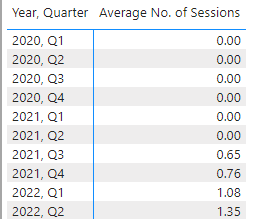
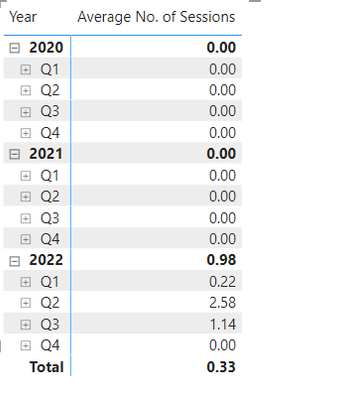
This is the formula that sort of works. It returns the results correctly, averaging the usage data including the days when the unit wasn’t in use, but the issue is that My calendar starts in 2020 so the formula calculates the Averages from 2020 not when my Connector was first used and runs to Q4 2022, as per my calendar.
I just need the function to calculate all the O’s between the 1st use until last usage, e.g. today.
With this function I am calculating the SDR ID(unique number) Average per CP ID (unit number) Average, per day;
Some days the items are not in use, so that’s why I thought I need to add the coalesce calculation.
I am filtering the above function by the column (FACT TABLE[Connector]).
I hope this makes sense. Please advise what can be done about this?
Thank you kindly.
- Mark as New
- Bookmark
- Subscribe
- Mute
- Subscribe to RSS Feed
- Permalink
- Report Inappropriate Content
@Anonymous
When I said I needed to see the data, I was referring to the raw data underlying the model, not any visuals since the visuals don't have all the information that's required.
- Mark as New
- Bookmark
- Subscribe
- Mute
- Subscribe to RSS Feed
- Permalink
- Report Inappropriate Content
Hi daXtreme,
This is a sample of the FACT DATA TABLE. I hope you can help.
| SDR ID | CP ID | Connector | Connector Type | Duration | Start Date | Start Time | End Date | End Time |
| 4056617 | M0005 | ChaDeMo | Rapid | 00:12:15 | 01/06/2022 | 00:08:00 | 01/06/2022 | 00:20:00 |
| 4056684 | M0019 | ChaDeMo | Rapid | 00:13:51 | 01/06/2022 | 00:03:37 | 01/06/2022 | 00:17:28 |
| 4056686 | A52104 | ChaDeMo | Rapid | 00:04:33 | 31/05/2022 | 23:59:52 | 01/06/2022 | 00:04:25 |
| 4056638 | 54008ew | CCS | Rapid | 00:19:59 | 31/05/2022 | 23:19:40 | 31/05/2022 | 23:39:39 |
| 4056637 | 530344 | CCS | Rapid | 00:49:39 | 31/05/2022 | 23:17:57 | 01/06/2022 | 00:07:36 |
| 4056635 | 5149823 | ChaDeMo | Rapid | 00:24:45 | 31/05/2022 | 23:16:44 | 31/05/2022 | 23:41:29 |
| 4056633 | 346784g | ChaDeMo | Rapid | 00:40:38 | 31/05/2022 | 23:15:50 | 31/05/2022 | 23:56:28 |
| 4056629 | 5370133 | CCS | Rapid | 00:55:47 | 31/05/2022 | 23:13:51 | 01/06/2022 | 00:09:38 |
| 4056628 | 600221 | CCS | Rapid | 00:59:18 | 31/05/2022 | 23:13:22 | 01/06/2022 | 00:12:40 |
| 4056627 | 600351 | AC | Rapid | 01:02:58 | 31/05/2022 | 23:12:08 | 01/06/2022 | 00:15:06 |
| 4056626 | 600425 | CCS | Rapid | 00:54:54 | 31/05/2022 | 23:11:45 | 01/06/2022 | 00:06:39 |
| 4056623 | 4350969 | ChaDeMo | Rapid | 00:38:42 | 31/05/2022 | 23:11:38 | 31/05/2022 | 23:50:20 |
| 4056622 | 1251860 | CCS | Rapid | 00:58:40 | 31/05/2022 | 23:10:38 | 01/06/2022 | 00:09:18 |
| 4056609 | 521824 | ChaDeMo | Rapid | 00:58:36 | 31/05/2022 | 23:02:22 | 01/06/2022 | 00:00:58 |
| 4056607 | 515684 | CCS | Rapid | 01:24:32 | 31/05/2022 | 22:59:32 | 01/06/2022 | 00:24:04 |
| 4056604 | 541561 | CCS | Rapid | 00:20:36 | 31/05/2022 | 22:58:01 | 31/05/2022 | 23:18:37 |
- Mark as New
- Bookmark
- Subscribe
- Mute
- Subscribe to RSS Feed
- Permalink
- Report Inappropriate Content
My formula works great except it includes days/month/years when the item wasn't operational, so when I add my line graph, it shows me zeros from Jan 2020 where it should only show from Q1 2022 in my example.
Thank you,
J
Helpful resources

Microsoft Fabric Learn Together
Covering the world! 9:00-10:30 AM Sydney, 4:00-5:30 PM CET (Paris/Berlin), 7:00-8:30 PM Mexico City

Power BI Monthly Update - April 2024
Check out the April 2024 Power BI update to learn about new features.

| User | Count |
|---|---|
| 42 | |
| 21 | |
| 21 | |
| 14 | |
| 13 |
| User | Count |
|---|---|
| 43 | |
| 39 | |
| 33 | |
| 18 | |
| 17 |


