- Power BI forums
- Updates
- News & Announcements
- Get Help with Power BI
- Desktop
- Service
- Report Server
- Power Query
- Mobile Apps
- Developer
- DAX Commands and Tips
- Custom Visuals Development Discussion
- Health and Life Sciences
- Power BI Spanish forums
- Translated Spanish Desktop
- Power Platform Integration - Better Together!
- Power Platform Integrations (Read-only)
- Power Platform and Dynamics 365 Integrations (Read-only)
- Training and Consulting
- Instructor Led Training
- Dashboard in a Day for Women, by Women
- Galleries
- Community Connections & How-To Videos
- COVID-19 Data Stories Gallery
- Themes Gallery
- Data Stories Gallery
- R Script Showcase
- Webinars and Video Gallery
- Quick Measures Gallery
- 2021 MSBizAppsSummit Gallery
- 2020 MSBizAppsSummit Gallery
- 2019 MSBizAppsSummit Gallery
- Events
- Ideas
- Custom Visuals Ideas
- Issues
- Issues
- Events
- Upcoming Events
- Community Blog
- Power BI Community Blog
- Custom Visuals Community Blog
- Community Support
- Community Accounts & Registration
- Using the Community
- Community Feedback
Register now to learn Fabric in free live sessions led by the best Microsoft experts. From Apr 16 to May 9, in English and Spanish.
- Power BI forums
- Forums
- Get Help with Power BI
- DAX Commands and Tips
- How to place an extra column in a matrix (based on...
- Subscribe to RSS Feed
- Mark Topic as New
- Mark Topic as Read
- Float this Topic for Current User
- Bookmark
- Subscribe
- Printer Friendly Page
- Mark as New
- Bookmark
- Subscribe
- Mute
- Subscribe to RSS Feed
- Permalink
- Report Inappropriate Content
How to place an extra column in a matrix (based on a string)?
Hi,
For an assignment I am looking for a solution, hopefully it is possible.... In a Matrix, after a regular count of the number of some occurrences, I want to add an extra column for clarification for the end user. These are strings that come before the number (the 'main figures'): "A1" to "A16", categories so to speak.
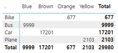
My initial matrix looks like the following (with figures in every cell, unlike the sample below):
Now I want to add the extra column, in order to get something like this (sample made in Excel, without the Totals):
The Id's (A1 to A16) are based on the combination of the x and y axis (like: Car and Blue = A3), and are situated in the model as a calculated column:
Id =
SWITCH(TRUE(),
TEST'[X]="Blue" && 'TEST'[Y]="Bike","A1",
TEST'[X]="Blue" && 'TEST'[Y]="Bus","A2",
TEST'[X]="Car" && 'TEST'[Y]="Blue","A3",
TEST'[X]="Plane" && 'TEST'[Y]="Blue","A4",
TEST'[X]="Brown" && 'TEST'[Y]="Bike","A5",
TEST'[X]="Brown" && 'TEST'[Y]="Bus","A6",
etc.
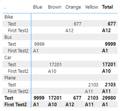
The thing is, no matter what I try, I can't get this extra column added in the Matrix. It is simply possible to add an extra row using these Id's (without a column name then, but frankly that doesn't matter much), but then the ID's are in a self-contained row, not in front of the number, see below:
Does anyone have any ideas? Many thanks in advance for your thoughts!
Solved! Go to Solution.
- Mark as New
- Bookmark
- Subscribe
- Mute
- Subscribe to RSS Feed
- Permalink
- Report Inappropriate Content
Sure. But from the format settings make sure you don't select "measure on rows" and you have (compared to the given example) the category on rows and the color on columns. Also what are the empty rows that is shown in the last screenshot?
- Mark as New
- Bookmark
- Subscribe
- Mute
- Subscribe to RSS Feed
- Permalink
- Report Inappropriate Content
Ha yes I know, the allignment isn't that hard, also blanked out the total for the A1 - A16 fields (this total doesn't make any sense). But I expected the full A1 to A16 in the matrix (as in the example in the first post). Played around a bit, and the 'trick' for this was; use the same measures / columns as used in the matrix itself... 😉 I used a different column in the measure, this column contains the color codes. The matrix itself then includes the column of the actual colors. And then something doesn't go quite right....
Thanks for your help!
- Mark as New
- Bookmark
- Subscribe
- Mute
- Subscribe to RSS Feed
- Permalink
- Report Inappropriate Content
- Mark as New
- Bookmark
- Subscribe
- Mute
- Subscribe to RSS Feed
- Permalink
- Report Inappropriate Content
Hi, unfortunately this doesn't work. I only can add this as a value, not as a column or row. Doesn't have to be a problem I think, however, it still produces an extra row:
- Mark as New
- Bookmark
- Subscribe
- Mute
- Subscribe to RSS Feed
- Permalink
- Report Inappropriate Content
Maybe a better picture of this outcome:
- Mark as New
- Bookmark
- Subscribe
- Mute
- Subscribe to RSS Feed
- Permalink
- Report Inappropriate Content
Are you having the measures on rows or columns?
- Mark as New
- Bookmark
- Subscribe
- Mute
- Subscribe to RSS Feed
- Permalink
- Report Inappropriate Content
I was only allowed to add the new measure for the A1 - A16 ID's (SELECTEDVALUE ( Table[Id] )) into the value field.
- Mark as New
- Bookmark
- Subscribe
- Mute
- Subscribe to RSS Feed
- Permalink
- Report Inappropriate Content
Sure. But from the format settings make sure you don't select "measure on rows" and you have (compared to the given example) the category on rows and the color on columns. Also what are the empty rows that is shown in the last screenshot?
- Mark as New
- Bookmark
- Subscribe
- Mute
- Subscribe to RSS Feed
- Permalink
- Report Inappropriate Content
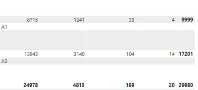
Hi, the empty rows are the result of placing the just made measure as a value (with the option "show on rows"), creating the same as in the example:
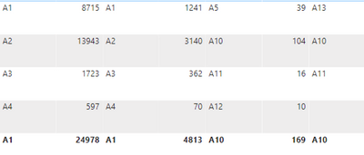
Ha, I de-activated the "show on rows", and now it seems pretty nice (see below)! Not exactly what I'd expected (the Id's are located on some odd places), but I have to check the data for this. Will do that tomorrow. Thank you very much for the advice!
- Mark as New
- Bookmark
- Subscribe
- Mute
- Subscribe to RSS Feed
- Permalink
- Report Inappropriate Content
Yes that is because by default the text data type is aligned left while whole and decimal numbers are aligned right. You can fix that easily. Have a good night
Helpful resources

Microsoft Fabric Learn Together
Covering the world! 9:00-10:30 AM Sydney, 4:00-5:30 PM CET (Paris/Berlin), 7:00-8:30 PM Mexico City

Power BI Monthly Update - April 2024
Check out the April 2024 Power BI update to learn about new features.

| User | Count |
|---|---|
| 42 | |
| 21 | |
| 21 | |
| 14 | |
| 13 |
| User | Count |
|---|---|
| 43 | |
| 36 | |
| 33 | |
| 18 | |
| 18 |


