- Power BI forums
- Updates
- News & Announcements
- Get Help with Power BI
- Desktop
- Service
- Report Server
- Power Query
- Mobile Apps
- Developer
- DAX Commands and Tips
- Custom Visuals Development Discussion
- Health and Life Sciences
- Power BI Spanish forums
- Translated Spanish Desktop
- Power Platform Integration - Better Together!
- Power Platform Integrations (Read-only)
- Power Platform and Dynamics 365 Integrations (Read-only)
- Training and Consulting
- Instructor Led Training
- Dashboard in a Day for Women, by Women
- Galleries
- Community Connections & How-To Videos
- COVID-19 Data Stories Gallery
- Themes Gallery
- Data Stories Gallery
- R Script Showcase
- Webinars and Video Gallery
- Quick Measures Gallery
- 2021 MSBizAppsSummit Gallery
- 2020 MSBizAppsSummit Gallery
- 2019 MSBizAppsSummit Gallery
- Events
- Ideas
- Custom Visuals Ideas
- Issues
- Issues
- Events
- Upcoming Events
- Community Blog
- Power BI Community Blog
- Custom Visuals Community Blog
- Community Support
- Community Accounts & Registration
- Using the Community
- Community Feedback
Register now to learn Fabric in free live sessions led by the best Microsoft experts. From Apr 16 to May 9, in English and Spanish.
- Power BI forums
- Forums
- Get Help with Power BI
- DAX Commands and Tips
- Re: How to do cohort analysis - same starting poin...
- Subscribe to RSS Feed
- Mark Topic as New
- Mark Topic as Read
- Float this Topic for Current User
- Bookmark
- Subscribe
- Printer Friendly Page
- Mark as New
- Bookmark
- Subscribe
- Mute
- Subscribe to RSS Feed
- Permalink
- Report Inappropriate Content
How to do cohort analysis - same starting point with relative time period?
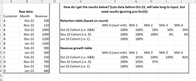
Could someone please help me? Left table is what I have, and the right 2 tables are what I need.
Thanks a lot!
Solved! Go to Solution.
- Mark as New
- Bookmark
- Subscribe
- Mute
- Subscribe to RSS Feed
- Permalink
- Report Inappropriate Content
Hi, Greg,
The 2nd link above was helpful but still not enough for me. The challenges are:
1. Customer starting dates are in another table which is properly linked to the left table in my original screenshot above. That is, the left table in the screenshot only starts from a recent month while many more historical sales data are to be input. I tried "related" with "datediff", but couldn't get the age.
2. Even if I do get the customer age, how do I pupulate a table that looks like those in the right table in my screenshot above? The columns headers should read "1st month from onboarding, 2nd month from onboarding,.... 50th month from onboarding".
Could you please help? Thanks a lot. @Greg_Deckler
- Mark as New
- Bookmark
- Subscribe
- Mute
- Subscribe to RSS Feed
- Permalink
- Report Inappropriate Content
@ewu Try this: Patient Cohort (AND Slicer) - Microsoft Power BI Community or this: Customer Retention Part 3: Period Of Stay – Cohort... - Microsoft Power BI Community
@ me in replies or I'll lose your thread!!!
Instead of a Kudo, please vote for this idea
Become an expert!: Enterprise DNA
External Tools: MSHGQM
YouTube Channel!: Microsoft Hates Greg
Latest book!: The Definitive Guide to Power Query (M)
DAX is easy, CALCULATE makes DAX hard...
- Mark as New
- Bookmark
- Subscribe
- Mute
- Subscribe to RSS Feed
- Permalink
- Report Inappropriate Content
Thanks Greg. The 2nd link is quite similar to what I wanted. Let me try to do it the same way first these a few days. @Greg_Deckler
- Mark as New
- Bookmark
- Subscribe
- Mute
- Subscribe to RSS Feed
- Permalink
- Report Inappropriate Content
Hi, Greg,
The 2nd link above was helpful but still not enough for me. The challenges are:
1. Customer starting dates are in another table which is properly linked to the left table in my original screenshot above. That is, the left table in the screenshot only starts from a recent month while many more historical sales data are to be input. I tried "related" with "datediff", but couldn't get the age.
2. Even if I do get the customer age, how do I pupulate a table that looks like those in the right table in my screenshot above? The columns headers should read "1st month from onboarding, 2nd month from onboarding,.... 50th month from onboarding".
Could you please help? Thanks a lot. @Greg_Deckler
- Mark as New
- Bookmark
- Subscribe
- Mute
- Subscribe to RSS Feed
- Permalink
- Report Inappropriate Content
No worries. My mistake. Anything minor could kill everything.
- Mark as New
- Bookmark
- Subscribe
- Mute
- Subscribe to RSS Feed
- Permalink
- Report Inappropriate Content
Unfortuantely I went through the above videos and a couple more, but still cannot get the final results. One of the challenges is I am not sure what to do with my newly created generateseries table. Here are the 2 tables I have now:
Below is what I want:
Could someone please help? @Greg_Deckler
Helpful resources

Microsoft Fabric Learn Together
Covering the world! 9:00-10:30 AM Sydney, 4:00-5:30 PM CET (Paris/Berlin), 7:00-8:30 PM Mexico City

Power BI Monthly Update - April 2024
Check out the April 2024 Power BI update to learn about new features.

| User | Count |
|---|---|
| 47 | |
| 24 | |
| 20 | |
| 15 | |
| 13 |
| User | Count |
|---|---|
| 51 | |
| 46 | |
| 39 | |
| 19 | |
| 19 |


