- Power BI forums
- Updates
- News & Announcements
- Get Help with Power BI
- Desktop
- Service
- Report Server
- Power Query
- Mobile Apps
- Developer
- DAX Commands and Tips
- Custom Visuals Development Discussion
- Health and Life Sciences
- Power BI Spanish forums
- Translated Spanish Desktop
- Power Platform Integration - Better Together!
- Power Platform Integrations (Read-only)
- Power Platform and Dynamics 365 Integrations (Read-only)
- Training and Consulting
- Instructor Led Training
- Dashboard in a Day for Women, by Women
- Galleries
- Community Connections & How-To Videos
- COVID-19 Data Stories Gallery
- Themes Gallery
- Data Stories Gallery
- R Script Showcase
- Webinars and Video Gallery
- Quick Measures Gallery
- 2021 MSBizAppsSummit Gallery
- 2020 MSBizAppsSummit Gallery
- 2019 MSBizAppsSummit Gallery
- Events
- Ideas
- Custom Visuals Ideas
- Issues
- Issues
- Events
- Upcoming Events
- Community Blog
- Power BI Community Blog
- Custom Visuals Community Blog
- Community Support
- Community Accounts & Registration
- Using the Community
- Community Feedback
Register now to learn Fabric in free live sessions led by the best Microsoft experts. From Apr 16 to May 9, in English and Spanish.
- Power BI forums
- Forums
- Get Help with Power BI
- DAX Commands and Tips
- Re: Graph Last 12 Weeks based on Week Slicer selec...
- Subscribe to RSS Feed
- Mark Topic as New
- Mark Topic as Read
- Float this Topic for Current User
- Bookmark
- Subscribe
- Printer Friendly Page
- Mark as New
- Bookmark
- Subscribe
- Mute
- Subscribe to RSS Feed
- Permalink
- Report Inappropriate Content
Graph Last 12 Weeks based on Week Slicer selection
Hi everyone,
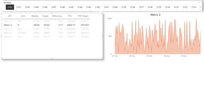
I currently have a report showing a Weekly table of data and upon clicking on each KPI entry, it populates a graph with Hourly values.
This is possible thanks to the following measure as the main table is an unpivotted, curated, version of the tables in the model:
KPI Selection =
SWITCH(
    TRUE(),
    VALUES('KPI_Table'[KPI]) = "Metric 1", SUM('Hourly'[Metric1]),
    VALUES('KPI_Table'[KPI]) = "Metric 2", SUM('Hourly'[Metric2]),
    VALUES('KPI_Table'[KPI]) = "Metric 3", SUM('Hourly'[Metric3]),
    VALUES('KPI_Table'[KPI]) = "Metric 4", SUM('Hourly'[Metric4]),
    VALUES('KPI_Table'[KPI]) = "Metric 5", SUM('Hourly'[Metric5]),
    BLANK ()
)
To this report, I would like to add the following:
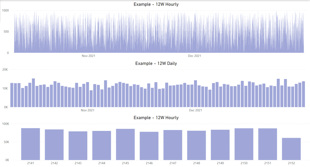
1 - A similar area graph of Hourly data for the last 12 weeks based off the YearWeek slicer (2016 data points, 168 * 12)
2 - Bar graph of Daily data for the last 12 weeks based off the YearWeek slicer (84 data points, 7 * 12)
3 - Bar graph of Weekly data for the last 12 weeks based off YearWeek slicer (12 data points)
Here's a Dummy pbix file with the data model replicated as best as possible.
I've had a thread open on this a long time ago, nearly solved it, and was left on my backlog ever since.
Here's a list of measures I've tried and believe might have gotten close to what I needed:
12Weeks =
VAR ReferenceDate = MAX ( 'Calendar'[Date] )
VAR StartDate = DATESINPERIOD ('Calendar'[Date], ReferenceDate, -84, DAY)

VAR Result =
CALCULATE(
[KPI Selection],
REMOVEFILTERS( 'Calendar' ),
KEEPFILTERS( StartDate )
)
RETURN
Result
12Weeks.2 =
VAR ReferenceDate = CALCULATE( MAX ( 'Daily'[Daily] ), 'Daily'[YearWeek]=SELECTEDVALUE(ISO50001[YearWeek]))
VAR Result =
CALCULATE([KPI Selection]),DATESINPERIOD('Daily'[Daily],LASTDATE('Daily'[Daily] ) ,-84,day))
RETURN
Result L12W = CALCULATE([KPI Selection]),REMOVEFILTERS('Calendar'),
KEEPFILTERS(DATESINPERIOD('Calendar'[Date],LASTDATE('Calendar'[Date]),-84,day)), USERELATIONSHIP(Weekly[YearWeek],KPI_Table[YearWeek]))
Lastly, this is how the "Metric1" graphs should look like if YearWeek 2152 is selected:
Thank you in advance for taking some time to look into this,
Tom
- Mark as New
- Bookmark
- Subscribe
- Mute
- Subscribe to RSS Feed
- Permalink
- Report Inappropriate Content
@TomBLG , Based on what I got
if you select a date and want to display more than that, you need independent date table
//Date1 is independent Date table, Date is joined with Table
new measure =
var _max = maxx(allselected(Date1),Date1[Date])
var _min = _max -84
return
calculate( sum(Table[Value]), filter('Date', 'Date'[Date] >=_min && 'Date'[Date] <=_max))
Also, check
Power BI — Week on Week and WTD
https://medium.com/@amitchandak.1978/power-bi-wtd-questions-time-intelligence-4-5-98c30fab69d3
https://community.powerbi.com/t5/Community-Blog/Week-Is-Not-So-Weak-WTD-Last-WTD-and-This-Week-vs-La...
https://www.youtube.com/watch?v=pnAesWxYgJ8
Microsoft Power BI Learning Resources, 2023 !!
Learn Power BI - Full Course with Dec-2022, with Window, Index, Offset, 100+ Topics !!
Did I answer your question? Mark my post as a solution! Appreciate your Kudos !! Proud to be a Super User! !!
- Mark as New
- Bookmark
- Subscribe
- Mute
- Subscribe to RSS Feed
- Permalink
- Report Inappropriate Content
Hi @amitchandak,
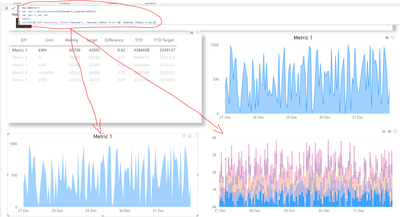
Unfortunately I wasn't able to get to the solution I need with your measure nor with the links provided. Despite the new Date1 table (which I named Calendar1), it will still display just the week selected:
Another matter is the fact that this is only displaying properly on the area charts. For a bar chart, it will display all Metrics and instead highlight just the selected one, rather than simply showing the selected metric.
I suspect that rather than doing this:
new measure =
var _max = maxx(allselected(Calendar1),Calendar1[Date])
var _min = _max -84
return
calculate( [KPI Selection], filter('Calendar', 'Calendar'[Date] >=_min && 'Calendar'[Date] <=_max))
I need to somehow integrate this measure in that one instead of calling [KPI Selection] in the calculate:
KPI Selection =
SWITCH(
    TRUE(),
    VALUES('KPI_Table'[KPI]) = "Metric 1", SUM('Hourly'[Metric1]),
    VALUES('KPI_Table'[KPI]) = "Metric 2", SUM('Hourly'[Metric2]),
    VALUES('KPI_Table'[KPI]) = "Metric 3", SUM('Hourly'[Metric3]),
    VALUES('KPI_Table'[KPI]) = "Metric 4", SUM('Hourly'[Metric4]),
    VALUES('KPI_Table'[KPI]) = "Metric 5", SUM('Hourly'[Metric5]),
    BLANK ()
)
If you see where the problem is and could change and send the pbix file back I would appreciate it immensely:
Helpful resources

Microsoft Fabric Learn Together
Covering the world! 9:00-10:30 AM Sydney, 4:00-5:30 PM CET (Paris/Berlin), 7:00-8:30 PM Mexico City

Power BI Monthly Update - April 2024
Check out the April 2024 Power BI update to learn about new features.

| User | Count |
|---|---|
| 40 | |
| 20 | |
| 17 | |
| 16 | |
| 15 |
| User | Count |
|---|---|
| 50 | |
| 26 | |
| 21 | |
| 17 | |
| 16 |


