- Power BI forums
- Updates
- News & Announcements
- Get Help with Power BI
- Desktop
- Service
- Report Server
- Power Query
- Mobile Apps
- Developer
- DAX Commands and Tips
- Custom Visuals Development Discussion
- Health and Life Sciences
- Power BI Spanish forums
- Translated Spanish Desktop
- Power Platform Integration - Better Together!
- Power Platform Integrations (Read-only)
- Power Platform and Dynamics 365 Integrations (Read-only)
- Training and Consulting
- Instructor Led Training
- Dashboard in a Day for Women, by Women
- Galleries
- Community Connections & How-To Videos
- COVID-19 Data Stories Gallery
- Themes Gallery
- Data Stories Gallery
- R Script Showcase
- Webinars and Video Gallery
- Quick Measures Gallery
- 2021 MSBizAppsSummit Gallery
- 2020 MSBizAppsSummit Gallery
- 2019 MSBizAppsSummit Gallery
- Events
- Ideas
- Custom Visuals Ideas
- Issues
- Issues
- Events
- Upcoming Events
- Community Blog
- Power BI Community Blog
- Custom Visuals Community Blog
- Community Support
- Community Accounts & Registration
- Using the Community
- Community Feedback
Register now to learn Fabric in free live sessions led by the best Microsoft experts. From Apr 16 to May 9, in English and Spanish.
- Power BI forums
- Forums
- Get Help with Power BI
- DAX Commands and Tips
- Filtering a table based on one of several of it's ...
- Subscribe to RSS Feed
- Mark Topic as New
- Mark Topic as Read
- Float this Topic for Current User
- Bookmark
- Subscribe
- Printer Friendly Page
- Mark as New
- Bookmark
- Subscribe
- Mute
- Subscribe to RSS Feed
- Permalink
- Report Inappropriate Content
Filtering a table based on one of several of it's columns' values (by selected x-axis series)
Hi all,
I'm struggling to articulate what I mean here, so hopefully this is clear enough. I have a bunch of survey response data where I have codified verbatim comments into one or many feedback themes (e.g., "Platform issues", "Support timeliness", etc.). Because there can be several themes per response, in the source file (an .xlsx) there are separate columns per theme. E.g., where a respondent references both support timeliness and platform issues in their comment, each of those columns will have a 1 on the row for that survey response.
I've been able to add the sum of the various feedback themes (columns) to a bar chart as multiple x axes, but I need to have this filter the other visuals. E.g., when Support timeliness is selected, I need the other visuals to be filtered by the rows which have a 1 in that column. I know this is probably a data model issue stemming from each theme having it's own column, but I can't figure out how to change it or work around it with DAX so that I can select a feedback theme from the themes bar chart, and have that filter the others.
Appreciate any suggestions or input, thanks! (including how to explain this better!)
EDIT: At the suggestion of @Wilson_ - adding a very simplified sample file which demonstrates the issue. I need to be able to filter the bottom table by selecting one or more series' from the above bar chart.
Solved! Go to Solution.
- Mark as New
- Bookmark
- Subscribe
- Mute
- Subscribe to RSS Feed
- Permalink
- Report Inappropriate Content
Hey Marshall,
Thanks for adding in the sample file. That helped me understand better.
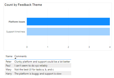
So mainly what I did to solve your issue was tweak your data model (as you suspected) by unpivoting the two columns with feedback themes in them, then delete the Value column. This left me with three columns: Name, Feedback Theme, and Comments. I then changed your bar chart to have Feedback Theme in the y-axis and Count in the x-axis.
Here's your sample file reattached so you can hopefully see what I did.
This is what the report page looks like now (below), with Platform Issues selected in the bar graph.
Please let me know if this is what you were looking for. 😄
----------------------------------
If this post helps, please consider accepting it as the solution to help other members find it quickly. Also, don't forget to hit that thumbs up and subscribe! (Oh, uh, wrong platform?)
- Mark as New
- Bookmark
- Subscribe
- Mute
- Subscribe to RSS Feed
- Permalink
- Report Inappropriate Content
Thanks @Wilson_, I was trying to do this another way other than unpivoting because there's a lot of other info in the source table, including metrics such as question scores, etc. which can't be duplicated on unpivoted rows, since this affects average scores. Should I create another table with just those columns, then unpivot that, and link it or something?
- Mark as New
- Bookmark
- Subscribe
- Mute
- Subscribe to RSS Feed
- Permalink
- Report Inappropriate Content
Marshall,
Ah I see, that makes sense. Is the full dataset just the one table? If so, you could unpivot it like I did, then write a measure to essentially remove duplicated records before calculating average score. As an example, assuming the combination of Name and Comments was a unique identifier for one survey response, your measure could look something like:
Average Score =
AVERAGEX (
    SUMMARIZE (
        'Survey Responses',
        'Survey Responses'[Name], 'Survey Responses'[Comments], 'Survey Responses'[Score]
    ),
    'Survey Responses'[Score]
)
The SUMMARIZE function would re-aggregate the Survey Responses table by Name, Comments and Score to remove the duplicated rows, then send that table to the AVERAGEX function to take the average of the Score column.
Would that work for you?
----------------------------------
If this post helps, please consider accepting it as the solution to help other members find it quickly. Also, don't forget to hit that thumbs up and subscribe! (Oh, uh, wrong platform?)
- Mark as New
- Bookmark
- Subscribe
- Mute
- Subscribe to RSS Feed
- Permalink
- Report Inappropriate Content
Thanks so much @Wilson_. I didn't go with that method, because there are a lof of measures that I would have needed to modify, and creating a second themes table with limited columns and unpivoting that (and creating a response key out of the datetime and email to join them) was faster. This does work, and I'm reasonably happy with it, although I'm curious to know whether there's a DAX way of dynamically selecting a column based on which X axis value is selected (the original question I asked), because having separate axes means I'm able to colour code bars (series') based on the sentiment of feedback themes, which is a visual value-add. So, I'd been to stick with the multiple X axis method if possible. You helped me get to somewhat of a solution, which is appreciated! 🙂
- Mark as New
- Bookmark
- Subscribe
- Mute
- Subscribe to RSS Feed
- Permalink
- Report Inappropriate Content
Hey Marshall,
You're welcome, glad I could help!
If the main reason for wanting multiple x-axis was to colour code the different categories, you should be able to move the column containing all the different categories into the Legend in the bar chart visual. 😄
----------------------------------
If this post helps, please consider accepting it as the solution to help other members find it quickly. Also, don't forget to hit that thumbs up and subscribe! (Oh, uh, wrong platform?)
- Mark as New
- Bookmark
- Subscribe
- Mute
- Subscribe to RSS Feed
- Permalink
- Report Inappropriate Content
Oh, cool! Thanks 🙏😀 I just did that, but it made the bars really skinny, and I'm playing with the spacing but can't seem to make them look normal-ish!
- Mark as New
- Bookmark
- Subscribe
- Mute
- Subscribe to RSS Feed
- Permalink
- Report Inappropriate Content
haha so this may or may not be closer to what you want, but you can also remove the categories from the y-axis altogether and only leave it in legends. It'll stick the bars together with no gap between them. You can also drop the inner padding to 0 px to make the bars a bit thicker.
- Mark as New
- Bookmark
- Subscribe
- Mute
- Subscribe to RSS Feed
- Permalink
- Report Inappropriate Content
Hey Marshall,
It might help if you shared a snippet of the data table (with anonymized data) and maybe a mock sample report.
Helpful resources

Microsoft Fabric Learn Together
Covering the world! 9:00-10:30 AM Sydney, 4:00-5:30 PM CET (Paris/Berlin), 7:00-8:30 PM Mexico City

Power BI Monthly Update - April 2024
Check out the April 2024 Power BI update to learn about new features.

| User | Count |
|---|---|
| 49 | |
| 25 | |
| 20 | |
| 15 | |
| 12 |
| User | Count |
|---|---|
| 57 | |
| 49 | |
| 44 | |
| 18 | |
| 18 |


