- Power BI forums
- Updates
- News & Announcements
- Get Help with Power BI
- Desktop
- Service
- Report Server
- Power Query
- Mobile Apps
- Developer
- DAX Commands and Tips
- Custom Visuals Development Discussion
- Health and Life Sciences
- Power BI Spanish forums
- Translated Spanish Desktop
- Power Platform Integration - Better Together!
- Power Platform Integrations (Read-only)
- Power Platform and Dynamics 365 Integrations (Read-only)
- Training and Consulting
- Instructor Led Training
- Dashboard in a Day for Women, by Women
- Galleries
- Community Connections & How-To Videos
- COVID-19 Data Stories Gallery
- Themes Gallery
- Data Stories Gallery
- R Script Showcase
- Webinars and Video Gallery
- Quick Measures Gallery
- 2021 MSBizAppsSummit Gallery
- 2020 MSBizAppsSummit Gallery
- 2019 MSBizAppsSummit Gallery
- Events
- Ideas
- Custom Visuals Ideas
- Issues
- Issues
- Events
- Upcoming Events
- Community Blog
- Power BI Community Blog
- Custom Visuals Community Blog
- Community Support
- Community Accounts & Registration
- Using the Community
- Community Feedback
Register now to learn Fabric in free live sessions led by the best Microsoft experts. From Apr 16 to May 9, in English and Spanish.
- Power BI forums
- Forums
- Get Help with Power BI
- DAX Commands and Tips
- Re: Dynamically legend
- Subscribe to RSS Feed
- Mark Topic as New
- Mark Topic as Read
- Float this Topic for Current User
- Bookmark
- Subscribe
- Printer Friendly Page
- Mark as New
- Bookmark
- Subscribe
- Mute
- Subscribe to RSS Feed
- Permalink
- Report Inappropriate Content
Dynamically legend
Hello everyone,
We build a schema for analysis any measures in the same sheet
Measure =
VAR Logic Test =
COUNTROWS(DISTINCT(FILTER(ALLSELECTED('KPI´s'[KPI]),'KPI´s'[KPI] = "Real Sales"))) = 1
RETURN
IF(LogicTest, [Real_Sale],blank())
We utilize the visualization Line and Clustered column charts, in shared axis we have month and column values we have 4 measures (Real sales, Planned Sales,(...)).
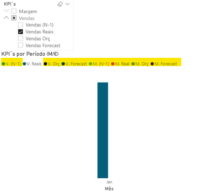
Our problem is, when for example we selected only measure (Real Sales) the graph value appear correctly but the legend appear all measures (not selected in filter).
Is there any way for the legend graph to be dynamic? Or create a outside legend the chart?
Thank you.
- Mark as New
- Bookmark
- Subscribe
- Mute
- Subscribe to RSS Feed
- Permalink
- Report Inappropriate Content
@iago_salvadori1
Follow below steps to get dynamic legends:-
1) Open the data table in Power query adn DUPLICATE it and rename the other table.
2)Remove the unwanted columns from table.
3)Add index to both tables(Original Table and Duplicate table).
4)Select and unpivot the columns that you want to display dynamically as legend.
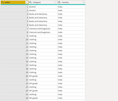
5)After unpivoting you will get two new columns having ATTRIBUTE and VALUE
6) Save and close power query.
7)In Model view tab, create relationship between Original Table and New unpivot table on Index column.
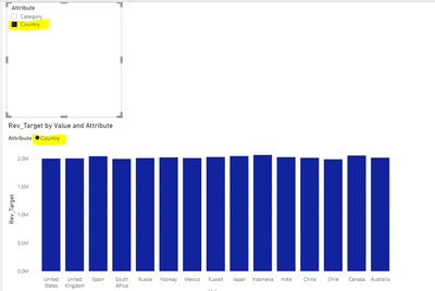
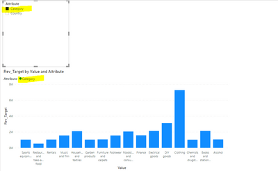
😎 Now you can put the ATTRIBUTE column from new table(on which we have done unpivoting) in column series of clustered chart.
- Mark as New
- Bookmark
- Subscribe
- Mute
- Subscribe to RSS Feed
- Permalink
- Report Inappropriate Content
Do we have any solution to this requirement?
- Mark as New
- Bookmark
- Subscribe
- Mute
- Subscribe to RSS Feed
- Permalink
- Report Inappropriate Content
Hi @NidhiBhusari , thank you suggestion.
But I don´t understand why I have create a index.
I will try to explain myself better:
I have two tables in my model, one table (Table1) I have all data what I need and another table (Table2) I created for select all measures in one sheet:
Table2
For example:
Vendas Reais =
VAR Logic Test =
COUNTROWS(DISTINCT(FILTER(ALLSELECTED('KPI´s'[KPI]),'KPI´s'[KPI] = " Vendas Reais"))) = 1
RETURN
IF(LogicTest, [Real_Sale],blank())
The measure [Real_sale] is calculated in Table1.
When we selected in filter a measure the legend graph appear all measures (not selected in filter).
We want the legend visualizations to show only the measures that are selected.
Thank you.
- Mark as New
- Bookmark
- Subscribe
- Mute
- Subscribe to RSS Feed
- Permalink
- Report Inappropriate Content
Thank you for this, worked perfectly on my own health data - where I wanted to have the Column Series switch between Episode of Care, Admission Category, Gender and I even added Ward to see how well it worked. Perfect!
Saved me hours of time running bookmarks etc!
🙂
Regards
ClinEpi
- Mark as New
- Bookmark
- Subscribe
- Mute
- Subscribe to RSS Feed
- Permalink
- Report Inappropriate Content
Hi @iago_salvadori1 !
Please try changing teh slicer type to be single select & see if that make any difference.
Regards,
Hasham
Helpful resources

Microsoft Fabric Learn Together
Covering the world! 9:00-10:30 AM Sydney, 4:00-5:30 PM CET (Paris/Berlin), 7:00-8:30 PM Mexico City

Power BI Monthly Update - April 2024
Check out the April 2024 Power BI update to learn about new features.

| User | Count |
|---|---|
| 41 | |
| 21 | |
| 21 | |
| 14 | |
| 13 |
| User | Count |
|---|---|
| 43 | |
| 36 | |
| 33 | |
| 18 | |
| 18 |


