- Power BI forums
- Updates
- News & Announcements
- Get Help with Power BI
- Desktop
- Service
- Report Server
- Power Query
- Mobile Apps
- Developer
- DAX Commands and Tips
- Custom Visuals Development Discussion
- Health and Life Sciences
- Power BI Spanish forums
- Translated Spanish Desktop
- Power Platform Integration - Better Together!
- Power Platform Integrations (Read-only)
- Power Platform and Dynamics 365 Integrations (Read-only)
- Training and Consulting
- Instructor Led Training
- Dashboard in a Day for Women, by Women
- Galleries
- Community Connections & How-To Videos
- COVID-19 Data Stories Gallery
- Themes Gallery
- Data Stories Gallery
- R Script Showcase
- Webinars and Video Gallery
- Quick Measures Gallery
- 2021 MSBizAppsSummit Gallery
- 2020 MSBizAppsSummit Gallery
- 2019 MSBizAppsSummit Gallery
- Events
- Ideas
- Custom Visuals Ideas
- Issues
- Issues
- Events
- Upcoming Events
- Community Blog
- Power BI Community Blog
- Custom Visuals Community Blog
- Community Support
- Community Accounts & Registration
- Using the Community
- Community Feedback
Register now to learn Fabric in free live sessions led by the best Microsoft experts. From Apr 16 to May 9, in English and Spanish.
- Power BI forums
- Forums
- Get Help with Power BI
- DAX Commands and Tips
- Re: Dynamic Slicer - Count Distinct Value if one C...
- Subscribe to RSS Feed
- Mark Topic as New
- Mark Topic as Read
- Float this Topic for Current User
- Bookmark
- Subscribe
- Printer Friendly Page
- Mark as New
- Bookmark
- Subscribe
- Mute
- Subscribe to RSS Feed
- Permalink
- Report Inappropriate Content
Dynamic Slicer - Count Distinct Value if one Criteria is met within a group
I'm having an issue where I'm trying to calculate if something is covered or not based on if a value is met within a category. I would like to have a slicer for the column "Provider" where I can select numerous combinations of the provider, and if atleast one of them is "Covered" then I'd like the product to be considered covered. Currently, my bar chart (with "Covered?" as the legend) is double counting values (distinct count of product ID) when i select various combinations.
The dataset I'm working with looks like this:
| Unit | Product | Provider | Covered? |
| Computers | A | Apple | Covered |
| Computers | A | Not Covered | |
| Computers | A | Microsoft | Covered |
| Computers | A | Tesla | Covered |
| Computers | B | Apple | Not Covered |
| Computers | B | Covered | |
| Computers | B | Microsoft | Not Covered |
| Computers | B | Tesla | Not Covered |
| Computers | C | Apple | Covered |
| Computers | C | Covered | |
| Computers | C | Microsoft | Covered |
| Computers | C | Tesla | Covered |
| Computers | D | Apple | Covered |
| Computers | D | Covered | |
| Computers | D | Microsoft | Not Covered |
| Computers | D | Tesla | Covered |
For example, if I select Microsoft and Tesla in the slicer, then I would want :
Product A to return "Covered",
Product B to return "Not Covered",
Product C to retun "Covered",
Product D to return "Covered"
The picture below shows how its double counting Product D. I would like this to just have a 1 for "Covered", and for the breakdown by unit be a split of 3 covered, 1 not covered
Any ideas how I can accomplish this? Thank you!
Solved! Go to Solution.
- Mark as New
- Bookmark
- Subscribe
- Mute
- Subscribe to RSS Feed
- Permalink
- Report Inappropriate Content
I added a second Unit "Phones" to my test data, & slightly changed the "Coverage" column data for it so that it differs a bit from the data you provided for unit "Computers". This was done to test the final breakdown for the Covered / Not Covered Line Chart.
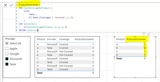
Step 1 - Create a calculated column.
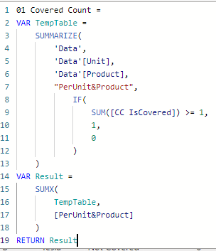
Step 2 - Create a measure to count the number of Unit + Product combinations which are covered.
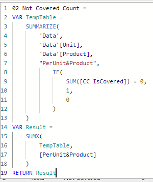
Step 3 - Create a measure to count the number of Unit + Product combinations which are NOT covered.
Finally, add the 2 measures to the line chart.
Data is as follows (your original "Computers" data + my additional "Phones" data):
Hopefully this is helpful to you.
Nathan
- Mark as New
- Bookmark
- Subscribe
- Mute
- Subscribe to RSS Feed
- Permalink
- Report Inappropriate Content
- Mark as New
- Bookmark
- Subscribe
- Mute
- Subscribe to RSS Feed
- Permalink
- Report Inappropriate Content
Thanks - I dont think that solution would work because I ultimately need to roll this up at a "Unit" level by a distinct count of products and need to have the "Covered" / "Not Covered" legend to show the segmentation in a bar chart.
- Mark as New
- Bookmark
- Subscribe
- Mute
- Subscribe to RSS Feed
- Permalink
- Report Inappropriate Content
I added a second Unit "Phones" to my test data, & slightly changed the "Coverage" column data for it so that it differs a bit from the data you provided for unit "Computers". This was done to test the final breakdown for the Covered / Not Covered Line Chart.
Step 1 - Create a calculated column.
Step 2 - Create a measure to count the number of Unit + Product combinations which are covered.
Step 3 - Create a measure to count the number of Unit + Product combinations which are NOT covered.
Finally, add the 2 measures to the line chart.
Data is as follows (your original "Computers" data + my additional "Phones" data):
Hopefully this is helpful to you.
Nathan
- Mark as New
- Bookmark
- Subscribe
- Mute
- Subscribe to RSS Feed
- Permalink
- Report Inappropriate Content
Thank you! That worked for the purpose of what I was trying to do. The only additional thing is the filter ability gets removed from the stacked bar chart. Is there a solution to be able to click on the "Covered" or "Not Covered" segmentation in the stacked bar chart to be able to filter for those products/units that are, or are not covered?
As always, appreciate the assistance!
- Mark as New
- Bookmark
- Subscribe
- Mute
- Subscribe to RSS Feed
- Permalink
- Report Inappropriate Content
- Mark as New
- Bookmark
- Subscribe
- Mute
- Subscribe to RSS Feed
- Permalink
- Report Inappropriate Content
The bar chart visual is predefined so that when you click on a bar for "Covered" or "Not Covered", you're not actually selecting the bar, but rather the entire category "Computers".
If you want to isolate only what is covered or not covered, I would recommend simply adding a slicer for the "Coverage" column.
- Mark as New
- Bookmark
- Subscribe
- Mute
- Subscribe to RSS Feed
- Permalink
- Report Inappropriate Content
Thanks - thats what I figured. One other note I would add is originally my dataset looked like the below table, but I ended up transposing it because I thought that would be the easiest in terms of filter layout. Note the 1 represents if it is covered by that provider, and the 0 is not covered. The original concept I designed was fairly static, so thats why the overall coverage column is there. As mentioned previously, I'm looking for that column to be dynamic based on the selections (e.g For product B, if Apple and Microsoft are selected, then "not covered", but if Apple and Google are selected, then "covered"
| Unit | Product | Apple | Microsoft | Tesla | Overall Coverage | |
| Computers | A | 1 | 0 | 1 | 1 | Covered |
| Computers | B | 0 | 1 | 0 | 0 | Covered |
| Computers | C | 1 | 1 | 1 | 1 | Covered |
| Computers | D | 1 | 1 | 0 | 1 | Covered |
| Phones | E | 1 | 0 | 0 | 0 | Covered |
| Phones | F | 1 | 1 | 1 | 1 | Covered |
| Phones | G | 0 | 1 | 0 | 1 | Covered |
| Phones | H | 0 | 1 | 0 | 1 | Covered |
| Phones | I | 0 | 0 | 0 | 0 | Not Covered |
If I used that layout instead, would a similar solution be available that would allow me to select the providers via slicer and based on the selections, it would return covered or not covered in the same segmented bar chart fashion, but allow for the filtering to be done at the covered/not covered level in the bar chart? I'm not sure on the exact DAX logic, but I would imagine it would be something like "If Apple and Tesla are selected, and the sum of both columns is >1, then 1, else 0". I'm just not sure how to account for the filtering aspect of the bar chart that I'm looking for. Perhaps a disconnected Covered/Not Covered table that acts as a legend (although If its disconnected, im not sure the filtering by segment in the bar chart would work)?
Really appreciate any help/guidence!
Helpful resources

Microsoft Fabric Learn Together
Covering the world! 9:00-10:30 AM Sydney, 4:00-5:30 PM CET (Paris/Berlin), 7:00-8:30 PM Mexico City

Power BI Monthly Update - April 2024
Check out the April 2024 Power BI update to learn about new features.

| User | Count |
|---|---|
| 49 | |
| 26 | |
| 21 | |
| 16 | |
| 12 |
| User | Count |
|---|---|
| 57 | |
| 49 | |
| 44 | |
| 19 | |
| 18 |


