- Power BI forums
- Updates
- News & Announcements
- Get Help with Power BI
- Desktop
- Service
- Report Server
- Power Query
- Mobile Apps
- Developer
- DAX Commands and Tips
- Custom Visuals Development Discussion
- Health and Life Sciences
- Power BI Spanish forums
- Translated Spanish Desktop
- Power Platform Integration - Better Together!
- Power Platform Integrations (Read-only)
- Power Platform and Dynamics 365 Integrations (Read-only)
- Training and Consulting
- Instructor Led Training
- Dashboard in a Day for Women, by Women
- Galleries
- Community Connections & How-To Videos
- COVID-19 Data Stories Gallery
- Themes Gallery
- Data Stories Gallery
- R Script Showcase
- Webinars and Video Gallery
- Quick Measures Gallery
- 2021 MSBizAppsSummit Gallery
- 2020 MSBizAppsSummit Gallery
- 2019 MSBizAppsSummit Gallery
- Events
- Ideas
- Custom Visuals Ideas
- Issues
- Issues
- Events
- Upcoming Events
- Community Blog
- Power BI Community Blog
- Custom Visuals Community Blog
- Community Support
- Community Accounts & Registration
- Using the Community
- Community Feedback
Register now to learn Fabric in free live sessions led by the best Microsoft experts. From Apr 16 to May 9, in English and Spanish.
- Power BI forums
- Forums
- Get Help with Power BI
- DAX Commands and Tips
- Data labels as % of total in stacked column chart
- Subscribe to RSS Feed
- Mark Topic as New
- Mark Topic as Read
- Float this Topic for Current User
- Bookmark
- Subscribe
- Printer Friendly Page
- Mark as New
- Bookmark
- Subscribe
- Mute
- Subscribe to RSS Feed
- Permalink
- Report Inappropriate Content
Data labels as % of total in stacked column chart
Hello,
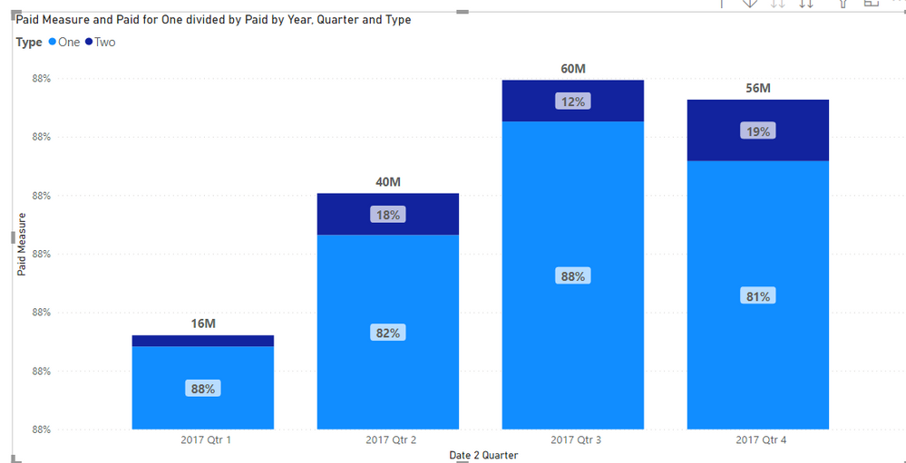
I was wonderig if there is a way to display % of total instead of actual value in data lable - similarly to using 'value from cell' in Excel charts. For example, I would like my chart in the pbix file (link below) to show 18% ($10M/$56M) and 82% ($46M/$56M) in data labels while still showing the column total as total dollar amount of $56M. If possible, showing both $ and % would be even better.
You can see that I've attampted to at least show it in the tooltip, but looks like my measure is not correct either. Some help with that formula would also be greatly appreciated.
https://1drv.ms/u/s!AgeVqxpmuh7I9QLQ966gtP5d6czR?e=JgWZtF
Thank you!
Solved! Go to Solution.
- Mark as New
- Bookmark
- Subscribe
- Mute
- Subscribe to RSS Feed
- Permalink
- Report Inappropriate Content
@YevD
I tried using Calculation Groups and got the desired results, please check the attached file and let me know if you need to understand how it was done.
⭕ Subscribe and learn Power BI from these videos
⚪ Website ⚪ LinkedIn ⚪ PBI User Group
- Mark as New
- Bookmark
- Subscribe
- Mute
- Subscribe to RSS Feed
- Permalink
- Report Inappropriate Content
Hi @Fowmy, it's been a year since I posted this, but wanted to thank you again for your solution! I finally got to working with claculation groups and was able to replicate. I did run into a bit of an issue where labels which contain 0 were displaying incorrectly. I was able to get around it with suggestion in article below where same problem is tackled.
https://www.sqlbi.com/tv/displaying-measures-as-percentages-in-power-bi-charts-unplugged/
- Mark as New
- Bookmark
- Subscribe
- Mute
- Subscribe to RSS Feed
- Permalink
- Report Inappropriate Content
Hi @Fowmy,
Unfortunately I am strugling to recreate this. Can you please give me a brief walkthrough?
Many thanks,
Yev
- Mark as New
- Bookmark
- Subscribe
- Mute
- Subscribe to RSS Feed
- Permalink
- Report Inappropriate Content
Hi @Fowmy ,
This is exactly what I was looking for. If you don't mind, I'd love some help with understanding how it was done. I started reading up on the calculation groups but haven't been able to re-create this yet. It seems like I should start using them for most if not all of my measures.
Helpful resources

Microsoft Fabric Learn Together
Covering the world! 9:00-10:30 AM Sydney, 4:00-5:30 PM CET (Paris/Berlin), 7:00-8:30 PM Mexico City

Power BI Monthly Update - April 2024
Check out the April 2024 Power BI update to learn about new features.

| User | Count |
|---|---|
| 41 | |
| 21 | |
| 21 | |
| 14 | |
| 13 |
| User | Count |
|---|---|
| 44 | |
| 32 | |
| 30 | |
| 18 | |
| 17 |

