- Power BI forums
- Updates
- News & Announcements
- Get Help with Power BI
- Desktop
- Service
- Report Server
- Power Query
- Mobile Apps
- Developer
- DAX Commands and Tips
- Custom Visuals Development Discussion
- Health and Life Sciences
- Power BI Spanish forums
- Translated Spanish Desktop
- Power Platform Integration - Better Together!
- Power Platform Integrations (Read-only)
- Power Platform and Dynamics 365 Integrations (Read-only)
- Training and Consulting
- Instructor Led Training
- Dashboard in a Day for Women, by Women
- Galleries
- Community Connections & How-To Videos
- COVID-19 Data Stories Gallery
- Themes Gallery
- Data Stories Gallery
- R Script Showcase
- Webinars and Video Gallery
- Quick Measures Gallery
- 2021 MSBizAppsSummit Gallery
- 2020 MSBizAppsSummit Gallery
- 2019 MSBizAppsSummit Gallery
- Events
- Ideas
- Custom Visuals Ideas
- Issues
- Issues
- Events
- Upcoming Events
- Community Blog
- Power BI Community Blog
- Custom Visuals Community Blog
- Community Support
- Community Accounts & Registration
- Using the Community
- Community Feedback
Register now to learn Fabric in free live sessions led by the best Microsoft experts. From Apr 16 to May 9, in English and Spanish.
- Power BI forums
- Forums
- Get Help with Power BI
- DAX Commands and Tips
- Re: DAX for Percentage of Column Total
- Subscribe to RSS Feed
- Mark Topic as New
- Mark Topic as Read
- Float this Topic for Current User
- Bookmark
- Subscribe
- Printer Friendly Page
- Mark as New
- Bookmark
- Subscribe
- Mute
- Subscribe to RSS Feed
- Permalink
- Report Inappropriate Content
DAX for Percentage of Column Total
Hi, I have a question about calculate percentage of column total.
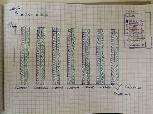
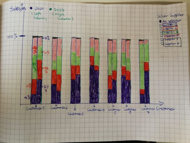
I want to create a bar chart with pecentage in columns like following:
1. When I select "All Selected" in Slicer(Supplier), the chart should be like this,
2. But the idea behind this chart is actually
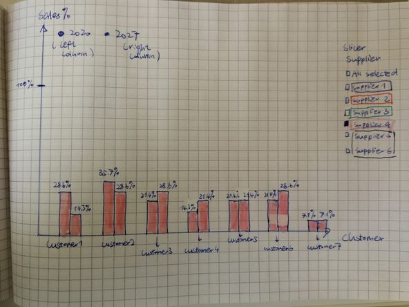
3. And when I click on a supplier (Here Supplier 4 is selected). This is the final chart I'm trying to get.
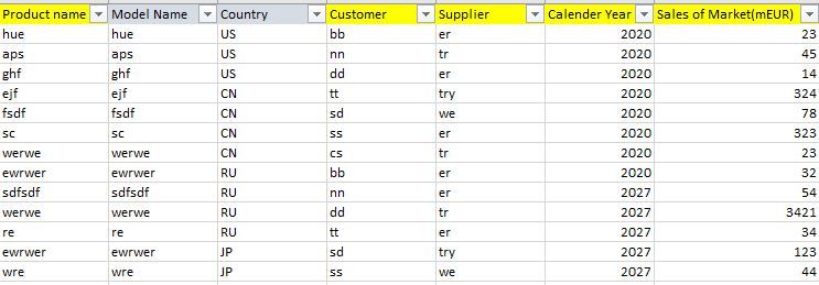
The dataset is as following:
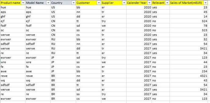
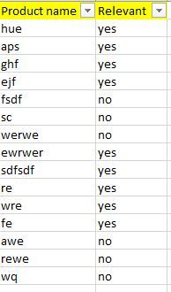
I only need to calculate items which "Relevant=yes". So I wrote:
Sales=caculate(sum('table'[sales of market(mEUR)],filter(table,table[relevant]="yes")
Sales%=table.Sales/Calculate(table[Sales]),All())*100
I don't know what went wrong, when I create the chart the percentages in columns are incorrect. (Because I also build pie charts for comparing) .
Could anyone help me with this?
Thank you!
Solved! Go to Solution.
- Mark as New
- Bookmark
- Subscribe
- Mute
- Subscribe to RSS Feed
- Permalink
- Report Inappropriate Content
HI @Anonymous ,
On your information there was not enough data to have more than one supplier by customer so I added a few rows of the same client but different supplier and values.
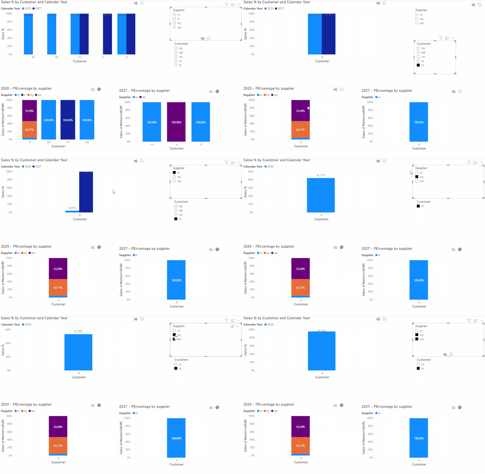
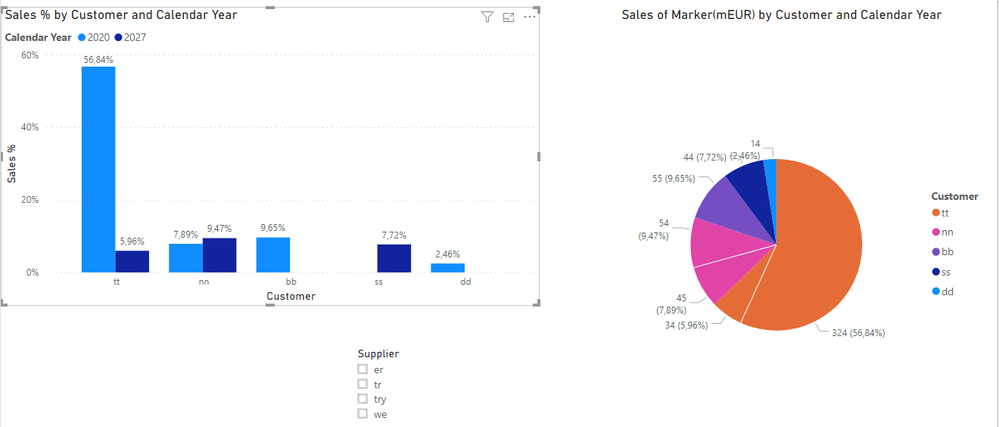
As you can see below the Customer TT has 3 values no the 100% stacked column (I made this chart for comparision) using the measure below you can see that the top chart calculates accordingly:
Sales % = SUM(Table1[Sales of Marker(mEUR)])/CALCULATE(SUM(Table1[Sales of Marker(mEUR)]);ALL(Table1[Supplier]))
The top chart is a bar chart with following format:
- X-Axis: Customer
- Values: %Sales
- Legend: Year
Once again I have made the calculation of relevant in the filter but can be added to your calculation measure.
If you want to have different colours according to selection of supplier you need to create a Measure to make the conditional formatting of the colour.
Regards
Miguel Félix
Did I answer your question? Mark my post as a solution!
Proud to be a Super User!
Check out my blog: Power BI em Português- Mark as New
- Bookmark
- Subscribe
- Mute
- Subscribe to RSS Feed
- Permalink
- Report Inappropriate Content
Hello Gyarr,
You have to use ALL function inside FILTER function at Sales% measure like this one:
----------------------------------------------
Did I answer your question? Mark my post as a solution!
- Mark as New
- Bookmark
- Subscribe
- Mute
- Subscribe to RSS Feed
- Permalink
- Report Inappropriate Content
Hi Motasem,
Thank you for answering! I think this gonna solve my problem!
What if, my column "relevant" is in another table (Table2))?
I tried it in this way
Sales% = table.Sales/Calculate(sum('table'[sales of market(mEUR)]),filter(All(table2),table2[relevant]="yes"))
It shows wrong. How do I fix the filter here? P.S. The two tables are connected already.
Thank you in advance!
- Mark as New
- Bookmark
- Subscribe
- Mute
- Subscribe to RSS Feed
- Permalink
- Report Inappropriate Content
Hello @Anonymous
You have to make a relationship between the two tables, here is an example to fake data generated to answer your question:
Based on that relation ship i go the result accurate 100%, the pie chart show the percantegas based on sales measure
and the column chart show the result of sales% measure
Hope that helps you,
If you still have a problem please share table headers and the created relation ships between them.
Best wishes
----------------------------------------------
Did I answer your question? Mark my post as a solution!
- Mark as New
- Bookmark
- Subscribe
- Mute
- Subscribe to RSS Feed
- Permalink
- Report Inappropriate Content
Hello! Motasem,
Thank you, I will share more information.
I have a Table1:
And a Table2:
These tables are different Excel files and both had been loaded to Power BI. In the Table2, the values of Product Name are unique, so I could create a relationship between Table1 and Table2:
From: Table1(Product Name) to Table2 (Product Name)
Then I want to create a chart as the picture in the original quesition.
I only want to calculate sales of which products are "relevant", so I have these formulas already:
Sales=Calculate(Sum(Table1[Sales of Market (mEUR)], Filter(Table2, Table2[Relevant]="yes")) which works well and correctly.
then by adapting what you have suggested to get the colunm total in a bar chart:
Sales%=Table1[Sales]/Calculate(Sum(Table1[Sales of Market (mEUR)], Filter(All(Table2), Table2[Relevant]="yes"))*100
In order to create the bar chart, I used:
Axis: Customer;
Legend: Calendar year;
Value: Sales%
Combined with a slicer: Supplier, in order to see Sales% of relevant "yes" of a single suppier for customers.
However the chart goes like this, and when I use my "Slicer: Supplier" to select a single supplier, it remains unchanged with all columns still show 100%.
Thank you for your help and looking forward to get the solution from you!
Best,
- Mark as New
- Bookmark
- Subscribe
- Mute
- Subscribe to RSS Feed
- Permalink
- Report Inappropriate Content
Hello @Anonymous,
You need to do the below:
1. Change relation ship filter direction to be both.
2. Change the measure to use ALLSelected instead of All to keep the slicer data:
Sales%=Table1[Sales]/Calculate(Sum(Table1[Sales of Market (mEUR)], Filter(AllSelected(Table2), Table2[Relevant]="yes"))*100
Hope that solve the issue.
----------------------------------------------
Did I answer your question? Mark my post as a solution!
Don't forget to like my post please.
- Mark as New
- Bookmark
- Subscribe
- Mute
- Subscribe to RSS Feed
- Permalink
- Report Inappropriate Content
Hi Motasem!
Thanks a lot!
Yes,a I have changed the Cross filter direction to be "Both."
Unfortunately it still doesn't work.
I tried this one Sales%=Table1[Sales]/Calculate(Sum(Table1[Sales of Market (mEUR)], Filter(AllSelected(Table2), Table2[Relevant]="yes"))*100
When I select a single supplier with the slicer, I can see the X-Axis(Customer) is changing but not the columns. They still all show 100%. : ( Don't know why...
Best,
- Mark as New
- Bookmark
- Subscribe
- Mute
- Subscribe to RSS Feed
- Permalink
- Report Inappropriate Content
Hi @Anonymous ,
Not really sure if I understand the request you want but having made a pie chart with:
- Legend: Customer
- Details: Calendar Year
- Values: Sales
I get some percentages based on customer then add a slicer for supplier.
Created the following measure:
Sales % =
SUM ( Table1[Sales of Marker(mEUR)] )
    / CALCULATE (
        SUM ( Table1[Sales of Marker(mEUR)] );
        ALL ( Table1[Customer]; Table1[Calendar Year] )
    )
As you can see in the image below the percentages of the bar chart match the ones in the pie chart, not really sure if this is what you need but please take a look.
I have place the Relevant filter on page filter so it would be easier to have it accross all charts at once but you can use it as you have on the filter of measure itself.
If this is not the final result please share some more detailed expected outcome with a table showing exactly what is the percentage you want calculated per bar.
Regards
Miguel Félix
Did I answer your question? Mark my post as a solution!
Proud to be a Super User!
Check out my blog: Power BI em Português- Mark as New
- Bookmark
- Subscribe
- Mute
- Subscribe to RSS Feed
- Permalink
- Report Inappropriate Content
Hi Miguel! Thank you for your post!
But I'm not trying to make percentages sum up to 100% horizontally.
I'd like to reframe what I"m trying to achieve exactly. : )
So when I select "All suppliers" in the slicer, the chart should be look like this.
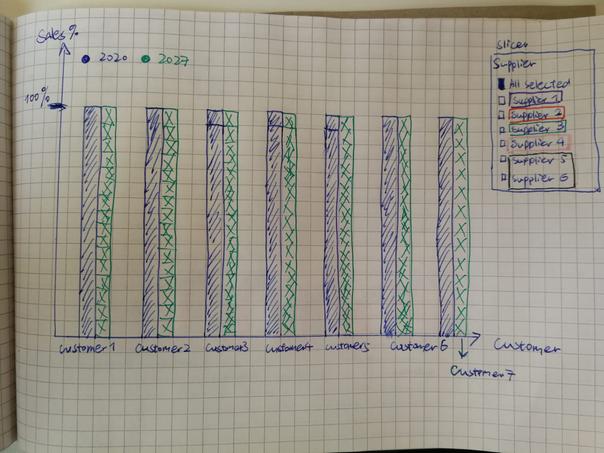
But the idea behind it is actually like below (each supplier has a share in 1 customer's business).
Then when I select 1 supplier (Supplier 4), the chart changes into:
So this final chart is the one I'm trying hard to get. Every time I select a supplier, it will show its share in different customers'business.
I shared my data tables are in the original quesiton and also in other reviews, hope you can find them and me further suggestions.
Thank you a lot!!! : )
Best,
- Mark as New
- Bookmark
- Subscribe
- Mute
- Subscribe to RSS Feed
- Permalink
- Report Inappropriate Content
HI @Anonymous ,
On your information there was not enough data to have more than one supplier by customer so I added a few rows of the same client but different supplier and values.
As you can see below the Customer TT has 3 values no the 100% stacked column (I made this chart for comparision) using the measure below you can see that the top chart calculates accordingly:
Sales % = SUM(Table1[Sales of Marker(mEUR)])/CALCULATE(SUM(Table1[Sales of Marker(mEUR)]);ALL(Table1[Supplier]))
The top chart is a bar chart with following format:
- X-Axis: Customer
- Values: %Sales
- Legend: Year
Once again I have made the calculation of relevant in the filter but can be added to your calculation measure.
If you want to have different colours according to selection of supplier you need to create a Measure to make the conditional formatting of the colour.
Regards
Miguel Félix
Did I answer your question? Mark my post as a solution!
Proud to be a Super User!
Check out my blog: Power BI em Português- Mark as New
- Bookmark
- Subscribe
- Mute
- Subscribe to RSS Feed
- Permalink
- Report Inappropriate Content
Hi Miguel!
Really thank you for your post!
It works!!!!
Then do you know if I still want to put the "Relevant=Yes" Filter inside the formula, what should I do?
THANK YOU!! : )
Best,
Gyarrr
- Mark as New
- Bookmark
- Subscribe
- Mute
- Subscribe to RSS Feed
- Permalink
- Report Inappropriate Content
Should be similar to this
Sales % =
CALCULATE(
SUM ( Table1[Sales of Marker(mEUR)] )
/ CALCULATE (
SUM ( Table1[Sales of Marker(mEUR)] );
ALL ( Table1[Customer]; Table1[Calendar Year] )
);
Table2[Relevant] = "yes")
Regards
Miguel Félix
Did I answer your question? Mark my post as a solution!
Proud to be a Super User!
Check out my blog: Power BI em Português- Mark as New
- Bookmark
- Subscribe
- Mute
- Subscribe to RSS Feed
- Permalink
- Report Inappropriate Content
@Anonymous
have you tried to see digits in table visual, not in chart?
- Mark as New
- Bookmark
- Subscribe
- Mute
- Subscribe to RSS Feed
- Permalink
- Report Inappropriate Content
Hi az38,
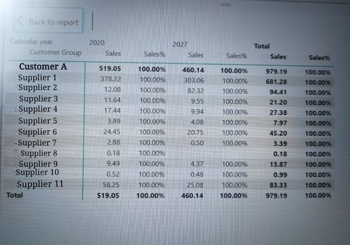
If I write like this and check the numbers in table visual, it shows as following.
Sales=caculate(sum('table'[sales of market(mEUR)],filter(table,table[relevant]="yes")
Sales%=Table1[Sales]/Calculate(Sum(Table1[Sales of Market (mEUR)], Filter(AllSelected(Table2), Table2[Relevant]="yes"))*100
Thank you for replying!
- Mark as New
- Bookmark
- Subscribe
- Mute
- Subscribe to RSS Feed
- Permalink
- Report Inappropriate Content
Click the little drop down arrow in the Fields area for the column/measure in question and then Show As and then Percent of Column Total.
@ me in replies or I'll lose your thread!!!
Instead of a Kudo, please vote for this idea
Become an expert!: Enterprise DNA
External Tools: MSHGQM
YouTube Channel!: Microsoft Hates Greg
Latest book!: The Definitive Guide to Power Query (M)
DAX is easy, CALCULATE makes DAX hard...
- Mark as New
- Bookmark
- Subscribe
- Mute
- Subscribe to RSS Feed
- Permalink
- Report Inappropriate Content
Hi, thank you for replying,
But there is only one "Percent of grand total". It's not correct either....
Helpful resources

Microsoft Fabric Learn Together
Covering the world! 9:00-10:30 AM Sydney, 4:00-5:30 PM CET (Paris/Berlin), 7:00-8:30 PM Mexico City

Power BI Monthly Update - April 2024
Check out the April 2024 Power BI update to learn about new features.

| User | Count |
|---|---|
| 43 | |
| 23 | |
| 21 | |
| 15 | |
| 15 |
| User | Count |
|---|---|
| 45 | |
| 31 | |
| 30 | |
| 18 | |
| 17 |
