- Power BI forums
- Updates
- News & Announcements
- Get Help with Power BI
- Desktop
- Service
- Report Server
- Power Query
- Mobile Apps
- Developer
- DAX Commands and Tips
- Custom Visuals Development Discussion
- Health and Life Sciences
- Power BI Spanish forums
- Translated Spanish Desktop
- Power Platform Integration - Better Together!
- Power Platform Integrations (Read-only)
- Power Platform and Dynamics 365 Integrations (Read-only)
- Training and Consulting
- Instructor Led Training
- Dashboard in a Day for Women, by Women
- Galleries
- Community Connections & How-To Videos
- COVID-19 Data Stories Gallery
- Themes Gallery
- Data Stories Gallery
- R Script Showcase
- Webinars and Video Gallery
- Quick Measures Gallery
- 2021 MSBizAppsSummit Gallery
- 2020 MSBizAppsSummit Gallery
- 2019 MSBizAppsSummit Gallery
- Events
- Ideas
- Custom Visuals Ideas
- Issues
- Issues
- Events
- Upcoming Events
- Community Blog
- Power BI Community Blog
- Custom Visuals Community Blog
- Community Support
- Community Accounts & Registration
- Using the Community
- Community Feedback
Register now to learn Fabric in free live sessions led by the best Microsoft experts. From Apr 16 to May 9, in English and Spanish.
- Power BI forums
- Forums
- Get Help with Power BI
- DAX Commands and Tips
- Re: DAX Measure as Visual Filter to Limit Sparklin...
- Subscribe to RSS Feed
- Mark Topic as New
- Mark Topic as Read
- Float this Topic for Current User
- Bookmark
- Subscribe
- Printer Friendly Page
- Mark as New
- Bookmark
- Subscribe
- Mute
- Subscribe to RSS Feed
- Permalink
- Report Inappropriate Content
DAX Measure as Visual Filter to Limit Sparkline
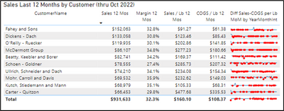
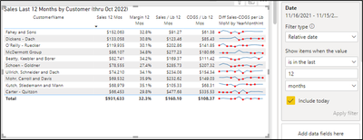
I have a table in my report that calculates trailing 12 months sales, margin, price/lb, and cost/lb. The DAX for these measures is all very similar and I have included one of the measures below, for reference. My goal is to add a sparkline to the table that shows the last 12 months of changes in price/lb minus cost/lb month-over-month; however, when I add the sparkline it shows ALL of the months of data (see first image). This makes the sparkline difficult to view and takes some time to update. The second image is close to what I desire the sparkline to look like, only showing the last 12 months, except that the 12-month timeframe needs to be dynamic based on the max date from the date slider selection.
My first thought was a disconnected date table, but I am unsure how that would work if the date slider also needs to affect other visuals that don’t use the disconnected date table.
My next thought was a DAX measure that returns 1 or 0 if dates are in the desired 12-month timeframe and then set that as a visual level filter for the table.
I have tried many different approaches to both of these the last three weeks with no luck.
I have included a link to a sample pbix file. Any help would be greatly appreciated!
Sales Trailing 12 Mos =
CALCULATE(
[Sales],
DATESINPERIOD(
'Date Table'[Date], ENDOFMONTH('Date Table'[Date]), -12, MONTH
)
)
Image showing issue:
Image showing close to desired:
Sample pbix file:
https://www.dropbox.com/s/ilqw6bvd881dorv/sample%20power%20bi%20file.pbix?dl=0
- Mark as New
- Bookmark
- Subscribe
- Mute
- Subscribe to RSS Feed
- Permalink
- Report Inappropriate Content
Hi @ksoukup ,
I think you have found a solution.
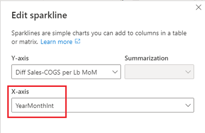
The X-axis of sparkline is from 2018 to 2022, so the measure you created will filter all the months.
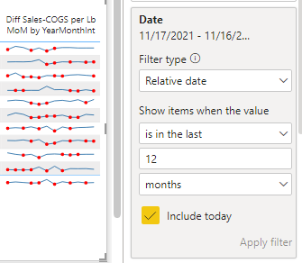
The solution you found is to add date to filter pane. I think this is a wonderful workaround.
Best regards,
Yadong Fang
If this post helps, then please consider Accept it as the solution to help the other members find it more quickly.
- Mark as New
- Bookmark
- Subscribe
- Mute
- Subscribe to RSS Feed
- Permalink
- Report Inappropriate Content
Hi @v-yadongf-msft,
Thank you for taking the time to review. Adding the last 12 months as a visual level filter returns me the desired look (sparkline with shorter timeframe), but this method is not dynamic. If the user changes the end date of the date slider to an earlier date, the visual will not adjust.
Best Regards,
ksoukup
Helpful resources

Microsoft Fabric Learn Together
Covering the world! 9:00-10:30 AM Sydney, 4:00-5:30 PM CET (Paris/Berlin), 7:00-8:30 PM Mexico City

Power BI Monthly Update - April 2024
Check out the April 2024 Power BI update to learn about new features.

| User | Count |
|---|---|
| 49 | |
| 25 | |
| 20 | |
| 15 | |
| 12 |
| User | Count |
|---|---|
| 57 | |
| 49 | |
| 44 | |
| 19 | |
| 18 |


