- Power BI forums
- Updates
- News & Announcements
- Get Help with Power BI
- Desktop
- Service
- Report Server
- Power Query
- Mobile Apps
- Developer
- DAX Commands and Tips
- Custom Visuals Development Discussion
- Health and Life Sciences
- Power BI Spanish forums
- Translated Spanish Desktop
- Power Platform Integration - Better Together!
- Power Platform Integrations (Read-only)
- Power Platform and Dynamics 365 Integrations (Read-only)
- Training and Consulting
- Instructor Led Training
- Dashboard in a Day for Women, by Women
- Galleries
- Community Connections & How-To Videos
- COVID-19 Data Stories Gallery
- Themes Gallery
- Data Stories Gallery
- R Script Showcase
- Webinars and Video Gallery
- Quick Measures Gallery
- 2021 MSBizAppsSummit Gallery
- 2020 MSBizAppsSummit Gallery
- 2019 MSBizAppsSummit Gallery
- Events
- Ideas
- Custom Visuals Ideas
- Issues
- Issues
- Events
- Upcoming Events
- Community Blog
- Power BI Community Blog
- Custom Visuals Community Blog
- Community Support
- Community Accounts & Registration
- Using the Community
- Community Feedback
Register now to learn Fabric in free live sessions led by the best Microsoft experts. From Apr 16 to May 9, in English and Spanish.
- Power BI forums
- Forums
- Get Help with Power BI
- DAX Commands and Tips
- Re: Creating Line Chart in Power BI comparing Prio...
- Subscribe to RSS Feed
- Mark Topic as New
- Mark Topic as Read
- Float this Topic for Current User
- Bookmark
- Subscribe
- Printer Friendly Page
- Mark as New
- Bookmark
- Subscribe
- Mute
- Subscribe to RSS Feed
- Permalink
- Report Inappropriate Content
Creating Line Chart in Power BI comparing Prior Year vs. Current Year by day
Good Day All
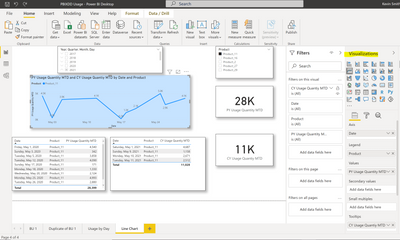
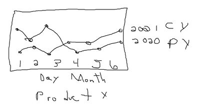
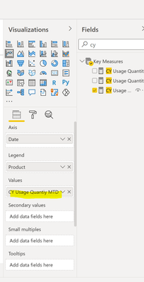
I'm trying to create a line chart in PBI that shows PY vs. CY usage for a product by day of the month on the same line chart. Screen Shots below
Thank you in advance for your time.
Solved! Go to Solution.
- Mark as New
- Bookmark
- Subscribe
- Mute
- Subscribe to RSS Feed
- Permalink
- Report Inappropriate Content
Hi Hasham
You are the man! Can believe we accomplished this via screen shost. In the future, can I send a demo PBIX. to make thing easier? If so, how would I go about it? I know I can use Dropbox or Google Drive, but not clear on every step to get it done.
Much appreciate you help today.
Thank you
- Mark as New
- Bookmark
- Subscribe
- Mute
- Subscribe to RSS Feed
- Permalink
- Report Inappropriate Content
Hi Hasham
I'm I missing something per your instructions. How can I send you my PBIX. Demo Data?
- Mark as New
- Bookmark
- Subscribe
- Mute
- Subscribe to RSS Feed
- Permalink
- Report Inappropriate Content
Hi @PBI-Curious !
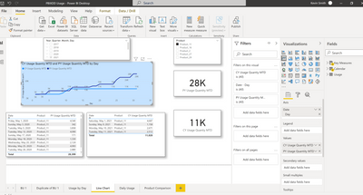
You are almost there, now in your axis date has 4 element, Year, Quarter, Month & Day. Remove (Just click in [x] icon next to) Year, Quarter & Month, you will be left with Day element. This will let you analyze the CY vs PY sales at day level.
Regards,
Hasham
- Mark as New
- Bookmark
- Subscribe
- Mute
- Subscribe to RSS Feed
- Permalink
- Report Inappropriate Content
Hasham
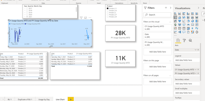
Moving Product out allowed me to add in PY MTD and CY MTD in the value section. Here is the output
- Mark as New
- Bookmark
- Subscribe
- Mute
- Subscribe to RSS Feed
- Permalink
- Report Inappropriate Content
Hi @PBI-Curious !
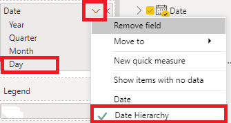
Now you can try to put only Day element from Date hierarchy as shown in earlier image. You can have Year & Month available as slicer value.
Regards,
Hasham
- Mark as New
- Bookmark
- Subscribe
- Mute
- Subscribe to RSS Feed
- Permalink
- Report Inappropriate Content
Hi Hasham
Initially moving CY MTD to the visual that's where it landed in the Tooltips sectioin. Moving CY MTD to Values replaced PY MTD. Do you have any other suggestions?
Much appreciate your help!
- Mark as New
- Bookmark
- Subscribe
- Mute
- Subscribe to RSS Feed
- Permalink
- Report Inappropriate Content
Hi @PBI-Curious !
You can move Prodcut out of [Legend] to be able to compare, 2 or more KPI's in Line Chart. You can look for matrix or other visuals which will alow you to plot multiple values against category & axis.
Regards,
Hasham
- Mark as New
- Bookmark
- Subscribe
- Mute
- Subscribe to RSS Feed
- Permalink
- Report Inappropriate Content
Hi @PBI-Curious !
Currently you have placed your CY measure in tooltip, kindly move it to values section for Line chart, so both PY & CY measure lines can be plotted next to each other. For Date to show as Day number please click on down arrow next to Date in Line Chart & change it from Date to Date Hirarchy and select Day as element. See the image below;
Regards,
Hasham
Helpful resources

Microsoft Fabric Learn Together
Covering the world! 9:00-10:30 AM Sydney, 4:00-5:30 PM CET (Paris/Berlin), 7:00-8:30 PM Mexico City

Power BI Monthly Update - April 2024
Check out the April 2024 Power BI update to learn about new features.

| User | Count |
|---|---|
| 47 | |
| 26 | |
| 19 | |
| 14 | |
| 10 |
| User | Count |
|---|---|
| 58 | |
| 50 | |
| 44 | |
| 19 | |
| 18 |
