- Power BI forums
- Updates
- News & Announcements
- Get Help with Power BI
- Desktop
- Service
- Report Server
- Power Query
- Mobile Apps
- Developer
- DAX Commands and Tips
- Custom Visuals Development Discussion
- Health and Life Sciences
- Power BI Spanish forums
- Translated Spanish Desktop
- Power Platform Integration - Better Together!
- Power Platform Integrations (Read-only)
- Power Platform and Dynamics 365 Integrations (Read-only)
- Training and Consulting
- Instructor Led Training
- Dashboard in a Day for Women, by Women
- Galleries
- Community Connections & How-To Videos
- COVID-19 Data Stories Gallery
- Themes Gallery
- Data Stories Gallery
- R Script Showcase
- Webinars and Video Gallery
- Quick Measures Gallery
- 2021 MSBizAppsSummit Gallery
- 2020 MSBizAppsSummit Gallery
- 2019 MSBizAppsSummit Gallery
- Events
- Ideas
- Custom Visuals Ideas
- Issues
- Issues
- Events
- Upcoming Events
- Community Blog
- Power BI Community Blog
- Custom Visuals Community Blog
- Community Support
- Community Accounts & Registration
- Using the Community
- Community Feedback
Register now to learn Fabric in free live sessions led by the best Microsoft experts. From Apr 16 to May 9, in English and Spanish.
- Power BI forums
- Forums
- Get Help with Power BI
- DAX Commands and Tips
- Re: Conditionally format YEARLY MAX and MIN values...
- Subscribe to RSS Feed
- Mark Topic as New
- Mark Topic as Read
- Float this Topic for Current User
- Bookmark
- Subscribe
- Printer Friendly Page
- Mark as New
- Bookmark
- Subscribe
- Mute
- Subscribe to RSS Feed
- Permalink
- Report Inappropriate Content
Conditionally format YEARLY MAX and MIN values in line chart / column chart
Hello everyone,
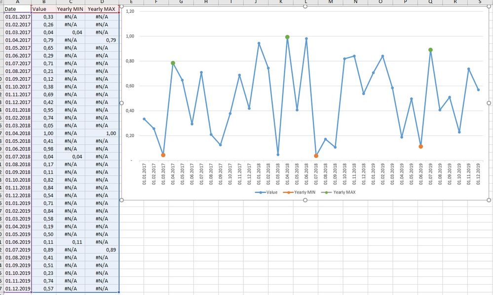
Please help to write a measure that calculates yearly MAX and yearly MIN values so that I can use this measure to conditionally format points on the line chart or columns on the bar chart. Here is a simple example done in Excel. I want to achieve the same result in Power BI.
| Date | Value |
| 01.01.2017 | 0,33 |
| 01.02.2017 | 0,26 |
| 01.03.2017 | 0,04 |
| 01.04.2017 | 0,79 |
| 01.05.2017 | 0,65 |
| 01.06.2017 | 0,29 |
| 01.07.2017 | 0,71 |
| 01.08.2017 | 0,21 |
| 01.09.2017 | 0,12 |
| 01.10.2017 | 0,38 |
| 01.11.2017 | 0,69 |
| 01.12.2017 | 0,42 |
| 01.01.2018 | 0,95 |
| 01.02.2018 | 0,74 |
| 01.03.2018 | 0,05 |
| 01.04.2018 | 1,00 |
| 01.05.2018 | 0,41 |
| 01.06.2018 | 0,98 |
| 01.07.2018 | 0,04 |
| 01.08.2018 | 0,17 |
| 01.09.2018 | 0,11 |
| 01.10.2018 | 0,82 |
| 01.11.2018 | 0,84 |
| 01.12.2018 | 0,54 |
| 01.01.2019 | 0,71 |
| 01.02.2019 | 0,84 |
| 01.03.2019 | 0,58 |
| 01.04.2019 | 0,19 |
| 01.05.2019 | 0,50 |
| 01.06.2019 | 0,11 |
| 01.07.2019 | 0,89 |
| 01.08.2019 | 0,41 |
| 01.09.2019 | 0,51 |
| 01.10.2019 | 0,23 |
| 01.11.2019 | 0,74 |
| 01.12.2019 | 0,57 |
Thank you for attention to my post.
- Mark as New
- Bookmark
- Subscribe
- Mute
- Subscribe to RSS Feed
- Permalink
- Report Inappropriate Content
Hello to whoever is looking through this thread.
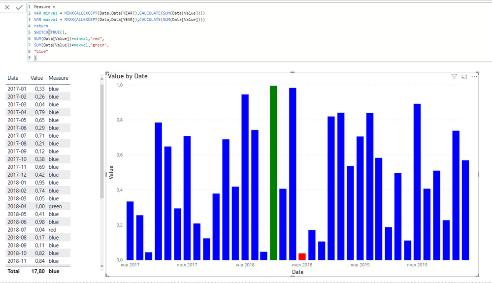
So far, I have only managed to highlight MIN and MAX for ENTIRE range of dates, however, this is not what I need. I still hope someone helps me out to write a measure to highlight yearly/annual MAX and MIN value.
- Mark as New
- Bookmark
- Subscribe
- Mute
- Subscribe to RSS Feed
- Permalink
- Report Inappropriate Content
@Anonymous , Create a bar visual and use a measure like give below in data color (advance option) with field value option (conditional formatting)
measure =
var _min = minx(values(Date[Date]),[Value])
var _max = minx(values(Date[Date]),[Value])
return
Switch(true() ,
[Value] = _min , "red",
[Value] = _max , "green",
"blue"
)
And then convert to like with marker.
steps: https://radacad.com/dax-and-conditional-formatting-better-together-find-the-biggest-and-smallest-numbers-in-the-column
https://docs.microsoft.com/en-us/power-bi/desktop-conditional-table-formatting#color-by-color-values
Microsoft Power BI Learning Resources, 2023 !!
Learn Power BI - Full Course with Dec-2022, with Window, Index, Offset, 100+ Topics !!
Did I answer your question? Mark my post as a solution! Appreciate your Kudos !! Proud to be a Super User! !!
- Mark as New
- Bookmark
- Subscribe
- Mute
- Subscribe to RSS Feed
- Permalink
- Report Inappropriate Content
Thanks for response, but it just highlighted everythin in red. Any other ideas?
- Mark as New
- Bookmark
- Subscribe
- Mute
- Subscribe to RSS Feed
- Permalink
- Report Inappropriate Content
@Anonymous , put a calculate on top of sum in first two var and try
measure =
var _min = minx(values(Date[Date]),calculate(sum(Table[Value])))
var _max = minx(values(Date[Date]),calculate(sum(Table[Value])))
return
Switch(true() ,
[Value] = _min , "red",
[Value] = _max , "green",
"blue"
)
Microsoft Power BI Learning Resources, 2023 !!
Learn Power BI - Full Course with Dec-2022, with Window, Index, Offset, 100+ Topics !!
Did I answer your question? Mark my post as a solution! Appreciate your Kudos !! Proud to be a Super User! !!
- Mark as New
- Bookmark
- Subscribe
- Mute
- Subscribe to RSS Feed
- Permalink
- Report Inappropriate Content
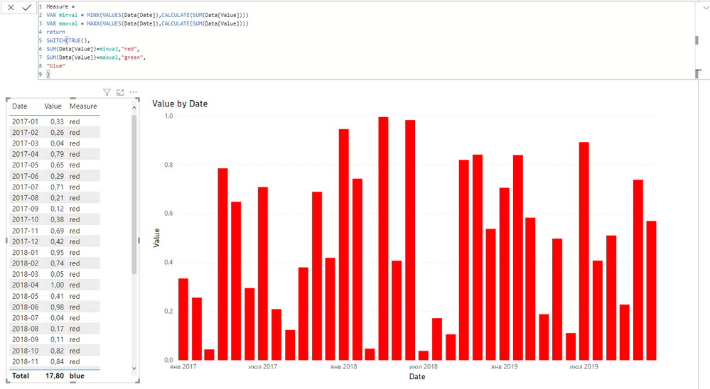
@amitchandak , unfortunately, it still shows the same result. Looks like this measure does not go beyond MIN. Any other ideas? Thank you for help.
Helpful resources

Microsoft Fabric Learn Together
Covering the world! 9:00-10:30 AM Sydney, 4:00-5:30 PM CET (Paris/Berlin), 7:00-8:30 PM Mexico City

Power BI Monthly Update - April 2024
Check out the April 2024 Power BI update to learn about new features.

| User | Count |
|---|---|
| 47 | |
| 23 | |
| 20 | |
| 15 | |
| 13 |
| User | Count |
|---|---|
| 51 | |
| 42 | |
| 39 | |
| 19 | |
| 19 |


