- Power BI forums
- Updates
- News & Announcements
- Get Help with Power BI
- Desktop
- Service
- Report Server
- Power Query
- Mobile Apps
- Developer
- DAX Commands and Tips
- Custom Visuals Development Discussion
- Health and Life Sciences
- Power BI Spanish forums
- Translated Spanish Desktop
- Power Platform Integration - Better Together!
- Power Platform Integrations (Read-only)
- Power Platform and Dynamics 365 Integrations (Read-only)
- Training and Consulting
- Instructor Led Training
- Dashboard in a Day for Women, by Women
- Galleries
- Community Connections & How-To Videos
- COVID-19 Data Stories Gallery
- Themes Gallery
- Data Stories Gallery
- R Script Showcase
- Webinars and Video Gallery
- Quick Measures Gallery
- 2021 MSBizAppsSummit Gallery
- 2020 MSBizAppsSummit Gallery
- 2019 MSBizAppsSummit Gallery
- Events
- Ideas
- Custom Visuals Ideas
- Issues
- Issues
- Events
- Upcoming Events
- Community Blog
- Power BI Community Blog
- Custom Visuals Community Blog
- Community Support
- Community Accounts & Registration
- Using the Community
- Community Feedback
Register now to learn Fabric in free live sessions led by the best Microsoft experts. From Apr 16 to May 9, in English and Spanish.
- Power BI forums
- Forums
- Get Help with Power BI
- DAX Commands and Tips
- Comparing multi selected averages with total avera...
- Subscribe to RSS Feed
- Mark Topic as New
- Mark Topic as Read
- Float this Topic for Current User
- Bookmark
- Subscribe
- Printer Friendly Page
- Mark as New
- Bookmark
- Subscribe
- Mute
- Subscribe to RSS Feed
- Permalink
- Report Inappropriate Content
Comparing multi selected averages with total average on a line graph
Hello All,
Another newbie to Power BI and struggling with a problem....
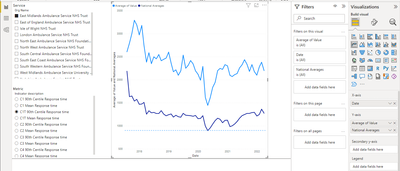
I am trying to compare NHS services against each other and against a national average (calculated via a measure, 'National Averages'), by a particular metric. However the moment a second service within my slicer, the two are aggregated into a single line.
However the moment a second service within my slicer, the two are aggregated into a single line, alongside the national average, when I'd like a third line instead.
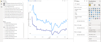
I have tried adding the service name to the legend however then I cannot add my 'National Averages' to the Y-axis.
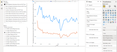
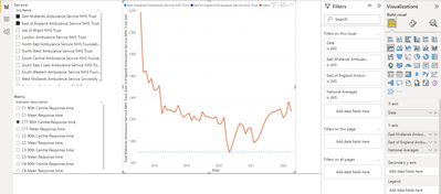
I have also tried and failed to solve the problem using the SWITCH function, based on this post and solution, creating separate measures each service but again, once I make a second selection the result aggregates the results into a single line, including the national average, when again, I want 3 lines or more if I choose additional services.
Can anyone advise where my approaches are going wrong/an alternative approach?
Hope this clear! If not please do not hesitate to ask!
- Mark as New
- Bookmark
- Subscribe
- Mute
- Subscribe to RSS Feed
- Permalink
- Report Inappropriate Content
Hi agian brownrice
Just to be clear ... I dont work for Microsoft .. I am an unpaid volunteer helping you for kudos.
I cant change how Power BI works. I can meerly advise you on the options.
I've anserwed your question and explained what can and cant be done.
So please click the thumbs up and accept as solution buttons. Thank you ! 😎
- Mark as New
- Bookmark
- Subscribe
- Mute
- Subscribe to RSS Feed
- Permalink
- Report Inappropriate Content
Thanks for the clarifying "Just in case there is any confusion, I would like to be able to select multiple services as shown below but also have an additonal national average line on at all times regardless of whether I have selected 1 or 5 services."
I don't know how I can make it any clearer.....
If you slice 3 regions then your average will be based on just those 3 regions unless you use REMOVEFILTERS to calculate the National avearge.
You can draw multiple regions on a line graph ok because they each have a distinct legend, but the National average does not.
Consider using a Line and Cluster Column Chart,
which is is better visual for compare regions to a national average.
If must insist on having a line graph to show regions and national then you can use this trick ...
duplicate the input file and change the region column values to "National" and append it to your table.
Voila! You can now compare North and South with National.
But just make sure no one runs a grand total .... because it would double the amount !
Understand ???
- Mark as New
- Bookmark
- Subscribe
- Mute
- Subscribe to RSS Feed
- Permalink
- Report Inappropriate Content
Hello speedramps,
Following your reply, it looks like I did understand your comment re. REMOVEFILTERS first time around, however it neither makes a difference to the outcome of my 'National Average' measure nor resolves my ultimate issue.
Appreciate your recommendation of the clustered column and line chart but, in my opinion, doesn't look very good.
Also, I too have considered appending the aggregated data to the table but, as I think you would agree, this wouldn't be best practice. Perhaps this is a sacrifice I may have to live with.
- Mark as New
- Bookmark
- Subscribe
- Mute
- Subscribe to RSS Feed
- Permalink
- Report Inappropriate Content
Hi again brownrice
What are you trying to do? Please give example with input data (as tables not screen prints so we can importat them and build solutions) and an example if the desired output with clearer description. We can best help you if we understand what you need. 😀😀😀
I think you are trying to compare regions (eg North, South, East and West) peformance with each other and a National average. But you want to pick and choose which regions to compare. For example just North and South and hide East and West but hshow the National average.
If you use a slicer then you need to use REMOVEFILTER rather than ALL to calculate the national average.
A line graph will compare the regions in the Legend, but you cant drag the National average metric.
Hence I advise you to consider using a Line and Cluster Column Chart.
See this example
Click here to download example
I have helped you, now please help me by giving kudos.
Click the thumbs up and accept as solution button. Thanks
- Mark as New
- Bookmark
- Subscribe
- Mute
- Subscribe to RSS Feed
- Permalink
- Report Inappropriate Content
Hello speedramps,
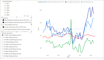
Ultimately I would like something like the below where the red line (drawn on by me) is the national average and remains on the chart for comparison whether I have 1, 2, 3 or more services selected.
Report here - > https://1drv.ms/u/s!AodvXZif-fFgcHQV3_DSKJKEmYM?e=p3hhRf
- Mark as New
- Bookmark
- Subscribe
- Mute
- Subscribe to RSS Feed
- Permalink
- Report Inappropriate Content
Hi agan brownrice
Thanks for clarifying "Ultimately I would like something like the below where the red line (drawn on by me) is the national average and remains on the chart for comparison whether I have 1, 2, 3 or more services selected."
As previously explained (several times now) you can only do that be duplicating the data as "National".
Each line represents a legend North, South, East, West but you cant drag a National average metric because it does not have a legend.
If you can duplicate the data as "National" then it will have a legend and you can draw it and compare it with North, South, East, West.
Please click the thumbs up and accept as solution button. Thanks
- Mark as New
- Bookmark
- Subscribe
- Mute
- Subscribe to RSS Feed
- Permalink
- Report Inappropriate Content
Hello speedramps,
I had already acknowledged that duplicating the data was a possibility therefore I don't think the condescending attitude (which you have shown throughout) is really necessary.
Thank you for your responses.
- Mark as New
- Bookmark
- Subscribe
- Mute
- Subscribe to RSS Feed
- Permalink
- Report Inappropriate Content
Hi brownrice
You appear to be are using a region slicer.
A slicer does what it says and slices the data !!!
So if you slice North and South then ALL will be just based on those 2 regions.
You need to use REMOVEFILTERS to override the slicers.
Also consider using a Line and Cluster Column Chart,
which is is better visual for compare regions to a national average.
See this example
Click here to download example
I have helped you, now please help me by giving kudos.
Click the thumbs up and accept as solution button.
One question per ticket please. If you need to extend your request then please raise a new ticket.
You will get a quicker response and each solver will get the kudos they deserve. Thank you !
- Mark as New
- Bookmark
- Subscribe
- Mute
- Subscribe to RSS Feed
- Permalink
- Report Inappropriate Content
Hello speedramps,
Appreciate the response however, unless I am mistaken, I don't think it solves the issue. I assume firstly you are recommending I replace the ALL in my 'National Averages' measure with REMOVEFILTERS, I have done this but am unsure if this gets me closer to my goal. Unless it needs to go elsewhere?
I am aware I could use a line and clustered column chart however my preferance would be a line chart if I can achieve it.
Just in case there is any confusion, I would like to be able to select multiple services as shown below but also have an additonal national average line on at all times regardless of whether I have selected 1 or 5 services.
Helpful resources

Microsoft Fabric Learn Together
Covering the world! 9:00-10:30 AM Sydney, 4:00-5:30 PM CET (Paris/Berlin), 7:00-8:30 PM Mexico City

Power BI Monthly Update - April 2024
Check out the April 2024 Power BI update to learn about new features.

| User | Count |
|---|---|
| 49 | |
| 26 | |
| 21 | |
| 15 | |
| 12 |
| User | Count |
|---|---|
| 57 | |
| 49 | |
| 44 | |
| 19 | |
| 18 |
