- Power BI forums
- Updates
- News & Announcements
- Get Help with Power BI
- Desktop
- Service
- Report Server
- Power Query
- Mobile Apps
- Developer
- DAX Commands and Tips
- Custom Visuals Development Discussion
- Health and Life Sciences
- Power BI Spanish forums
- Translated Spanish Desktop
- Power Platform Integration - Better Together!
- Power Platform Integrations (Read-only)
- Power Platform and Dynamics 365 Integrations (Read-only)
- Training and Consulting
- Instructor Led Training
- Dashboard in a Day for Women, by Women
- Galleries
- Community Connections & How-To Videos
- COVID-19 Data Stories Gallery
- Themes Gallery
- Data Stories Gallery
- R Script Showcase
- Webinars and Video Gallery
- Quick Measures Gallery
- 2021 MSBizAppsSummit Gallery
- 2020 MSBizAppsSummit Gallery
- 2019 MSBizAppsSummit Gallery
- Events
- Ideas
- Custom Visuals Ideas
- Issues
- Issues
- Events
- Upcoming Events
- Community Blog
- Power BI Community Blog
- Custom Visuals Community Blog
- Community Support
- Community Accounts & Registration
- Using the Community
- Community Feedback
Register now to learn Fabric in free live sessions led by the best Microsoft experts. From Apr 16 to May 9, in English and Spanish.
- Subscribe to RSS Feed
- Mark Topic as New
- Mark Topic as Read
- Float this Topic for Current User
- Bookmark
- Subscribe
- Printer Friendly Page
- Mark as New
- Bookmark
- Subscribe
- Mute
- Subscribe to RSS Feed
- Permalink
- Report Inappropriate Content
Burndown
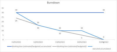
Hey! How to Create a Scrum Sprint Tracking Chart My team has an existing report in Excel that I'm trying to revamp in Power BI that uses a burndown chart. Thanks in advance for any help- Sprint total de 5 dias
- horas orçadas
- horas de corrida
- Mark as New
- Bookmark
- Subscribe
- Mute
- Subscribe to RSS Feed
- Permalink
- Report Inappropriate Content
Hi @KellSilveira ,
You have three values in your screenshot but only one working time column in your table.
Can you describe how these three values are obtained?
Best Regards,
Jay
If this post helps, then please consider Accept it as the solution to help the other members find it.
- Mark as New
- Bookmark
- Subscribe
- Mute
- Subscribe to RSS Feed
- Permalink
- Report Inappropriate Content
Hi @v-jayw-msft ,
Follow the rationale in Excel (I need to reproduce this chart in Power BI). https://1drv.ms/x/s!Aj3tDf4ersZ_pGSZpmE5rxTUHkww?e=Pd3X58
Graphic
On the vertical axis, the sum of budgeted hours needed to carry out the activities of the current iteration (eg, sprint 22.23) and, on the horizontal axis, the work days of the iteration.
This graph is represented in two lines. The first is the ideal line (budgeted hours), straight, from top to bottom, representing the complete demand for work at the beginning of the project (top left) and going to the lowest point on the right, where the forecast completion of the sprint on the schedule.
The second is the actual line (in my case, hours executed), which reveals how the team behaved in relation to the projection of time usage for demand during the sprint selected in the segmentation.
In the pbix file the Task Creation Date, Column (Task Created At) and Completion (Task Due At)
- Mark as New
- Bookmark
- Subscribe
- Mute
- Subscribe to RSS Feed
- Permalink
- Report Inappropriate Content
Hi
Complementing
Graphic
On the vertical axis, the sum of budgeted hours needed to carry out the activities of the current iteration (eg, sprint 22.23) and, on the horizontal axis, the work days of the iteration.
This graph is represented in two lines. The first is the ideal line (budgeted hours), straight, from top to bottom, representing the complete demand for work at the beginning of the project (top left) and going to the lowest point on the right, where the forecast completion of the sprint on the schedule.
The second is the actual line (in my case, hours executed), which reveals how the team behaved in relation to the projection of time usage for demand during the sprint selected in the segmentation.
Helpful resources

Microsoft Fabric Learn Together
Covering the world! 9:00-10:30 AM Sydney, 4:00-5:30 PM CET (Paris/Berlin), 7:00-8:30 PM Mexico City

Power BI Monthly Update - April 2024
Check out the April 2024 Power BI update to learn about new features.

| User | Count |
|---|---|
| 47 | |
| 24 | |
| 20 | |
| 15 | |
| 13 |
| User | Count |
|---|---|
| 55 | |
| 48 | |
| 43 | |
| 19 | |
| 19 |


