- Power BI forums
- Updates
- News & Announcements
- Get Help with Power BI
- Desktop
- Service
- Report Server
- Power Query
- Mobile Apps
- Developer
- DAX Commands and Tips
- Custom Visuals Development Discussion
- Health and Life Sciences
- Power BI Spanish forums
- Translated Spanish Desktop
- Power Platform Integration - Better Together!
- Power Platform Integrations (Read-only)
- Power Platform and Dynamics 365 Integrations (Read-only)
- Training and Consulting
- Instructor Led Training
- Dashboard in a Day for Women, by Women
- Galleries
- Community Connections & How-To Videos
- COVID-19 Data Stories Gallery
- Themes Gallery
- Data Stories Gallery
- R Script Showcase
- Webinars and Video Gallery
- Quick Measures Gallery
- 2021 MSBizAppsSummit Gallery
- 2020 MSBizAppsSummit Gallery
- 2019 MSBizAppsSummit Gallery
- Events
- Ideas
- Custom Visuals Ideas
- Issues
- Issues
- Events
- Upcoming Events
- Community Blog
- Power BI Community Blog
- Custom Visuals Community Blog
- Community Support
- Community Accounts & Registration
- Using the Community
- Community Feedback
Register now to learn Fabric in free live sessions led by the best Microsoft experts. From Apr 16 to May 9, in English and Spanish.
- Power BI forums
- Forums
- Get Help with Power BI
- Custom Visuals Development Discussion
- Waterfall chart to visualize number of open and cl...
- Subscribe to RSS Feed
- Mark Topic as New
- Mark Topic as Read
- Float this Topic for Current User
- Bookmark
- Subscribe
- Printer Friendly Page
- Mark as New
- Bookmark
- Subscribe
- Mute
- Subscribe to RSS Feed
- Permalink
- Report Inappropriate Content
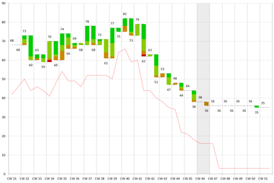
Waterfall chart to visualize number of open and closed items in each calendar week
Hello,
I am trying to build a waterfall chart with calendar wek on X axis and number of items on Y axis. I wan to visualize number of open iems and closed items in each week. Sample data:
Expected result:
- Mark as New
- Bookmark
- Subscribe
- Mute
- Subscribe to RSS Feed
- Permalink
- Report Inappropriate Content
To calculate the number of currently active pharmacies in a given year (based on the slicer), we are going to create two measures that will denote whether or not the pharmacy was opened prior or during to the selected year(s) (by giving a value of 1) and/or closed prior to or during the selected years (giving a value of -1)
IsOpen =
IF (
    CALCULATE ( MINX ( pharmacy, pharmacy[openDate] ) ) <= LASTDATE ( 'Date'[Date] ),
    1,
    0
)
IsClosed =
VAR minDate =
    CALCULATE ( MINX ( pharmacy, pharmacy[closedate] ) )
RETURN
    IF (
        AND ( minDate <= LASTDATE ( 'Date'[Date] ), NOT ( ISBLANK ( minDate ) ) ),
        -1,
        0
    )
Finally, the number of current active pharmacies is simply the sum of IsOpen and IsClosed
Pharmacy Active =
CALCULATE ( SUMX ( pharmacy, [IsOpen] ) + SUMX ( pharmacy, [IsClosed] ) )
And the number of active pharmacies in the year prior to the minimum selected year
Pharmacy Active LY =
VAR minSelYear =
    YEAR ( CALCULATE ( MIN ( 'Date'[Date] ), ALLSELECTED ( 'Date'[Year] ) ) )
VAR PAMinSel =
    CALCULATE ( [Pharmacy Active], 'Date'[Year] = minSelYear - 1 )
RETURN
    IF ( ISBLANK ( PAMinSel ), 0, PAMinSel )
- Mark as New
- Bookmark
- Subscribe
- Mute
- Subscribe to RSS Feed
- Permalink
- Report Inappropriate Content
This is how I want the waterfall chart to look like
- Mark as New
- Bookmark
- Subscribe
- Mute
- Subscribe to RSS Feed
- Permalink
- Report Inappropriate Content
Hello,
You can use d3 and combine waterfall chart with the line, using different layers.
For waterfall I found this example that looks exactly what you look for.
Kind Regards,
Evgenii Elkin,
Software Engineer
Microsoft Power BI Custom Visuals
pbicvsupport@microsoft.com
- Mark as New
- Bookmark
- Subscribe
- Mute
- Subscribe to RSS Feed
- Permalink
- Report Inappropriate Content
Hello,
Thanks for sharing. But it is difficult to interpret and understand the code. Do you suggest any other simpler way to understand it?
Helpful resources

Microsoft Fabric Learn Together
Covering the world! 9:00-10:30 AM Sydney, 4:00-5:30 PM CET (Paris/Berlin), 7:00-8:30 PM Mexico City

Power BI Monthly Update - April 2024
Check out the April 2024 Power BI update to learn about new features.


