- Power BI forums
- Updates
- News & Announcements
- Get Help with Power BI
- Desktop
- Service
- Report Server
- Power Query
- Mobile Apps
- Developer
- DAX Commands and Tips
- Custom Visuals Development Discussion
- Health and Life Sciences
- Power BI Spanish forums
- Translated Spanish Desktop
- Power Platform Integration - Better Together!
- Power Platform Integrations (Read-only)
- Power Platform and Dynamics 365 Integrations (Read-only)
- Training and Consulting
- Instructor Led Training
- Dashboard in a Day for Women, by Women
- Galleries
- Community Connections & How-To Videos
- COVID-19 Data Stories Gallery
- Themes Gallery
- Data Stories Gallery
- R Script Showcase
- Webinars and Video Gallery
- Quick Measures Gallery
- 2021 MSBizAppsSummit Gallery
- 2020 MSBizAppsSummit Gallery
- 2019 MSBizAppsSummit Gallery
- Events
- Ideas
- Custom Visuals Ideas
- Issues
- Issues
- Events
- Upcoming Events
- Community Blog
- Power BI Community Blog
- Custom Visuals Community Blog
- Community Support
- Community Accounts & Registration
- Using the Community
- Community Feedback
Register now to learn Fabric in free live sessions led by the best Microsoft experts. From Apr 16 to May 9, in English and Spanish.
- Power BI forums
- Forums
- Get Help with Power BI
- Custom Visuals Development Discussion
- Re: Visual Issue (Combination Whole Number/Percent...
- Subscribe to RSS Feed
- Mark Topic as New
- Mark Topic as Read
- Float this Topic for Current User
- Bookmark
- Subscribe
- Printer Friendly Page
- Mark as New
- Bookmark
- Subscribe
- Mute
- Subscribe to RSS Feed
- Permalink
- Report Inappropriate Content
Visual Issue (Combination Whole Number/Percentage)
Hi Power Bi users,
i come with a question and I hope someone could help me:
I have 2 measures % and whole number and I wanted to create a graph where those two measures are combine but the graphs that I use is not perfect for it:
Here are the tables:
Act
| Name | 31.10.2020 | 30.11.2020 | 31.12.2020 | 31.01.2021 | 28.02.2021 | 31.03.2021 | 30.04.2021 | 31.05.2021 | 30.06.2021 |
| A | 200 | 500 | 600 | 800 | 400 | 300 | 200 | 250 | 450 |
| B | 300 | 600 | 800 | 100 | 400 | 300 | 500 | 350 | 500 |
BDG
| Name | 31.10.2020 | 30.11.2020 | 31.12.2020 | 31.01.2021 | 28.02.2021 | 31.03.2021 | 30.04.2021 | 31.05.2021 | 30.06.2021 | 31.07.2021 | 31.08.2021 | 30.09.2021 |
| A | 400 | 300 | 250 | 750 | 350 | 500 | 500 | 250 | 450 | 500 | 250 | 200 |
| B | 500 | 600 | 750 | 200 | 500 | 400 | 350 | 100 | 500 | 450 | 350 | 250 |
ACT GR (%)
| Name | 31.10.2020 | 30.11.2020 | 31.12.2020 | 31.01.2021 | 28.02.2021 | 31.03.2021 | 30.04.2021 | 31.05.2021 | 30.06.2021 |
| A | 0,8 | 0,7 | 1 | 0,5 | 1 | 1 | 1 | 1 | 1 |
| B | 0 | 0 | 0,5 | 1 | 1 | 1 | 1 | 1 | 0,75 |
BDG GR (%)
| Name | 31.10.2020 | 30.11.2020 | 31.12.2020 | 31.01.2021 | 28.02.2021 | 31.03.2021 | 30.04.2021 | 31.05.2021 | 30.06.2021 | 31.07.2021 | 31.08.2021 | 30.09.2021 |
| A | 1 | 1 | 1 | 1 | 1 | 1 | 1 | 1 | 1 | 1 | 1 | 1 |
| B | 1 | 1 | 1 | 1 | 1 | 1 | 1 | 1 | 1 | 1 | 1 | 1 |
Here my Graph with the Percentage issue:
As you can see in the Line Value I have 3 measures and one of them is whole Numbers. But I need to have the BDG also in the Line Value. But then it comes to the problem that the other two measure in % is showing it wrong in the graph. There is a solution for it?
Thanks in Advance for any solution 🙂
- Mark as New
- Bookmark
- Subscribe
- Mute
- Subscribe to RSS Feed
- Permalink
- Report Inappropriate Content
Hello @RY2019
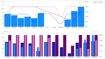
Don`t think it`s possible with the native visual, since series that are in Column Value are assigned to Primary Y-Axis and the series that are in the Line Value are automatically assigned to Secondary Y-Axis. You don`t have further control over which series from line values are assigned to what Y-Axis.
However, this is something you can achieve through 3-rd party visuals. for example this one https://appsource.microsoft.com/en-us/product/power-bi-visuals/WA104381944
It allows you to asign any of the series to any of the axis.
I have attached a simple example with the data you had.
https://failiem.lv/u/yaqqk7yfd
Here are 2 different variations from the same visual
Did I answer your question? Mark my post as a solution 🙂 If I gave you an idea on how to solve this otherwise give my post some Kudos 😄
Helpful resources

Microsoft Fabric Learn Together
Covering the world! 9:00-10:30 AM Sydney, 4:00-5:30 PM CET (Paris/Berlin), 7:00-8:30 PM Mexico City

Power BI Monthly Update - April 2024
Check out the April 2024 Power BI update to learn about new features.

| User | Count |
|---|---|
| 5 | |
| 1 | |
| 1 | |
| 1 | |
| 1 |


