- Power BI forums
- Updates
- News & Announcements
- Get Help with Power BI
- Desktop
- Service
- Report Server
- Power Query
- Mobile Apps
- Developer
- DAX Commands and Tips
- Custom Visuals Development Discussion
- Health and Life Sciences
- Power BI Spanish forums
- Translated Spanish Desktop
- Power Platform Integration - Better Together!
- Power Platform Integrations (Read-only)
- Power Platform and Dynamics 365 Integrations (Read-only)
- Training and Consulting
- Instructor Led Training
- Dashboard in a Day for Women, by Women
- Galleries
- Community Connections & How-To Videos
- COVID-19 Data Stories Gallery
- Themes Gallery
- Data Stories Gallery
- R Script Showcase
- Webinars and Video Gallery
- Quick Measures Gallery
- 2021 MSBizAppsSummit Gallery
- 2020 MSBizAppsSummit Gallery
- 2019 MSBizAppsSummit Gallery
- Events
- Ideas
- Custom Visuals Ideas
- Issues
- Issues
- Events
- Upcoming Events
- Community Blog
- Power BI Community Blog
- Custom Visuals Community Blog
- Community Support
- Community Accounts & Registration
- Using the Community
- Community Feedback
Register now to learn Fabric in free live sessions led by the best Microsoft experts. From Apr 16 to May 9, in English and Spanish.
- Power BI forums
- Forums
- Get Help with Power BI
- Custom Visuals Development Discussion
- Re: Truck Visual in powerBI
- Subscribe to RSS Feed
- Mark Topic as New
- Mark Topic as Read
- Float this Topic for Current User
- Bookmark
- Subscribe
- Printer Friendly Page
- Mark as New
- Bookmark
- Subscribe
- Mute
- Subscribe to RSS Feed
- Permalink
- Report Inappropriate Content
Truck Visual in powerBI
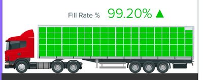
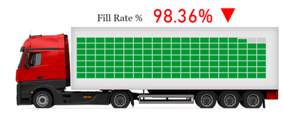
hey guys , Is it possible to create a truck like this and show the fill rate % in the visual in powerBI ??? If the value greater than 99 it shud be shown in green and lesser than 99 in red .
Share your thoughts or any idea about it . It will be really helpful. Thank you all
- Mark as New
- Bookmark
- Subscribe
- Mute
- Subscribe to RSS Feed
- Permalink
- Report Inappropriate Content
- Mark as New
- Bookmark
- Subscribe
- Mute
- Subscribe to RSS Feed
- Permalink
- Report Inappropriate Content
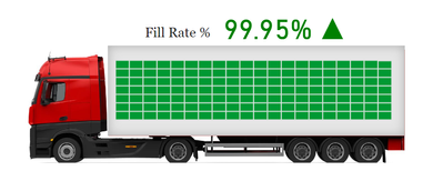
Thanks that did work. However I was able to get the exact visual using infographic designer.
- Mark as New
- Bookmark
- Subscribe
- Mute
- Subscribe to RSS Feed
- Permalink
- Report Inappropriate Content
hi, can you tell me method
- Mark as New
- Bookmark
- Subscribe
- Mute
- Subscribe to RSS Feed
- Permalink
- Report Inappropriate Content
Hi, Yes I will mention all the steps below which I followed to get this desired output.
1. Firstly, we need to get a truck image and place it in the dashboard like this
2. Next we need to go to the app source where we can add third party visuals to our reort. In this case I used Infographic Designer 1.9.7 visual ( to design the green boxes)
3. Then I added the Fill rate column as measure and date column as categroy in the chart.
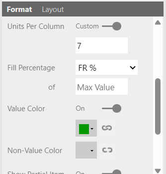
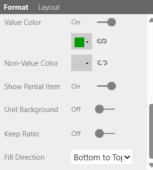
Please refer the below images to know how I had designed the visual.
Here you get to see how I have chose the shape style, enabled multiple units so that I can get multiples boxes as shown in the image, unit count by set to row and column , column count, units in a column, fill percentage, colour and finally the fill direction from bottom to top.
The general idea was to depict the exact truck visual with goods filled in it. Unfortunately we couldn't achieve applying conditional formatting in the infographic visual. But we had created few measures to show the Fill rate value and an icon to change dynamically (green/red) based on the percentage value. Fill rate % was a direct column so simply apply conditional formatting to it. For the icon, below are the measures created
1. Icon -
2. Icons colour
Regards,
Praveen
Helpful resources

Microsoft Fabric Learn Together
Covering the world! 9:00-10:30 AM Sydney, 4:00-5:30 PM CET (Paris/Berlin), 7:00-8:30 PM Mexico City

Power BI Monthly Update - April 2024
Check out the April 2024 Power BI update to learn about new features.

