- Power BI forums
- Updates
- News & Announcements
- Get Help with Power BI
- Desktop
- Service
- Report Server
- Power Query
- Mobile Apps
- Developer
- DAX Commands and Tips
- Custom Visuals Development Discussion
- Health and Life Sciences
- Power BI Spanish forums
- Translated Spanish Desktop
- Power Platform Integration - Better Together!
- Power Platform Integrations (Read-only)
- Power Platform and Dynamics 365 Integrations (Read-only)
- Training and Consulting
- Instructor Led Training
- Dashboard in a Day for Women, by Women
- Galleries
- Community Connections & How-To Videos
- COVID-19 Data Stories Gallery
- Themes Gallery
- Data Stories Gallery
- R Script Showcase
- Webinars and Video Gallery
- Quick Measures Gallery
- 2021 MSBizAppsSummit Gallery
- 2020 MSBizAppsSummit Gallery
- 2019 MSBizAppsSummit Gallery
- Events
- Ideas
- Custom Visuals Ideas
- Issues
- Issues
- Events
- Upcoming Events
- Community Blog
- Power BI Community Blog
- Custom Visuals Community Blog
- Community Support
- Community Accounts & Registration
- Using the Community
- Community Feedback
Register now to learn Fabric in free live sessions led by the best Microsoft experts. From Apr 16 to May 9, in English and Spanish.
- Power BI forums
- Forums
- Get Help with Power BI
- Custom Visuals Development Discussion
- Power KPI - Series
- Subscribe to RSS Feed
- Mark Topic as New
- Mark Topic as Read
- Float this Topic for Current User
- Bookmark
- Subscribe
- Printer Friendly Page
- Mark as New
- Bookmark
- Subscribe
- Mute
- Subscribe to RSS Feed
- Permalink
- Report Inappropriate Content
Power KPI - Series
Hi Folks,
I've ran into a strange problem with the power KPI visual. I have a table that has row categories (gender) and a column total. The data is in the following format
Year, Month, Gender, Total
2009, 1, Female, 12000
2009, 1, Male, 11000
2009, 2, Female, 12005
2009, 2, Male, 11001
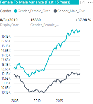
and so on. The table holds the data for the period 1-Jan-2004 to 1-Sep-2019. I was trying to display line trend of the each category of gender along with the % variance between the two over time. In the first instance, I created two measures to calculate totals for each category and drag them into the power KPI visual along with the date. No problems there
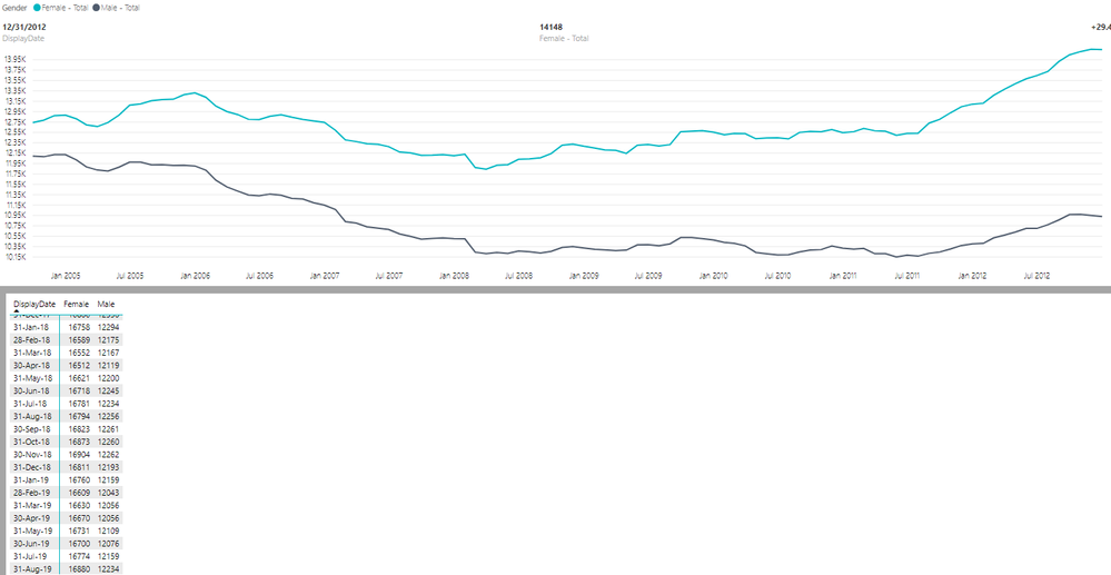
I tried another way to achieve the same, so instead of creating two measures, I dragged the total field into the visual Value, the gender category column in the Series and date on the axis. For some reason the graph just doesn't show any trend after end of 2012. But, I can see the data past 2012 upto 2019 in the data table used by the visual (as you can see int the picture below).
Any thoughts on what might be going on? I am using the power bi desktop version 2.65.5313.1562 64-bit for the power BI reporting server (all of our reports are hosted in house on the reporting server). power KPI version 2.0.0.0 release 4/12/2019
Uffan
- Mark as New
- Bookmark
- Subscribe
- Mute
- Subscribe to RSS Feed
- Permalink
- Report Inappropriate Content
Hi,
Sorry for the late answer.
Could you please send your report for analysis to pbicvsupport@microsoft.com ?
Kind Regards,
Evgenii Elkin,
Software Engineer
Microsoft Power BI Custom Visuals
pbicvsupport@microsoft.com
- Mark as New
- Bookmark
- Subscribe
- Mute
- Subscribe to RSS Feed
- Permalink
- Report Inappropriate Content
Hello,
It shows only 100 data points if any dimension is dragged in series.
I am facing the same issue. Did you get any solution?
- Mark as New
- Bookmark
- Subscribe
- Mute
- Subscribe to RSS Feed
- Permalink
- Report Inappropriate Content
Guys, I need your reports to analyze the issue and find a solution or make a suggestion.
So, if it's possible, please send them to pbicvsupport@microsoft.com
Kind Regards,
Evgenii Elkin,
Software Engineer
Microsoft Power BI Custom Visuals
pbicvsupport@microsoft.com
- Mark as New
- Bookmark
- Subscribe
- Mute
- Subscribe to RSS Feed
- Permalink
- Report Inappropriate Content
Hi @v-evelk, @Uffan, @Anonymous,
Was there any fix for this issue? I'm seeing the same problem as well. It seems that the X-axis will not show all value.
I have a Date as the X-Axis, and it'll only show up to 2018 - even though my date fields go all the way to 2020. It will only show 2020 data when I utilise a Date Filter and shorten the Between range. I suspect its a similar point brough up before that when a Series is added, the X-Axis will be made smaller.
Helpful resources

Microsoft Fabric Learn Together
Covering the world! 9:00-10:30 AM Sydney, 4:00-5:30 PM CET (Paris/Berlin), 7:00-8:30 PM Mexico City

Power BI Monthly Update - April 2024
Check out the April 2024 Power BI update to learn about new features.


