- Power BI forums
- Updates
- News & Announcements
- Get Help with Power BI
- Desktop
- Service
- Report Server
- Power Query
- Mobile Apps
- Developer
- DAX Commands and Tips
- Custom Visuals Development Discussion
- Health and Life Sciences
- Power BI Spanish forums
- Translated Spanish Desktop
- Power Platform Integration - Better Together!
- Power Platform Integrations (Read-only)
- Power Platform and Dynamics 365 Integrations (Read-only)
- Training and Consulting
- Instructor Led Training
- Dashboard in a Day for Women, by Women
- Galleries
- Community Connections & How-To Videos
- COVID-19 Data Stories Gallery
- Themes Gallery
- Data Stories Gallery
- R Script Showcase
- Webinars and Video Gallery
- Quick Measures Gallery
- 2021 MSBizAppsSummit Gallery
- 2020 MSBizAppsSummit Gallery
- 2019 MSBizAppsSummit Gallery
- Events
- Ideas
- Custom Visuals Ideas
- Issues
- Issues
- Events
- Upcoming Events
- Community Blog
- Power BI Community Blog
- Custom Visuals Community Blog
- Community Support
- Community Accounts & Registration
- Using the Community
- Community Feedback
Register now to learn Fabric in free live sessions led by the best Microsoft experts. From Apr 16 to May 9, in English and Spanish.
- Power BI forums
- Forums
- Get Help with Power BI
- Custom Visuals Development Discussion
- Re: Percentiles by group and date
- Subscribe to RSS Feed
- Mark Topic as New
- Mark Topic as Read
- Float this Topic for Current User
- Bookmark
- Subscribe
- Printer Friendly Page
- Mark as New
- Bookmark
- Subscribe
- Mute
- Subscribe to RSS Feed
- Permalink
- Report Inappropriate Content
Percentiles by group and date
Good morning community,
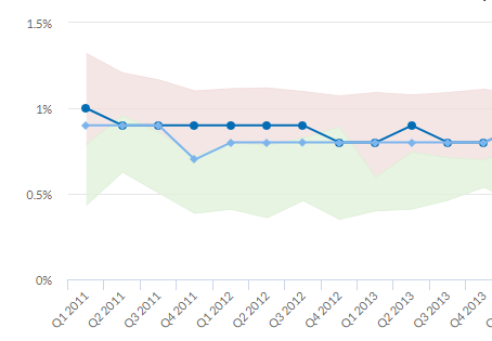
I have tried all my tricks and I cannot figure out how to recreate the graph below in Power Bi. Please help!
For reference, my data includes individual-level data, each individual belongs to a department within the organization. The line in dark blue represents the mean of a specific measure for the entire organization. The line in light blue is the mean of the same measure for one specific department within the organization. The light green area is the score between the 25th and 50th percentile for all the departments in the organization and the light red area is the score between 50th and 75th percentile for all the department in the organization. To add complexity all the measures are calculated by date (month, quarter, year - in the graph you see the data by quarter).
My question to you all is:
how do I calculate departments percentiles by date? and how do I color in between lines?
Any direction would be extremely helpful,
Warmest regards,
Estefania
- Mark as New
- Bookmark
- Subscribe
- Mute
- Subscribe to RSS Feed
- Permalink
- Report Inappropriate Content
Hello,
Do you want to develop something similar or you look for exisitng such a visual?
If you look for a visual please check Power BI Visual Store.
If it is question regarding visual development so, I recommend you to check our public visual repositories to look at the examples.
I can suppose that you should use grouping bucket and put there date field and other fields may be used as measures from other buckets. Then, when your data is grouped by date, you will be able to calculate all necessery things and build areas and line using d3 library.
Please, provide more details to understand your issue more clearly.
Kind Regards,
Evgenii Elkin,
Software Engineer
Microsoft Power BI Custom Visuals
pbicvsupport@microsoft.com
Helpful resources

Microsoft Fabric Learn Together
Covering the world! 9:00-10:30 AM Sydney, 4:00-5:30 PM CET (Paris/Berlin), 7:00-8:30 PM Mexico City

Power BI Monthly Update - April 2024
Check out the April 2024 Power BI update to learn about new features.


