- Power BI forums
- Updates
- News & Announcements
- Get Help with Power BI
- Desktop
- Service
- Report Server
- Power Query
- Mobile Apps
- Developer
- DAX Commands and Tips
- Custom Visuals Development Discussion
- Health and Life Sciences
- Power BI Spanish forums
- Translated Spanish Desktop
- Power Platform Integration - Better Together!
- Power Platform Integrations (Read-only)
- Power Platform and Dynamics 365 Integrations (Read-only)
- Training and Consulting
- Instructor Led Training
- Dashboard in a Day for Women, by Women
- Galleries
- Community Connections & How-To Videos
- COVID-19 Data Stories Gallery
- Themes Gallery
- Data Stories Gallery
- R Script Showcase
- Webinars and Video Gallery
- Quick Measures Gallery
- 2021 MSBizAppsSummit Gallery
- 2020 MSBizAppsSummit Gallery
- 2019 MSBizAppsSummit Gallery
- Events
- Ideas
- Custom Visuals Ideas
- Issues
- Issues
- Events
- Upcoming Events
- Community Blog
- Power BI Community Blog
- Custom Visuals Community Blog
- Community Support
- Community Accounts & Registration
- Using the Community
- Community Feedback
Register now to learn Fabric in free live sessions led by the best Microsoft experts. From Apr 16 to May 9, in English and Spanish.
- Power BI forums
- Forums
- Get Help with Power BI
- Custom Visuals Development Discussion
- Looking for a custom visual to visualise relations...
- Subscribe to RSS Feed
- Mark Topic as New
- Mark Topic as Read
- Float this Topic for Current User
- Bookmark
- Subscribe
- Printer Friendly Page
- Mark as New
- Bookmark
- Subscribe
- Mute
- Subscribe to RSS Feed
- Permalink
- Report Inappropriate Content
Looking for a custom visual to visualise relationships between business partners
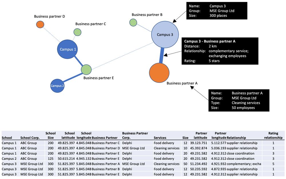
I am looking for a custom visual to visualise relationships between business partners. In this case the relationship of different school campuses with their suppliers. The image below shows my idea what the visual should look like and what elements of the visual should be reflecting the underlying data.
I searched throughout the marketplace and internet for custom visuals but found nothing that fits my idea. Therefore I think it will require some developing effort to realise this visual. I have no experience in developing custom visuals, neither JavaScript, Typescript or R and after studying some tutorials about developing custom visuals I realised there a quite a few approaches for developing a custom visual (Java Scripts, Visual Studio Code, R/Python scripts or using tools like Charticulator, etc.). So far I have no idea what approach would be best fitting for the type of visual I have in mind.
My questions are:
1. Did I overlook something in the available custom visuals and is there already a custom visual that fits my needs?
2. If not, can someone give me an indication how complicated or difficult the development of my preferred visual is and give some guidelines or assistance in the process of developing?
3. Or, where can I find someone willing to develop this custom visual for me?
Additional information:
- Distance between circles indicates geographical distance. Therefore length of the connecting lines also reflect distance.
- Size of the circles reflects size of School campus and/or Business partner.
- Color of the circles reflect the holding where each school of business partner belongs to. Preferably this color can also be set to change according to the type of services being delivered, etc.
- Thickness and style of lines between circles reflects rating of the relationship.
- There is no specific need to plot the circles in a map according to their lattitude and longitude as the focus is on the distance between them and the characteristics of the relationship. But if so, than only if the map layers can be set to a specific level of transparency, to make sure the focus is on the circles and relationships between them.
- When hovering over any circle or relationship the typical black pop-up window appears with the relevant information as shown in the example.
- Mark as New
- Bookmark
- Subscribe
- Mute
- Subscribe to RSS Feed
- Permalink
- Report Inappropriate Content
Hello,
Have you already checked a visual store?
The picture that you provided looks like Natwork Navigator Chart.
Kind Regrads,
Evgenii Elkin,
Software Engineer
Microsoft Power BI Custom Visuals
pbicvsupport@microsoft.com
Helpful resources

Microsoft Fabric Learn Together
Covering the world! 9:00-10:30 AM Sydney, 4:00-5:30 PM CET (Paris/Berlin), 7:00-8:30 PM Mexico City

Power BI Monthly Update - April 2024
Check out the April 2024 Power BI update to learn about new features.


