- Power BI forums
- Updates
- News & Announcements
- Get Help with Power BI
- Desktop
- Service
- Report Server
- Power Query
- Mobile Apps
- Developer
- DAX Commands and Tips
- Custom Visuals Development Discussion
- Health and Life Sciences
- Power BI Spanish forums
- Translated Spanish Desktop
- Power Platform Integration - Better Together!
- Power Platform Integrations (Read-only)
- Power Platform and Dynamics 365 Integrations (Read-only)
- Training and Consulting
- Instructor Led Training
- Dashboard in a Day for Women, by Women
- Galleries
- Community Connections & How-To Videos
- COVID-19 Data Stories Gallery
- Themes Gallery
- Data Stories Gallery
- R Script Showcase
- Webinars and Video Gallery
- Quick Measures Gallery
- 2021 MSBizAppsSummit Gallery
- 2020 MSBizAppsSummit Gallery
- 2019 MSBizAppsSummit Gallery
- Events
- Ideas
- Custom Visuals Ideas
- Issues
- Issues
- Events
- Upcoming Events
- Community Blog
- Power BI Community Blog
- Custom Visuals Community Blog
- Community Support
- Community Accounts & Registration
- Using the Community
- Community Feedback
Register now to learn Fabric in free live sessions led by the best Microsoft experts. From Apr 16 to May 9, in English and Spanish.
- Power BI forums
- Forums
- Get Help with Power BI
- Custom Visuals Development Discussion
- Re: Create a timeline view using the Stacked Bar C...
- Subscribe to RSS Feed
- Mark Topic as New
- Mark Topic as Read
- Float this Topic for Current User
- Bookmark
- Subscribe
- Printer Friendly Page
- Mark as New
- Bookmark
- Subscribe
- Mute
- Subscribe to RSS Feed
- Permalink
- Report Inappropriate Content
Create a timeline view using the Stacked Bar Chart Visualiztion
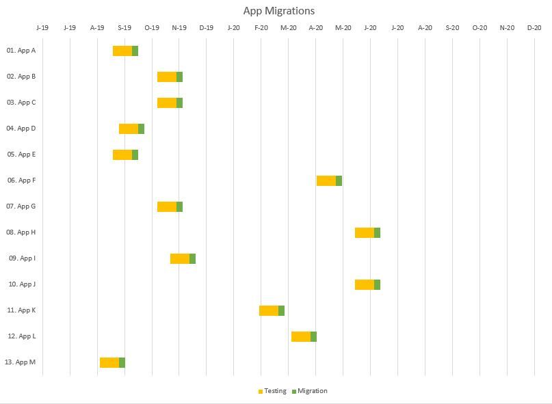
Hopefully there's a Datanaut out there that can help. I can, and have, for years been able to create time line views in Excel Charts using a Bar chart like so:

In Power BI, I have an ask to create a view just like this. Our organzational security FORBIDS the use of 3rd party custom visuals so that is not a solution.
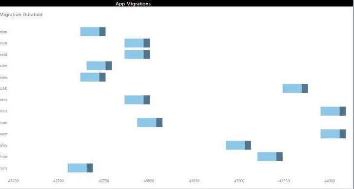
This is the closest I have been able to come:

I am so close I can taste it, but cannot figure a way to first, make the axis values convert from the numeric format into date format, and then second, set it so these are monthly values, not every 50 days.
Anyone that wants a big Kudos from me that has a solution to this one, let me know!
Warmest Thanks in advance
- Mark as New
- Bookmark
- Subscribe
- Mute
- Subscribe to RSS Feed
- Permalink
- Report Inappropriate Content
Have you tried:
make the axis values convert from the numeric format into date format:
On the right you have the list with data fields, select the field which contains your date (now showing as a number). Then click on the ribbon on modeling tab, and for Data type select Date/time:
set it so these are monthly values, not every 50 days
Have you tried adding a slicer? It is unfortunate that you are not allowed to use a custom visual, as the Timeline slicer in the marketplace is really what you'd need here. However the built in Slicer can at least help you. You could eventually try to add a new column which calculates the month, and then apply the slicer on that column.
Hope this helps!
- Mark as New
- Bookmark
- Subscribe
- Mute
- Subscribe to RSS Feed
- Permalink
- Report Inappropriate Content
Thank you for your outreach on this matter. I attempted your solution on the Modelling tab, but unless I am missing some other step, that just blows up the visual and I get the "Something is wrong with one or more of the fields" message.
I will see what I might be able to do with a slicer or displaying some sort of rolling series of months.
- Mark as New
- Bookmark
- Subscribe
- Mute
- Subscribe to RSS Feed
- Permalink
- Report Inappropriate Content
I guess the bar chart doesn't work with dates on the value axis, tried this myself and couldn't get it to work either.
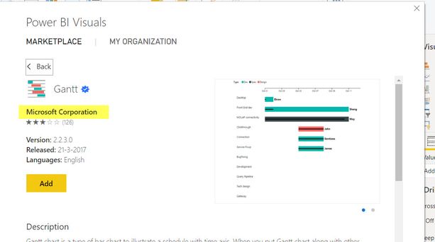
Just thinking out of the box: what you're building looks a lot like a project / activity chart, which normally could be displayed with a gantt chart. You mention that 3rd party visuals are forbidden, however Microsoft offers a custom visual in the marketplace (https://appsource.microsoft.com/en-us/product/power-bi-visuals/WA104380765?tab=Overview). Strictly speaking this isn't 3rd party, as it is from Microsoft as well 🙂 .
- Mark as New
- Bookmark
- Subscribe
- Mute
- Subscribe to RSS Feed
- Permalink
- Report Inappropriate Content
I appreciate that there is a section of "Microsoft Endorsed" items in the marketplace much like way back in the day MS placed their Powerpoint "Clip Art" out on their website that may be its purpose. As you may have ben able to tell from my email address, I work in a bank's IT Security dept and the Risk Adverse orientation is as high as you can imagine for good reason. It took approvals just to get access to this site. The position would be if Microsoft is certain there is no risk of malware or backdoors with the visual, then include it in the standard package of visualizations we get when we download. Other visualization types have been added over time so we know this could be done. Perhaps that could be added to the no doubt lengthy suggestionb list for this product?
Note that in the meantime, my Senior Leadership understands and accepts the current situation so its not like I'm under pressure to quickly find a resolution to this.
I continue to thank all of you for your suggestions and feedback!
- Mark as New
- Bookmark
- Subscribe
- Mute
- Subscribe to RSS Feed
- Permalink
- Report Inappropriate Content
The marketplace consists of visuals made by several 3rd parties as well as made by Microsoft themselves. Why these latter ones are not part of the default section I don't know, perhaps not to overwhelm the user with too many visuals.
The Gantt chart I mentioned is developed by Microsoft themselves, not by a 3rd party (as are some of the other gantt visuals).
I do understand that often the technical aspectof creating a solution is the 'easiest' part of the challenge 🙂
- Mark as New
- Bookmark
- Subscribe
- Mute
- Subscribe to RSS Feed
- Permalink
- Report Inappropriate Content
Hello,
Almost all of our visuals have public repositories.
It means that you can fork a repo, analyze the source code to be sure that it is secure, and build your own visual with custom GUID (otherwise visual will be loaded form CDN). Such approach will help you to cover both, security concerns and availability of rich functionality.
Kind Regards,
Evgenii Elkin,
Software Engineer
Microsoft Power BI Custom Visuals
pbicvsupport@microsoft.com
- Mark as New
- Bookmark
- Subscribe
- Mute
- Subscribe to RSS Feed
- Permalink
- Report Inappropriate Content
Hello,
Is it your own implementation of the visual? Do I correctly understand?
Kind Regards,
Evgenii Elkin,
Software Engineer
Microsoft Power BI Custom Visuals
pbicvsupport@microsoft.com
- Mark as New
- Bookmark
- Subscribe
- Mute
- Subscribe to RSS Feed
- Permalink
- Report Inappropriate Content
Yes,
The Power BI visual I have created is the Stacked Bar Chart visualization from the standard set that comes with BI Desktop
Did this answer your question? Is my question posed in the wrong forum?
- Mark as New
- Bookmark
- Subscribe
- Mute
- Subscribe to RSS Feed
- Permalink
- Report Inappropriate Content
Yep, the thread is correct.
Is it possible to look through your source code and a data set to better understand your issue?
You could send them to pbicvsupport@microsoft.com
Kind Regards,
Evgenii Elkin,
Software Engineer
Microsoft Power BI Custom Visuals
pbicvsupport@microsoft.com
- Mark as New
- Bookmark
- Subscribe
- Mute
- Subscribe to RSS Feed
- Permalink
- Report Inappropriate Content
Done. An email was sent with two attachments - one is the Excel Table and Chart, the other is a PowerBI visualizationof the same information
- Mark as New
- Bookmark
- Subscribe
- Mute
- Subscribe to RSS Feed
- Permalink
- Report Inappropriate Content
Thank you for the sent details.
I tried to solve the issue but, unfortunately, without success.
However, I requested information from visual developers so, as soon as they answer, I will provide it here.
Kind Regads,
Evgenii Elkin,
Software Engineer
Microsoft Power BI Custom Visuals
pbicvsupport@microsoft.com
Helpful resources

Microsoft Fabric Learn Together
Covering the world! 9:00-10:30 AM Sydney, 4:00-5:30 PM CET (Paris/Berlin), 7:00-8:30 PM Mexico City

Power BI Monthly Update - April 2024
Check out the April 2024 Power BI update to learn about new features.


