- Power BI forums
- Updates
- News & Announcements
- Get Help with Power BI
- Desktop
- Service
- Report Server
- Power Query
- Mobile Apps
- Developer
- DAX Commands and Tips
- Custom Visuals Development Discussion
- Health and Life Sciences
- Power BI Spanish forums
- Translated Spanish Desktop
- Power Platform Integration - Better Together!
- Power Platform Integrations (Read-only)
- Power Platform and Dynamics 365 Integrations (Read-only)
- Training and Consulting
- Instructor Led Training
- Dashboard in a Day for Women, by Women
- Galleries
- Community Connections & How-To Videos
- COVID-19 Data Stories Gallery
- Themes Gallery
- Data Stories Gallery
- R Script Showcase
- Webinars and Video Gallery
- Quick Measures Gallery
- 2021 MSBizAppsSummit Gallery
- 2020 MSBizAppsSummit Gallery
- 2019 MSBizAppsSummit Gallery
- Events
- Ideas
- Custom Visuals Ideas
- Issues
- Issues
- Events
- Upcoming Events
- Community Blog
- Power BI Community Blog
- Custom Visuals Community Blog
- Community Support
- Community Accounts & Registration
- Using the Community
- Community Feedback
Register now to learn Fabric in free live sessions led by the best Microsoft experts. From Apr 16 to May 9, in English and Spanish.
- Power BI forums
- Forums
- Get Help with Power BI
- Custom Visuals Development Discussion
- Clustered column chart -percentage
- Subscribe to RSS Feed
- Mark Topic as New
- Mark Topic as Read
- Float this Topic for Current User
- Bookmark
- Subscribe
- Printer Friendly Page
- Mark as New
- Bookmark
- Subscribe
- Mute
- Subscribe to RSS Feed
- Permalink
- Report Inappropriate Content
Clustered column chart -percentage
Hi ,
How we can create a desired Chart in power bi from the below data:-
data in this chart will be dynamic , it will change according to filter of date & year.
Data:--
| Year | Week | Month | Section-1 | Status | Section-2 | Status | Section-3 | Status | Section-4 | Status |
| 2019 | Week 6 | Feb | ICR | ICR | ICR | ICR | ||||
| 2019 | Week 6 | Feb | CR | CR | CR | ICR | ||||
| 2019 | Week 6 | Feb | ICR | ICR | ICR | ICR | ||||
| 2019 | Week 7 | Feb | CR | CR | ICR | ICR | ||||
| 2019 | Week 7 | Feb | ICR | ICR | ICR | ICR | ||||
| 2019 | Week 7 | Feb | CR | ICR | ICR | ICR | ||||
| 2019 | Week 7 | Feb | PD | ICR | PD | ICR | ||||
| 2019 | Week 7 | Feb | ICR | ICR | ICR | ICR | ||||
| 2019 | Week 8 | Feb | CR | ICR | CR | ICR | ||||
| 2019 | Week 8 | Feb | CR | ICR | CR | CR | ||||
| 2019 | Week 8 | Feb | CR | ICR | CR | CR | ||||
| 2019 | Week 8 | Feb | ICR | ICR | CR | ICR | ||||
| 2019 | Week 8 | Feb | ICR | ICR | CR | ICR | ||||
| 2019 | Week 9 | Feb | CR | ICR | CR | CR | ||||
| 2019 | Week 9 | Feb | PD | PD | CR | PD | ||||
| 2019 | Week 9 | Feb | ICR | ICR | CR | PD | ||||
| 2019 | Week 9 | Feb | CR | CR | CR | PD | ||||
| 2019 | Week 9 | Feb | PD | PD | CR | PD | ||||
| 2019 | Week 9 | Feb | ICR | ICR | ICR | PD | ||||
| 2019 | Week 9 | Feb | CR | CR | CR | CR | ||||
| 2019 | Week 9 | Feb | PD | PD | PD | PD |
Solved! Go to Solution.
- Mark as New
- Bookmark
- Subscribe
- Mute
- Subscribe to RSS Feed
- Permalink
- Report Inappropriate Content
Hi @Anonymous and welcome aboard.
This looks like a question that can be solved with core visuals. As such, you will get a much faster response (probably within minutes) in a more frequented location like the Desktop forums for questions of this manner. They will also be able to give you better advice on how to do this using measures, as well and any specific formatting questions, but I'm confident that this will get you started.
Firstly, your data is not in quite the correct format as pasted. the Section-x columns are empty, and the status has its own separate column. If you can modify your source data a little bit then I would suggest that each status coumn has a Section-x heading and then we can transform it later. I'm going to assume that the structure can be changed to this:
| Year | Week | Month | Section 1 | Section 2 | Section 3 | Section 4 |
| 2019 | Week 6 | Feb | ICR | ICR | ICR | ICR |
| 2019 | Week 6 | Feb | CR | CR | CR | ICR |
| ... | ... | ... | ... | ... | ... | ... |
We'll use the query editor to make this fit your visual requirements. After import, we should have something like this:

Now, select the first three columns, right-click and select Unpivot Other Columns from the context menu, e.g.:
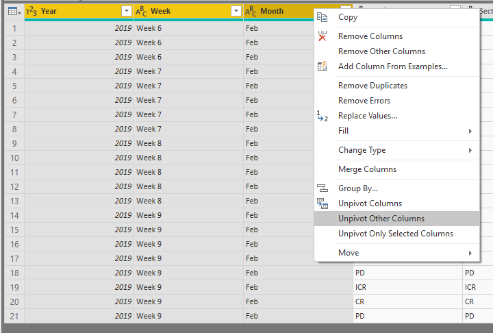
You'll now have a tall table, with and Attribute and a Value column, e.g.:

You now have columns that will work as attributes in Power BI when you want to build your chart. We'll rename them to something more sensible for your use case (Section and Status), e.g.:

Now, Close & Apply the query changes to be taken back to the Report view.
First, we'll put your filters in. Add two slicers to the canvas, and add Year to one and Week to the other, e.g.:
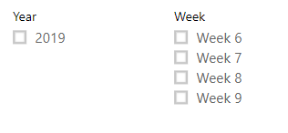
You can add slicers for whatever fields you need - these two are just for illustrative purposes.
Now, add a Clustered Column Chart to the canvas.
- Add the Section field from your data model to the Axis container on the chart.
- Add Status to the Legend container.
- Add Status to the Value container.
Our chart now looks like below. Note that the Status attribute changes to show Count of Status. This is because it's behaving as a measure for the chart. This doesn't quite fulfil your requirements, but we'll get to that in a second.

Power BI lets us convert this value to a % of grand total rather than the count, but this is for the whole visible data set, and it looks like you'll want to get this total for each Section value. We'll need a measure for this that takes this into consideration.
- Right-click the table and select Add Measure
- Paste the following DAX code into the text box:
Section % =
    DIVIDE(
        COUNT('Table1'[Status]),
        CALCULATE(
            COUNT(Table1[Status]),
            ALLSELECTED(Table1[Status])
        )
    )
This will create a measure called Section %. This divides the value in each bar by the total for each section group. I would suggest that for more help on these kinds of areas, ask in the DAX forum, as there's some awesome people in there who can explain much better than I can 🙂 - In the modelling ribbon, change your measure to a percentage format.
- Replace the field in the Value container with this new measure, e.g.:
Chart With %
All that's left is your data labels:
- Click on the Format pane, and switch Data Labels on.
- Expand and change Value decimal places to 0.
And we're done!
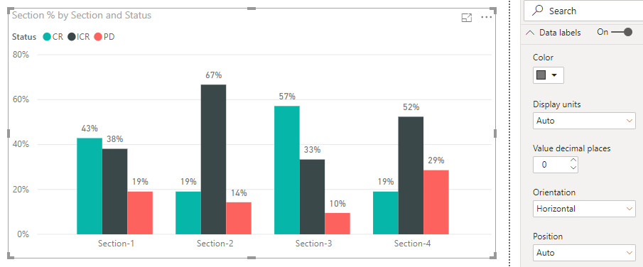
Selecting the slicers will modify the figures in the chart as needed, as per your requirements.
Hopefully this shows you what you need is possible.
Good luck!
Daniel
Did I answer your question? Mark my post as a solution!
Did I answer your question? Mark my post as a solution!
Proud to be a Super User!
My course: Introduction to Developing Power BI Visuals
On how to ask a technical question, if you really want an answer (courtesy of SQLBI)
- Mark as New
- Bookmark
- Subscribe
- Mute
- Subscribe to RSS Feed
- Permalink
- Report Inappropriate Content
Hi @Anonymous and welcome aboard.
This looks like a question that can be solved with core visuals. As such, you will get a much faster response (probably within minutes) in a more frequented location like the Desktop forums for questions of this manner. They will also be able to give you better advice on how to do this using measures, as well and any specific formatting questions, but I'm confident that this will get you started.
Firstly, your data is not in quite the correct format as pasted. the Section-x columns are empty, and the status has its own separate column. If you can modify your source data a little bit then I would suggest that each status coumn has a Section-x heading and then we can transform it later. I'm going to assume that the structure can be changed to this:
| Year | Week | Month | Section 1 | Section 2 | Section 3 | Section 4 |
| 2019 | Week 6 | Feb | ICR | ICR | ICR | ICR |
| 2019 | Week 6 | Feb | CR | CR | CR | ICR |
| ... | ... | ... | ... | ... | ... | ... |
We'll use the query editor to make this fit your visual requirements. After import, we should have something like this:

Now, select the first three columns, right-click and select Unpivot Other Columns from the context menu, e.g.:

You'll now have a tall table, with and Attribute and a Value column, e.g.:

You now have columns that will work as attributes in Power BI when you want to build your chart. We'll rename them to something more sensible for your use case (Section and Status), e.g.:

Now, Close & Apply the query changes to be taken back to the Report view.
First, we'll put your filters in. Add two slicers to the canvas, and add Year to one and Week to the other, e.g.:

You can add slicers for whatever fields you need - these two are just for illustrative purposes.
Now, add a Clustered Column Chart to the canvas.
- Add the Section field from your data model to the Axis container on the chart.
- Add Status to the Legend container.
- Add Status to the Value container.
Our chart now looks like below. Note that the Status attribute changes to show Count of Status. This is because it's behaving as a measure for the chart. This doesn't quite fulfil your requirements, but we'll get to that in a second.

Power BI lets us convert this value to a % of grand total rather than the count, but this is for the whole visible data set, and it looks like you'll want to get this total for each Section value. We'll need a measure for this that takes this into consideration.
- Right-click the table and select Add Measure
- Paste the following DAX code into the text box:
Section % =
    DIVIDE(
        COUNT('Table1'[Status]),
        CALCULATE(
            COUNT(Table1[Status]),
            ALLSELECTED(Table1[Status])
        )
    )
This will create a measure called Section %. This divides the value in each bar by the total for each section group. I would suggest that for more help on these kinds of areas, ask in the DAX forum, as there's some awesome people in there who can explain much better than I can 🙂 - In the modelling ribbon, change your measure to a percentage format.
- Replace the field in the Value container with this new measure, e.g.:
Chart With %
All that's left is your data labels:
- Click on the Format pane, and switch Data Labels on.
- Expand and change Value decimal places to 0.
And we're done!

Selecting the slicers will modify the figures in the chart as needed, as per your requirements.
Hopefully this shows you what you need is possible.
Good luck!
Daniel
Did I answer your question? Mark my post as a solution!
Did I answer your question? Mark my post as a solution!
Proud to be a Super User!
My course: Introduction to Developing Power BI Visuals
On how to ask a technical question, if you really want an answer (courtesy of SQLBI)
- Mark as New
- Bookmark
- Subscribe
- Mute
- Subscribe to RSS Feed
- Permalink
- Report Inappropriate Content
Thanks for your support.
It works perfectly.
Helpful resources

Microsoft Fabric Learn Together
Covering the world! 9:00-10:30 AM Sydney, 4:00-5:30 PM CET (Paris/Berlin), 7:00-8:30 PM Mexico City

Power BI Monthly Update - April 2024
Check out the April 2024 Power BI update to learn about new features.

