- Power BI forums
- Updates
- News & Announcements
- Get Help with Power BI
- Desktop
- Service
- Report Server
- Power Query
- Mobile Apps
- Developer
- DAX Commands and Tips
- Custom Visuals Development Discussion
- Health and Life Sciences
- Power BI Spanish forums
- Translated Spanish Desktop
- Power Platform Integration - Better Together!
- Power Platform Integrations (Read-only)
- Power Platform and Dynamics 365 Integrations (Read-only)
- Training and Consulting
- Instructor Led Training
- Dashboard in a Day for Women, by Women
- Galleries
- Community Connections & How-To Videos
- COVID-19 Data Stories Gallery
- Themes Gallery
- Data Stories Gallery
- R Script Showcase
- Webinars and Video Gallery
- Quick Measures Gallery
- 2021 MSBizAppsSummit Gallery
- 2020 MSBizAppsSummit Gallery
- 2019 MSBizAppsSummit Gallery
- Events
- Ideas
- Custom Visuals Ideas
- Issues
- Issues
- Events
- Upcoming Events
- Community Blog
- Power BI Community Blog
- Custom Visuals Community Blog
- Community Support
- Community Accounts & Registration
- Using the Community
- Community Feedback
Register now to learn Fabric in free live sessions led by the best Microsoft experts. From Apr 16 to May 9, in English and Spanish.
- Power BI forums
- Forums
- Get Help with Power BI
- Custom Visuals Development Discussion
- Re: Change automatically my chart color - Mudando ...
- Subscribe to RSS Feed
- Mark Topic as New
- Mark Topic as Read
- Float this Topic for Current User
- Bookmark
- Subscribe
- Printer Friendly Page
- Mark as New
- Bookmark
- Subscribe
- Mute
- Subscribe to RSS Feed
- Permalink
- Report Inappropriate Content
Change automatically my chart color - Mudando automaticamente a cor do meu rotulo de dados.
Bom dia,
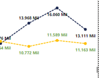
Atualmente eu tenho uma gráfico dessa maneira:
Gostaria que o rótulo de dado (em verde) ficasse amarelo que nem a linha. Porém gostaria de saber se tem como isso ser mais dinâmico, gostaria de saber se tem uma maneira de que se eu mudasse a minha linha para vermelho, o rotulo de dados automaticamente mudasse para vermelho, ou seja pegasse a mesma configuração. Gostaria de saber se isso é possível.
Obrigada pela ajuda,
Hello.
I have the following chart.
I would like to know if I can make the data (green) become yellow like the line. But I would like to know if there is a way of doing this automatically, If when I change my line, for example to red, and automatically my data change to red.
I don't know if I have to download a line chart that does that, or if I can do it, with the chat that comes with the Power BI
Thanks for the help,
Roberta.
- Mark as New
- Bookmark
- Subscribe
- Mute
- Subscribe to RSS Feed
- Permalink
- Report Inappropriate Content
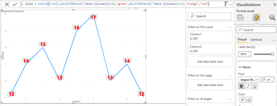
This is supposed to work via conditional formatting but it seems to be currently broken
Helpful resources

Microsoft Fabric Learn Together
Covering the world! 9:00-10:30 AM Sydney, 4:00-5:30 PM CET (Paris/Berlin), 7:00-8:30 PM Mexico City

Power BI Monthly Update - April 2024
Check out the April 2024 Power BI update to learn about new features.


