- Power BI forums
- Updates
- News & Announcements
- Get Help with Power BI
- Desktop
- Service
- Report Server
- Power Query
- Mobile Apps
- Developer
- DAX Commands and Tips
- Custom Visuals Development Discussion
- Health and Life Sciences
- Power BI Spanish forums
- Translated Spanish Desktop
- Power Platform Integration - Better Together!
- Power Platform Integrations (Read-only)
- Power Platform and Dynamics 365 Integrations (Read-only)
- Training and Consulting
- Instructor Led Training
- Dashboard in a Day for Women, by Women
- Galleries
- Community Connections & How-To Videos
- COVID-19 Data Stories Gallery
- Themes Gallery
- Data Stories Gallery
- R Script Showcase
- Webinars and Video Gallery
- Quick Measures Gallery
- 2021 MSBizAppsSummit Gallery
- 2020 MSBizAppsSummit Gallery
- 2019 MSBizAppsSummit Gallery
- Events
- Ideas
- Custom Visuals Ideas
- Issues
- Issues
- Events
- Upcoming Events
- Community Blog
- Power BI Community Blog
- Custom Visuals Community Blog
- Community Support
- Community Accounts & Registration
- Using the Community
- Community Feedback
Register now to learn Fabric in free live sessions led by the best Microsoft experts. From Apr 16 to May 9, in English and Spanish.
- Power BI forums
- Forums
- Get Help with Power BI
- Custom Visuals Development Discussion
- Budget, and Actuals Stacked Column Chart for Depar...
- Subscribe to RSS Feed
- Mark Topic as New
- Mark Topic as Read
- Float this Topic for Current User
- Bookmark
- Subscribe
- Printer Friendly Page
- Mark as New
- Bookmark
- Subscribe
- Mute
- Subscribe to RSS Feed
- Permalink
- Report Inappropriate Content
Budget, and Actuals Stacked Column Chart for Departments (x-axis labeling)
Hi Everyone,
I need help regarding the x-axis labeling. I've been working on this model for weeks. I have gotten closer to my desired result but I'm pretty stumped. Hoping I can receive a solution to this problem. I would like to keep the stacked column look.
1. This is the model from another data visualization software that I would like to mimic in power BI.
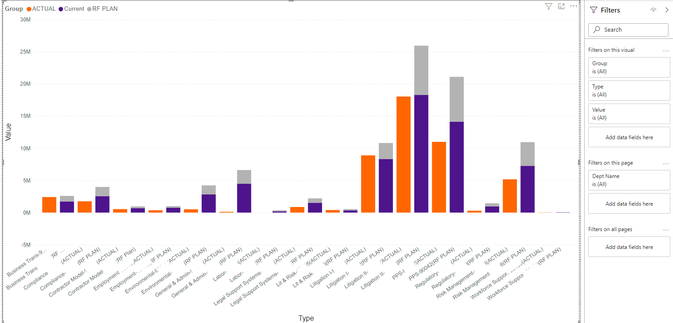
2. Below I attempted two times. As you can see (Exhibit A.) the labeling on the x-axis is pretty cluttered due to me having to differentiate between Actual and Current amounts and I would like it to be clean.
Exhibit A.
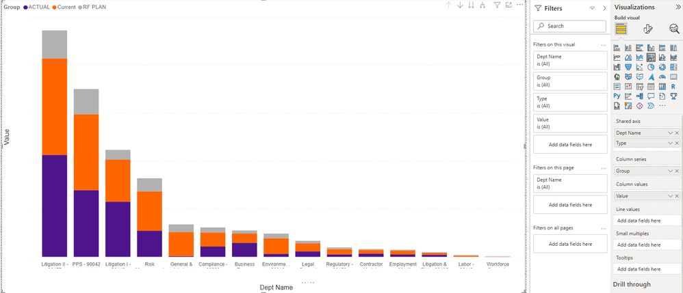
The second screenshot (Exhibit B.) is the desired aesthetic I would like however I am not sure how to move the actuals now that I have the Dept in the x-axis. Is it possible?
Exhibit B.
I would like the columns to look like Exhibit A, but the x-axis labeling to mimic Exhibit B.
Helpful resources

Microsoft Fabric Learn Together
Covering the world! 9:00-10:30 AM Sydney, 4:00-5:30 PM CET (Paris/Berlin), 7:00-8:30 PM Mexico City

Power BI Monthly Update - April 2024
Check out the April 2024 Power BI update to learn about new features.

| User | Count |
|---|---|
| 5 | |
| 1 | |
| 1 | |
| 1 | |
| 1 |


