- Power BI forums
- Updates
- News & Announcements
- Get Help with Power BI
- Desktop
- Service
- Report Server
- Power Query
- Mobile Apps
- Developer
- DAX Commands and Tips
- Custom Visuals Development Discussion
- Health and Life Sciences
- Power BI Spanish forums
- Translated Spanish Desktop
- Power Platform Integration - Better Together!
- Power Platform Integrations (Read-only)
- Power Platform and Dynamics 365 Integrations (Read-only)
- Training and Consulting
- Instructor Led Training
- Dashboard in a Day for Women, by Women
- Galleries
- Community Connections & How-To Videos
- COVID-19 Data Stories Gallery
- Themes Gallery
- Data Stories Gallery
- R Script Showcase
- Webinars and Video Gallery
- Quick Measures Gallery
- 2021 MSBizAppsSummit Gallery
- 2020 MSBizAppsSummit Gallery
- 2019 MSBizAppsSummit Gallery
- Events
- Ideas
- Custom Visuals Ideas
- Issues
- Issues
- Events
- Upcoming Events
- Community Blog
- Power BI Community Blog
- Custom Visuals Community Blog
- Community Support
- Community Accounts & Registration
- Using the Community
- Community Feedback
Register now to learn Fabric in free live sessions led by the best Microsoft experts. From Apr 16 to May 9, in English and Spanish.
- Power BI forums
- Forums
- Get Help with Power BI
- Service
- Map Highlight bubbles
- Subscribe to RSS Feed
- Mark Topic as New
- Mark Topic as Read
- Float this Topic for Current User
- Bookmark
- Subscribe
- Printer Friendly Page
- Mark as New
- Bookmark
- Subscribe
- Mute
- Subscribe to RSS Feed
- Permalink
- Report Inappropriate Content
Map Highlight bubbles
Hi !
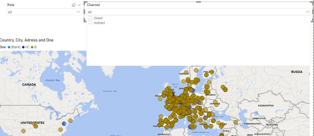
I am trying to see some information in the Map visual tool. Im relating to tables because I have the info in 2 different tables, One for the Installbase and one for the Headcounts. At the same time I have 2 slicers, One that select the information from Installbase(IB) and is called "Channel" has 2 selection in the slicer: Direct/Indirect. The second slicer contains information from the headcount(HC) like the region. You can see in the IMG better:
The issue is that when I tried to select something from the Channel slicer, the blue bubbles dissapear because this slicer is like filtering the information that I have just selected. What I want is tha instead of only seeing the info that I selected, I want to add or see in different colors what we are selecting. I want to see all the info despite what im selecting.
Thanks!
Solved! Go to Solution.
- Mark as New
- Bookmark
- Subscribe
- Mute
- Subscribe to RSS Feed
- Permalink
- Report Inappropriate Content
Hi @Anonymous
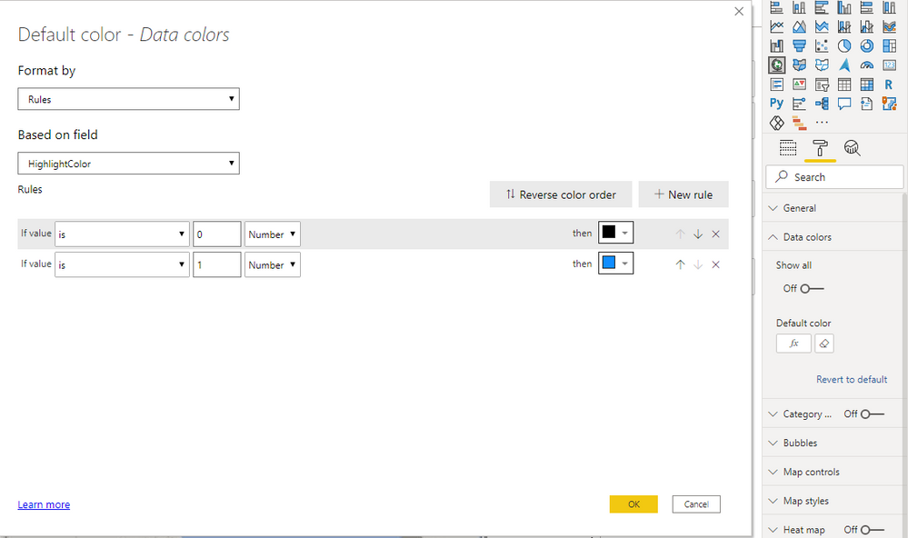
You can hightlight your bubbles by adding measure into data color.
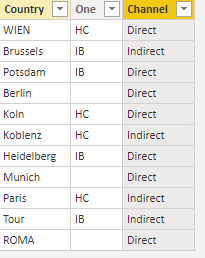
I build a sample table:
Build two slicer tables without building relationships between them and this table.
Channel = VALUES('Table'[Channel])Role = VALUES('Table'[One])Measure:
HighlightColor =
VAR _SelChannel =
    SELECTEDVALUE ( Channel[Channel] )
VAR _SelRole =
    SELECTEDVALUE ( Role[One] )
RETURN
    IF (
        ISFILTERED ( Channel[Channel] ) && ISFILTERED ( Role[One] )
            && _SelRole = MAX ( 'Table'[One] )
            && _SelChannel = MAX ( 'Table'[Channel] ),
        1,
        IF (
            ISFILTERED ( Channel[Channel] )
                && _SelChannel = MAX ( 'Table'[Channel] )
                && _SelRole = BLANK (),
            1,
            IF (
                ISFILTERED ( Role[One] )
                    && _SelRole = MAX ( 'Table'[One] )
                    && _SelChannel = BLANK (),
                1,
                0
            )
        )
    )
Add this measure into the data color .
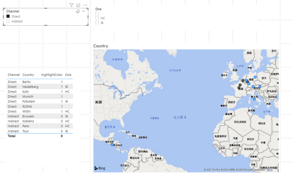
Result is as below, bubbles in map will show black by default and will be highlighted in blue when you select slicer.
You can download the pbix file from this link: Map Highlight bubbles
Best Regards,
Rico Zhou
If this post helps, then please consider Accept it as the solution to help the other members find it more quickly.
- Mark as New
- Bookmark
- Subscribe
- Mute
- Subscribe to RSS Feed
- Permalink
- Report Inappropriate Content
Hi @Anonymous
Could you tell me if your problem has been solved? If it is, kindly Accept it as the solution. More people will benefit from it. Or you are still confused about it, please provide me with more details about your table and your problem or share me with your pbix file from your Onedrive for Business.
Best Regards,
Rico Zhou
- Mark as New
- Bookmark
- Subscribe
- Mute
- Subscribe to RSS Feed
- Permalink
- Report Inappropriate Content
Hi @Anonymous
You can hightlight your bubbles by adding measure into data color.
I build a sample table:
Build two slicer tables without building relationships between them and this table.
Channel = VALUES('Table'[Channel])Role = VALUES('Table'[One])Measure:
HighlightColor =
VAR _SelChannel =
    SELECTEDVALUE ( Channel[Channel] )
VAR _SelRole =
    SELECTEDVALUE ( Role[One] )
RETURN
    IF (
        ISFILTERED ( Channel[Channel] ) && ISFILTERED ( Role[One] )
            && _SelRole = MAX ( 'Table'[One] )
            && _SelChannel = MAX ( 'Table'[Channel] ),
        1,
        IF (
            ISFILTERED ( Channel[Channel] )
                && _SelChannel = MAX ( 'Table'[Channel] )
                && _SelRole = BLANK (),
            1,
            IF (
                ISFILTERED ( Role[One] )
                    && _SelRole = MAX ( 'Table'[One] )
                    && _SelChannel = BLANK (),
                1,
                0
            )
        )
    )
Add this measure into the data color .
Result is as below, bubbles in map will show black by default and will be highlighted in blue when you select slicer.
You can download the pbix file from this link: Map Highlight bubbles
Best Regards,
Rico Zhou
If this post helps, then please consider Accept it as the solution to help the other members find it more quickly.
- Mark as New
- Bookmark
- Subscribe
- Mute
- Subscribe to RSS Feed
- Permalink
- Report Inappropriate Content
I cant download you powerbi file !
beside that didnt work when i selelct the year per exemple it shown me only the filtred bubbles on the map !
Helpful resources

Microsoft Fabric Learn Together
Covering the world! 9:00-10:30 AM Sydney, 4:00-5:30 PM CET (Paris/Berlin), 7:00-8:30 PM Mexico City

Power BI Monthly Update - April 2024
Check out the April 2024 Power BI update to learn about new features.


