- Power BI forums
- Updates
- News & Announcements
- Get Help with Power BI
- Desktop
- Service
- Report Server
- Power Query
- Mobile Apps
- Developer
- DAX Commands and Tips
- Custom Visuals Development Discussion
- Health and Life Sciences
- Power BI Spanish forums
- Translated Spanish Desktop
- Power Platform Integration - Better Together!
- Power Platform Integrations (Read-only)
- Power Platform and Dynamics 365 Integrations (Read-only)
- Training and Consulting
- Instructor Led Training
- Dashboard in a Day for Women, by Women
- Galleries
- Community Connections & How-To Videos
- COVID-19 Data Stories Gallery
- Themes Gallery
- Data Stories Gallery
- R Script Showcase
- Webinars and Video Gallery
- Quick Measures Gallery
- 2021 MSBizAppsSummit Gallery
- 2020 MSBizAppsSummit Gallery
- 2019 MSBizAppsSummit Gallery
- Events
- Ideas
- Custom Visuals Ideas
- Issues
- Issues
- Events
- Upcoming Events
- Community Blog
- Power BI Community Blog
- Custom Visuals Community Blog
- Community Support
- Community Accounts & Registration
- Using the Community
- Community Feedback
Register now to learn Fabric in free live sessions led by the best Microsoft experts. From Apr 16 to May 9, in English and Spanish.
- Power BI forums
- Forums
- Get Help with Power BI
- Desktop
- Re: Discrete line chart
- Subscribe to RSS Feed
- Mark Topic as New
- Mark Topic as Read
- Float this Topic for Current User
- Bookmark
- Subscribe
- Printer Friendly Page
- Mark as New
- Bookmark
- Subscribe
- Mute
- Subscribe to RSS Feed
- Permalink
- Report Inappropriate Content
Discrete line chart
Hey guys,
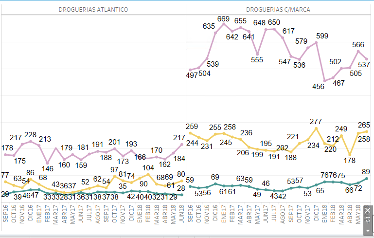
I'd like to know if there is a way to show a discrete line chart by axis and not only by values, I mean something similar to what Tableau does:
Tableau:
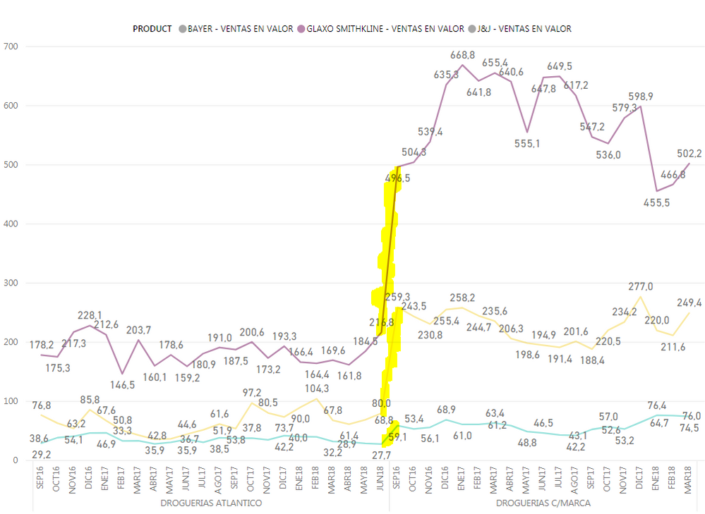
Power BI:
If you see the yellow highlighted line is not a real increment, it is just a change in one of the X axis: "DROGUERIAS ATLANTICO" to "DROGUERIAS C/MARCA".
I need to hide this comunication line and leave it like Tableau is showing the data and if we could put a line between them would be great!
Thanks in advanced!
Solved! Go to Solution.
- Mark as New
- Bookmark
- Subscribe
- Mute
- Subscribe to RSS Feed
- Permalink
- Report Inappropriate Content
Hello @Anonymous, I already have the latest release but still seems to allow more than one value only if you don't add a legend. Anyway I "solve" this adding NULL values in the dataset and telling the visual to show data with no values in the measure. Hope this feature get implemented soon, is pretty usefull.
Thanks for all the support guys!
![]()
- Mark as New
- Bookmark
- Subscribe
- Mute
- Subscribe to RSS Feed
- Permalink
- Report Inappropriate Content
Hi @SebastianLM ,
I seem to have missed the party.
Line chart x-axes do now support both linear as categorical values. 🙂
- Mark as New
- Bookmark
- Subscribe
- Mute
- Subscribe to RSS Feed
- Permalink
- Report Inappropriate Content
@SebastianLM This feature is now in the August release, you should try updating PowerBI and try making it now.
- Mark as New
- Bookmark
- Subscribe
- Mute
- Subscribe to RSS Feed
- Permalink
- Report Inappropriate Content
Hello @Anonymous, I already have the latest release but still seems to allow more than one value only if you don't add a legend. Anyway I "solve" this adding NULL values in the dataset and telling the visual to show data with no values in the measure. Hope this feature get implemented soon, is pretty usefull.
Thanks for all the support guys!
![]()
- Mark as New
- Bookmark
- Subscribe
- Mute
- Subscribe to RSS Feed
- Permalink
- Report Inappropriate Content
@SebastianLM you have to create 2 seperate charts for this. Power BI does not do this similar to Tableau unfortunately.
- Mark as New
- Bookmark
- Subscribe
- Mute
- Subscribe to RSS Feed
- Permalink
- Report Inappropriate Content
But the problem here is that sometimes it has more than 2 values. Well if this is not possible I think I'd need to find a workarround using R. Once I got it I'll post it here.
Thanks anyway.
- Mark as New
- Bookmark
- Subscribe
- Mute
- Subscribe to RSS Feed
- Permalink
- Report Inappropriate Content
Hi @SebastianLM,
Maybe you can create two separate measures, one for DROGUERIAS ATLANTICO and another for DROGUERIAS C/MARCA.
Regards,
Yuliana Gu
If this post helps, then please consider Accept it as the solution to help the other members find it more quickly.
- Mark as New
- Bookmark
- Subscribe
- Mute
- Subscribe to RSS Feed
- Permalink
- Report Inappropriate Content
Hi again @v-yulgu-msft,
I tried to manually create one especific measure for each value in MERCADO (the filed that contains DROGUERIAS ETC), but now I only can add them in the visual if I don't use a legend, this is frustrating, do you know any workaround for this? I mean a line chart with multiple values and using legends as well
- Mark as New
- Bookmark
- Subscribe
- Mute
- Subscribe to RSS Feed
- Permalink
- Report Inappropriate Content
Well, as I said before, there are more than ATLANTICO and C/MARCA, and it is not usable to create a different viz to each value, but thanks anyways.
In fact if someone know the correct way to do it with an R viz I'll apreciate it, or if ther is an special R forum to discuss this, please let me know.
Helpful resources

Microsoft Fabric Learn Together
Covering the world! 9:00-10:30 AM Sydney, 4:00-5:30 PM CET (Paris/Berlin), 7:00-8:30 PM Mexico City

Power BI Monthly Update - April 2024
Check out the April 2024 Power BI update to learn about new features.

| User | Count |
|---|---|
| 109 | |
| 98 | |
| 77 | |
| 66 | |
| 54 |
| User | Count |
|---|---|
| 144 | |
| 104 | |
| 101 | |
| 86 | |
| 64 |


