- Power BI forums
- Updates
- News & Announcements
- Get Help with Power BI
- Desktop
- Service
- Report Server
- Power Query
- Mobile Apps
- Developer
- DAX Commands and Tips
- Custom Visuals Development Discussion
- Health and Life Sciences
- Power BI Spanish forums
- Translated Spanish Desktop
- Power Platform Integration - Better Together!
- Power Platform Integrations (Read-only)
- Power Platform and Dynamics 365 Integrations (Read-only)
- Training and Consulting
- Instructor Led Training
- Dashboard in a Day for Women, by Women
- Galleries
- Community Connections & How-To Videos
- COVID-19 Data Stories Gallery
- Themes Gallery
- Data Stories Gallery
- R Script Showcase
- Webinars and Video Gallery
- Quick Measures Gallery
- 2021 MSBizAppsSummit Gallery
- 2020 MSBizAppsSummit Gallery
- 2019 MSBizAppsSummit Gallery
- Events
- Ideas
- Custom Visuals Ideas
- Issues
- Issues
- Events
- Upcoming Events
- Community Blog
- Power BI Community Blog
- Custom Visuals Community Blog
- Community Support
- Community Accounts & Registration
- Using the Community
- Community Feedback
Register now to learn Fabric in free live sessions led by the best Microsoft experts. From Apr 16 to May 9, in English and Spanish.
- Power BI forums
- Forums
- Get Help with Power BI
- Desktop
- Re: visualization
- Subscribe to RSS Feed
- Mark Topic as New
- Mark Topic as Read
- Float this Topic for Current User
- Bookmark
- Subscribe
- Printer Friendly Page
- Mark as New
- Bookmark
- Subscribe
- Mute
- Subscribe to RSS Feed
- Permalink
- Report Inappropriate Content
visualization
hello! i have a table that has 2 colums the first is years from 2012 to 2017 and the second in about two products i need to create a graph that will allow me to show for each year which were the sales for each product, im been trying to use the clustered columb chart but the problem is that it shows me the total of the sales of the products in all of the years not the total of each product per year.
hope you can help me
Solved! Go to Solution.
- Mark as New
- Bookmark
- Subscribe
- Mute
- Subscribe to RSS Feed
- Permalink
- Report Inappropriate Content
Hey,
sorry for the late response, but as far I understand your requirement this might be solve your requirement without any DAX magic involved 🙂
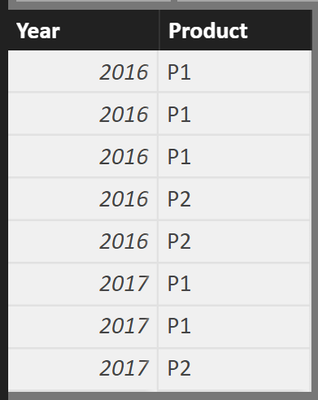
Here is a screenshot of a very simplistic datamodel, just containing two columns, year and product
I put the year column to the Axis pane (from the format of the xaxis i set the type to categorical), put the product to the legend pane and also ont the value pane (due to the text datatype of the column the aggregation COUNT is chosen).
You might wonder about the numbers that are shown in chart, this is simply due to the fact of the underlying base table shown here
Hopefully this is what you are looking for, from my point of understanding, there is no need to work with Quick measures for this requirement
Regards
Tom
Did I answer your question? Mark my post as a solution, this will help others!
Proud to be a Super User!
I accept Kudos 😉
Hamburg, Germany
- Mark as New
- Bookmark
- Subscribe
- Mute
- Subscribe to RSS Feed
- Permalink
- Report Inappropriate Content
Hi @anaorca1990,
Have you solved your problem with the solutions provided by @lisaeugene and @TomMartens?
If you have solved your problem, Please always accept the replies making sense as solution to your question so that people who may have the same question can get the solution directly.
If you still need help, please share some data sample and expected output, so that we can help further investigate on it?
Best regards,
Cherry
If this post helps, then please consider Accept it as the solution to help the other members find it more quickly.
- Mark as New
- Bookmark
- Subscribe
- Mute
- Subscribe to RSS Feed
- Permalink
- Report Inappropriate Content
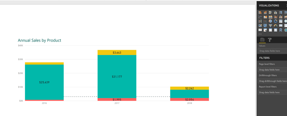
How about a stacked bar chart showing a bar for each year, segmented by product sales? To do that you need to choose that chart from your visualizations board. The fields you can use to come up with the sample one below are:
- 'Table'[Year] in Axis
- 'Table'[Products] in Legend
- 'Table'[SalesAmt] in Value.
You mentioned that you have only two columns in your table, but for my example here you need three. Sounds like you have the first two columns I mentioned, but need to have the sales amounts for the products in a third column in order to produce this kind of visualization.
Hope this helps!
- Mark as New
- Bookmark
- Subscribe
- Mute
- Subscribe to RSS Feed
- Permalink
- Report Inappropriate Content
hello
i have a problem cause they are only in two rows so this wont work, but thank you for help
- Mark as New
- Bookmark
- Subscribe
- Mute
- Subscribe to RSS Feed
- Permalink
- Report Inappropriate Content
actually I have no idea what you are trying to achieve.
Given your table there is a year column, put this to the axis of the clustered column chart.
There is a product column, put this to the legend pane of your chart.
Put the numeric sales column to the value pane, it will automatically be summed.
Done.
Why does this not work for you?
Maybe you can scribble a chart (based on easily identifyable data) and just provide the image
Regards
Tom
Did I answer your question? Mark my post as a solution, this will help others!
Proud to be a Super User!
I accept Kudos 😉
Hamburg, Germany
- Mark as New
- Bookmark
- Subscribe
- Mute
- Subscribe to RSS Feed
- Permalink
- Report Inappropriate Content
Hello,
the problem is there arent any numbers, everytime a name product shows is the list it equals one sale, i dont know if this makes it easier to understand
- Mark as New
- Bookmark
- Subscribe
- Mute
- Subscribe to RSS Feed
- Permalink
- Report Inappropriate Content
Hey,
sorry for the late response, but as far I understand your requirement this might be solve your requirement without any DAX magic involved 🙂
Here is a screenshot of a very simplistic datamodel, just containing two columns, year and product
I put the year column to the Axis pane (from the format of the xaxis i set the type to categorical), put the product to the legend pane and also ont the value pane (due to the text datatype of the column the aggregation COUNT is chosen).
You might wonder about the numbers that are shown in chart, this is simply due to the fact of the underlying base table shown here
Hopefully this is what you are looking for, from my point of understanding, there is no need to work with Quick measures for this requirement
Regards
Tom
Did I answer your question? Mark my post as a solution, this will help others!
Proud to be a Super User!
I accept Kudos 😉
Hamburg, Germany
- Mark as New
- Bookmark
- Subscribe
- Mute
- Subscribe to RSS Feed
- Permalink
- Report Inappropriate Content
I also struggled alot with the similar problem.Thanks alot this really helped
- Mark as New
- Bookmark
- Subscribe
- Mute
- Subscribe to RSS Feed
- Permalink
- Report Inappropriate Content
thank you so much for your patience, and your help.
- Mark as New
- Bookmark
- Subscribe
- Mute
- Subscribe to RSS Feed
- Permalink
- Report Inappropriate Content
Hi there,
Based on how I understand what you're trying to accomplish, your quick measure might be the fastest and best way to accomplish your visualization, given how your data's put together. There are many ways to build measures to count the Tipo de Contratos for a given year, but none of them are as simple or as fast as a quick measure. So, I'd stick with that for the time being.
That's my best answer for this situation. Hope it helps / Lisa
- Mark as New
- Bookmark
- Subscribe
- Mute
- Subscribe to RSS Feed
- Permalink
- Report Inappropriate Content
Hello,
the problem is there arent any numbers, everytime a name product shows is the list it equals one sale, i dont know if this makes it easier to understand
- Mark as New
- Bookmark
- Subscribe
- Mute
- Subscribe to RSS Feed
- Permalink
- Report Inappropriate Content
Hey,
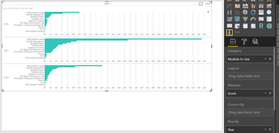
give the infographic desiger from the marketplace a try:
Here is a screenshot:
I also changed the type to bar:
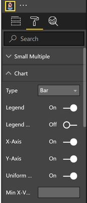
But maybe the default bar chart will also work
using the format option
Hopefully this gives you some ideas
Regards
Tom
Did I answer your question? Mark my post as a solution, this will help others!
Proud to be a Super User!
I accept Kudos 😉
Hamburg, Germany
- Mark as New
- Bookmark
- Subscribe
- Mute
- Subscribe to RSS Feed
- Permalink
- Report Inappropriate Content
hi Tom, thanks for you reply the problem is that only have two colums one with the year and the other with kind of th product, im attaching a pic, sorry is in spanish.
the first row is the years and the other one that is highlight is the product
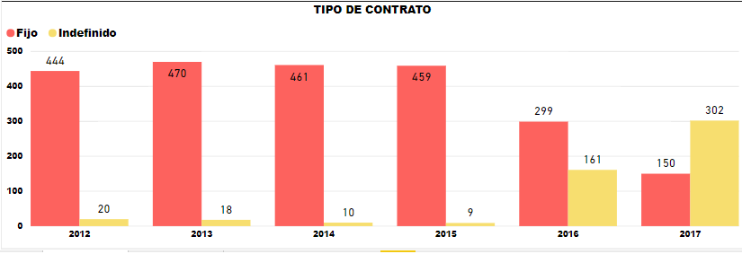
i manage to find a solution using a quick measure but i want to know if there is an easier way. what it does is that it counts how many items were sold by category per year
hope im clear, thank you for your help
Helpful resources

Microsoft Fabric Learn Together
Covering the world! 9:00-10:30 AM Sydney, 4:00-5:30 PM CET (Paris/Berlin), 7:00-8:30 PM Mexico City

Power BI Monthly Update - April 2024
Check out the April 2024 Power BI update to learn about new features.

| User | Count |
|---|---|
| 112 | |
| 100 | |
| 80 | |
| 64 | |
| 57 |
| User | Count |
|---|---|
| 146 | |
| 110 | |
| 93 | |
| 84 | |
| 67 |

