- Power BI forums
- Updates
- News & Announcements
- Get Help with Power BI
- Desktop
- Service
- Report Server
- Power Query
- Mobile Apps
- Developer
- DAX Commands and Tips
- Custom Visuals Development Discussion
- Health and Life Sciences
- Power BI Spanish forums
- Translated Spanish Desktop
- Power Platform Integration - Better Together!
- Power Platform Integrations (Read-only)
- Power Platform and Dynamics 365 Integrations (Read-only)
- Training and Consulting
- Instructor Led Training
- Dashboard in a Day for Women, by Women
- Galleries
- Community Connections & How-To Videos
- COVID-19 Data Stories Gallery
- Themes Gallery
- Data Stories Gallery
- R Script Showcase
- Webinars and Video Gallery
- Quick Measures Gallery
- 2021 MSBizAppsSummit Gallery
- 2020 MSBizAppsSummit Gallery
- 2019 MSBizAppsSummit Gallery
- Events
- Ideas
- Custom Visuals Ideas
- Issues
- Issues
- Events
- Upcoming Events
- Community Blog
- Power BI Community Blog
- Custom Visuals Community Blog
- Community Support
- Community Accounts & Registration
- Using the Community
- Community Feedback
Register now to learn Fabric in free live sessions led by the best Microsoft experts. From Apr 16 to May 9, in English and Spanish.
- Power BI forums
- Forums
- Get Help with Power BI
- Desktop
- selective slicer
- Subscribe to RSS Feed
- Mark Topic as New
- Mark Topic as Read
- Float this Topic for Current User
- Bookmark
- Subscribe
- Printer Friendly Page
- Mark as New
- Bookmark
- Subscribe
- Mute
- Subscribe to RSS Feed
- Permalink
- Report Inappropriate Content
selective slicer
Hi all,
I need to plot on clustered column chart the range distribution twice: the first one is the unfiltered version (made of by all the records in the table) and I need the second one to be dynamically adjustable based on a time slicer (I have a datetime column on my data model).
I don't know how to create a slicer that interacts only with the second dataset and not with the first one.
Thank you.
Regards,
Alberto
- Mark as New
- Bookmark
- Subscribe
- Mute
- Subscribe to RSS Feed
- Permalink
- Report Inappropriate Content
Hi,
You will need to create a new custom measure that ignores any filters set on the page. This can be done using the CALCULATE() function. Your aqua series can be linked to your core data, and your charcoal series can be linked to the new measure. This will mean that whenever you apply filters, the aqua series will be filtered but the charcoal series will stay as it is.
If you can post an example of your data structure, I (or another helpful member) can give you an example CALCULATE() function to use.
- Mark as New
- Bookmark
- Subscribe
- Mute
- Subscribe to RSS Feed
- Permalink
- Report Inappropriate Content
Hi Tobias,
it could be very useful for me because I'm at the very beginning with powerbi.
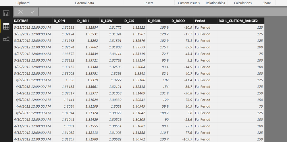
This is my data model:
DAYTIME is the field used in the slicer
RHGL_CUSTOM_RANGE2 is used to build tailored bins
Period is the legend
D_RHGL is the value to be aggregated (count) over the ranges.
Thank you,
Alberto
- Mark as New
- Bookmark
- Subscribe
- Mute
- Subscribe to RSS Feed
- Permalink
- Report Inappropriate Content
Hi,
Try this: NOTE - 'Table' is the name of your data table. Replace the word 'Table' in the formula below with your own table name (remember to use the quotation marks).
Custom Measure = CALCULATE(COUNT('Table'[D_RHGL]),ALL('Table'))
Then bind this to the charcoal series in your chart.
- Mark as New
- Bookmark
- Subscribe
- Mute
- Subscribe to RSS Feed
- Permalink
- Report Inappropriate Content
Hi Tobias,
I had to change something in the formula but it seems to work now. The measure I used is:
MyMeasure = CALCULATE(COUNT(HLCO_FREQ_DISTRIBUTION_1[D_RGHL]),ALLEXCEPT(HLCO_FREQ_DISTRIBUTION_1, HLCO_FREQ_DISTRIBUTION_1[RGHL_CUSTOM_RANGE2]))
Unfortunately I have another issue: if narrowing down the span of the aqua series I hit a period for whom that series has no values in a range, that range isn't showed (even if the other series has values in that range).
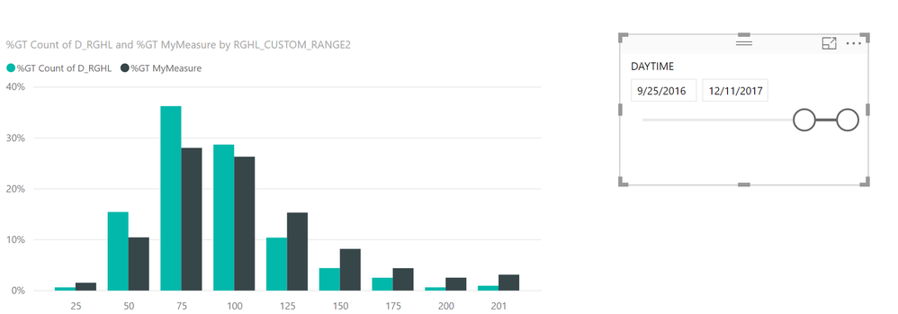
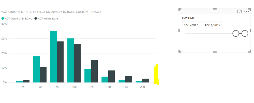
Maybe it should be more clear in the following images:
In this image all the ranges I defined are visible because both series have at least one element in each range.
In this image I narrowed down the slicer and the latest range (>200) disappeared even if the charcoal series has values in that range.
In any case thank you very much Tobias.
Regards,
Alberto
- Mark as New
- Bookmark
- Subscribe
- Mute
- Subscribe to RSS Feed
- Permalink
- Report Inappropriate Content
In the chart customisation pane, if you right-click the field that is used by the aqua series, you should see an option 'Show items with no data'.
Ticking this option will always show all of your category buckets, even when there are no values in the filtered view.
(P.S. Sorry I missed the fact that needed a 'Count' rather than a 'Sum' from your original post).
- Mark as New
- Bookmark
- Subscribe
- Mute
- Subscribe to RSS Feed
- Permalink
- Report Inappropriate Content
Hi Tobias,
I think my nightmare is over now 😉
I had to modify practically everything because 'Show items with no data' doesn't work if using 'Percent of Grand Total' (it shows a warning on the graph saying that it's unsupported).
So I removed the percentage view just for trying...the warning disappeared but still no luck. To make that work I had to move the custom ranges I defined in an external table and create 1:N relationship between the table of ranges and the table of data.
Then I cloned the data table to provide the data for the filtered data-series, binding the daytime column to the slicer.
Finally I had to define a custom measure for each data-series to calculate the percentage distribution:
MyMeasure = CALCULATE(COUNT(RAW_DATA[D_RGHL]))/(CALCULATE(COUNT(RAW_DATA[D_RGHL]),ALLSELECTED())/100)
It's working now; I'm pretty sure there is a simpler way to do that...but I didn't found it (yet).
Again, thank you very much.
Regards,
Alberto
- Mark as New
- Bookmark
- Subscribe
- Mute
- Subscribe to RSS Feed
- Permalink
- Report Inappropriate Content
You can edit interaction under "Format" tab to set it interact with other visuals or not.
Reference:
Visualization interactions in a Power BI report
Regards,
- Mark as New
- Bookmark
- Subscribe
- Mute
- Subscribe to RSS Feed
- Permalink
- Report Inappropriate Content
Hi v-sihou-msft,
thank you for the quick reply.
Unfortunately I don't think edit interaction function fits my needs.
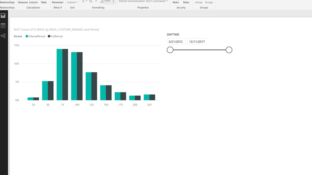
If you look at the following image, I'd like to slice only the aqua-coloured plot.
Helpful resources

Microsoft Fabric Learn Together
Covering the world! 9:00-10:30 AM Sydney, 4:00-5:30 PM CET (Paris/Berlin), 7:00-8:30 PM Mexico City

Power BI Monthly Update - April 2024
Check out the April 2024 Power BI update to learn about new features.

| User | Count |
|---|---|
| 109 | |
| 98 | |
| 77 | |
| 66 | |
| 54 |
| User | Count |
|---|---|
| 144 | |
| 104 | |
| 100 | |
| 86 | |
| 64 |


