- Power BI forums
- Updates
- News & Announcements
- Get Help with Power BI
- Desktop
- Service
- Report Server
- Power Query
- Mobile Apps
- Developer
- DAX Commands and Tips
- Custom Visuals Development Discussion
- Health and Life Sciences
- Power BI Spanish forums
- Translated Spanish Desktop
- Power Platform Integration - Better Together!
- Power Platform Integrations (Read-only)
- Power Platform and Dynamics 365 Integrations (Read-only)
- Training and Consulting
- Instructor Led Training
- Dashboard in a Day for Women, by Women
- Galleries
- Community Connections & How-To Videos
- COVID-19 Data Stories Gallery
- Themes Gallery
- Data Stories Gallery
- R Script Showcase
- Webinars and Video Gallery
- Quick Measures Gallery
- 2021 MSBizAppsSummit Gallery
- 2020 MSBizAppsSummit Gallery
- 2019 MSBizAppsSummit Gallery
- Events
- Ideas
- Custom Visuals Ideas
- Issues
- Issues
- Events
- Upcoming Events
- Community Blog
- Power BI Community Blog
- Custom Visuals Community Blog
- Community Support
- Community Accounts & Registration
- Using the Community
- Community Feedback
Register now to learn Fabric in free live sessions led by the best Microsoft experts. From Apr 16 to May 9, in English and Spanish.
- Power BI forums
- Forums
- Get Help with Power BI
- Desktop
- Re: reference band?
- Subscribe to RSS Feed
- Mark Topic as New
- Mark Topic as Read
- Float this Topic for Current User
- Bookmark
- Subscribe
- Printer Friendly Page
- Mark as New
- Bookmark
- Subscribe
- Mute
- Subscribe to RSS Feed
- Permalink
- Report Inappropriate Content
reference band?
hello everyone.
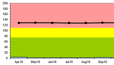
I have been trying to create a graph using the "line and Clustered column Chart" to achieve somewhat similar graph as above.
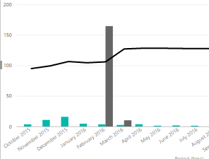
i currently managed until here:
I have 3 columns with value for color coding for Green, Red and yellow
Green is 75 and below. Red is 110 and above. Yellow is in between this two values. How do include the colored area to my graph that i drew? or probably a reference band? i am 1 day old to power bi so any help is greatly appreciated.
thank you!
Solved! Go to Solution.
- Mark as New
- Bookmark
- Subscribe
- Mute
- Subscribe to RSS Feed
- Permalink
- Report Inappropriate Content
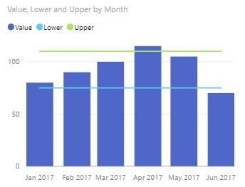
@GilbertQ, I dont think an average value was asked for. I was suggesting something like this:
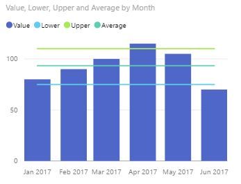
If you want the average then it would be easier to make a measure using something like:
Average = calculate(AVERAGE(Table1[Value]),all(Table1[Month]))
and create:
// If this is a solution please mark as such
- Mark as New
- Bookmark
- Subscribe
- Mute
- Subscribe to RSS Feed
- Permalink
- Report Inappropriate Content
A Power BI Idea has been submitted to support this idea:
- Mark as New
- Bookmark
- Subscribe
- Mute
- Subscribe to RSS Feed
- Permalink
- Report Inappropriate Content
Hi Joylili, Did you get any luck creating bands in Power BI, if yes could you please share. We are trying to achieve similar visulaization where I need bands.
I have 4 calculated columns in my dataset, which are 25th percentile, 50th Percentile, 75th Percentile and highest values, I need bands accoring to these columns. I also have a measure and a time dimension which I use for showing the line chart.
It would be great if you share.
Thanks!
- Mark as New
- Bookmark
- Subscribe
- Mute
- Subscribe to RSS Feed
- Permalink
- Report Inappropriate Content
Hi you wont be able to create this chart exactly. You could add lines for bounds using either:
1. a static constant (under the analysis tab for a visual) if you were using a line or column chart
2. if the bounds change by some dimensionality in the model then make a related table (related by the relevant dimension) that holds say Dimesion in the rows and then a column called upper bound and one called lower bound these would have the relevant limits in them. You can make one through Ribbon/Home/Enter Data.
I would keep in mind what the data is trying to do. Obviously you are migrating a report from excel. Ask the question, can I do it in a better way using this new tool?
// If this is a solution please mark as such
- Mark as New
- Bookmark
- Subscribe
- Mute
- Subscribe to RSS Feed
- Permalink
- Report Inappropriate Content
If you do want the Average value to be a line, you could create this using a Calculated Table in the Power BI model. Which you could then use as part of your line?
In terms of the colors I am not 100% sure if you can do what you want, but you might be able to using a visual as long as the values remain constant, or you shape your data to ensure that the value names stay the same.
- Mark as New
- Bookmark
- Subscribe
- Mute
- Subscribe to RSS Feed
- Permalink
- Report Inappropriate Content
@GilbertQ, I dont think an average value was asked for. I was suggesting something like this:
If you want the average then it would be easier to make a measure using something like:
Average = calculate(AVERAGE(Table1[Value]),all(Table1[Month]))
and create:
// If this is a solution please mark as such
- Mark as New
- Bookmark
- Subscribe
- Mute
- Subscribe to RSS Feed
- Permalink
- Report Inappropriate Content
hello everyone.
I have been trying to create a graph using the "line and Clustered column Chart" to achieve somewhat similar graph as above.
i currently managed until here:
I have 3 columns with value for color coding for Green, Red and yellow
Green is 75 and below. Red is 110 and above. Yellow is in between this two values. How do include the colored area to my graph that i drew? or probably a reference band? i am 1 day old to power bi so any help is greatly appreciated.
thank you!
- Mark as New
- Bookmark
- Subscribe
- Mute
- Subscribe to RSS Feed
- Permalink
- Report Inappropriate Content
@Anonymous I believe you cannot achieve the color band in column chart. Same you can try out in stacked area chart. Hope this helps !
Helpful resources

Microsoft Fabric Learn Together
Covering the world! 9:00-10:30 AM Sydney, 4:00-5:30 PM CET (Paris/Berlin), 7:00-8:30 PM Mexico City

Power BI Monthly Update - April 2024
Check out the April 2024 Power BI update to learn about new features.

| User | Count |
|---|---|
| 112 | |
| 97 | |
| 83 | |
| 67 | |
| 61 |
| User | Count |
|---|---|
| 150 | |
| 120 | |
| 99 | |
| 87 | |
| 68 |


