- Power BI forums
- Updates
- News & Announcements
- Get Help with Power BI
- Desktop
- Service
- Report Server
- Power Query
- Mobile Apps
- Developer
- DAX Commands and Tips
- Custom Visuals Development Discussion
- Health and Life Sciences
- Power BI Spanish forums
- Translated Spanish Desktop
- Power Platform Integration - Better Together!
- Power Platform Integrations (Read-only)
- Power Platform and Dynamics 365 Integrations (Read-only)
- Training and Consulting
- Instructor Led Training
- Dashboard in a Day for Women, by Women
- Galleries
- Community Connections & How-To Videos
- COVID-19 Data Stories Gallery
- Themes Gallery
- Data Stories Gallery
- R Script Showcase
- Webinars and Video Gallery
- Quick Measures Gallery
- 2021 MSBizAppsSummit Gallery
- 2020 MSBizAppsSummit Gallery
- 2019 MSBizAppsSummit Gallery
- Events
- Ideas
- Custom Visuals Ideas
- Issues
- Issues
- Events
- Upcoming Events
- Community Blog
- Power BI Community Blog
- Custom Visuals Community Blog
- Community Support
- Community Accounts & Registration
- Using the Community
- Community Feedback
Register now to learn Fabric in free live sessions led by the best Microsoft experts. From Apr 16 to May 9, in English and Spanish.
- Power BI forums
- Forums
- Get Help with Power BI
- Desktop
- Re: Yearly column chart with totals as percentage ...
- Subscribe to RSS Feed
- Mark Topic as New
- Mark Topic as Read
- Float this Topic for Current User
- Bookmark
- Subscribe
- Printer Friendly Page
- Mark as New
- Bookmark
- Subscribe
- Mute
- Subscribe to RSS Feed
- Permalink
- Report Inappropriate Content
Yearly column chart with totals as percentage of month
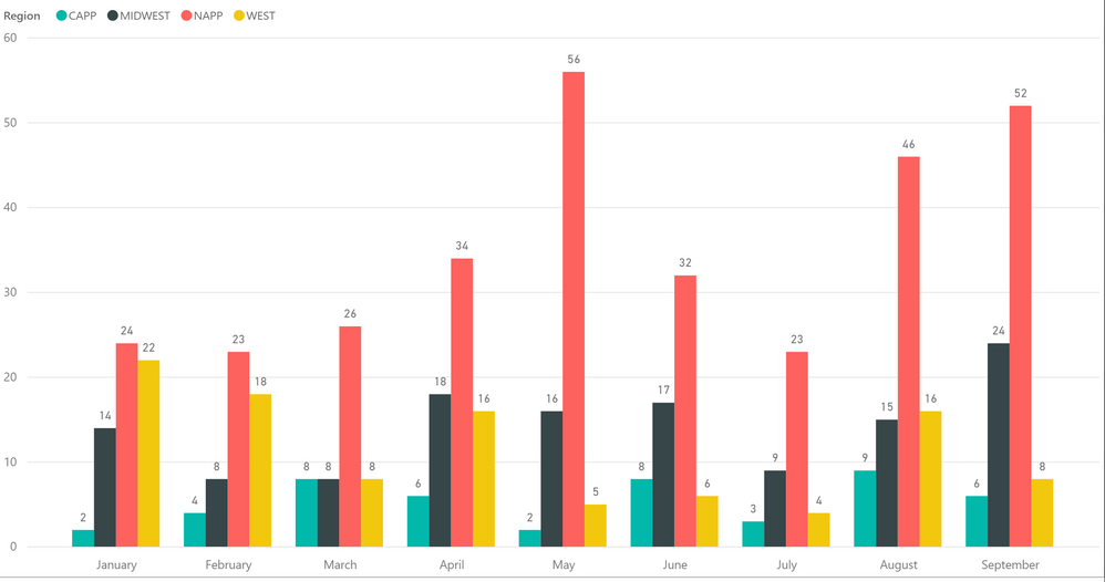
I currently have a yearly chart showing a total for each region per month. I would like to show the values as a percentage of the monthly total, but when I change it to show as a %, it displays the percentage of the year grand total. I've tried adding a few measures with no luck, I still only get a percentage of the year total. Any ideas? Thanks in advance for any help.
Solved! Go to Solution.
- Mark as New
- Bookmark
- Subscribe
- Mute
- Subscribe to RSS Feed
- Permalink
- Report Inappropriate Content
Hi @97gesex,
Please create the percentage using formula below.
Percentage = COUNT(Table[Region])/CALCULATE(COUNT(Table[Region]),ALLEXCEPT(Table,Table[Month]))
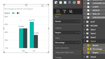
Then put the measure in value level, and check if it works fine.
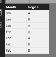
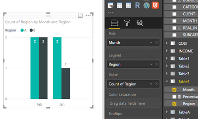
I create the following sample table, I create the measure and get desired result based on my sample table, please review.
Percentage = COUNT(Table4[Region])/CALCULATE(COUNT(Table4[Region]),ALLEXCEPT(Table4,Table4[Month]))
Please review the result as the screenshot shown.
Best Regards,
Angelia
- Mark as New
- Bookmark
- Subscribe
- Mute
- Subscribe to RSS Feed
- Permalink
- Report Inappropriate Content
You could change the value (sum) to percentage as following.
Click the value dropdown and convert it and click show value as -> Percentage og grand total.
Please elaborate more to provide a solution effectively.
Check below image for above described.
- Mark as New
- Bookmark
- Subscribe
- Mute
- Subscribe to RSS Feed
- Permalink
- Report Inappropriate Content
For instance, in the month of September, I have a total count of 90 for the month. I would like it to show the value each region has as a percentage of the grand total for only that month (NAPP would be 57%, Midwest would be 24%, etc). The option of Show Value As -> Percent of Grand Total gives me a percentage for the total count of the entire year, as opposed to a monthly total. Hope that helps to clarify.
- Mark as New
- Bookmark
- Subscribe
- Mute
- Subscribe to RSS Feed
- Permalink
- Report Inappropriate Content
Hi @97gesex,
Based on my understanding, the count of NAPP is 24, 24/90 should be 27%, how to get 57%? Could you plesae share more details?
Best Regards,
Angelia
- Mark as New
- Bookmark
- Subscribe
- Mute
- Subscribe to RSS Feed
- Permalink
- Report Inappropriate Content
- Mark as New
- Bookmark
- Subscribe
- Mute
- Subscribe to RSS Feed
- Permalink
- Report Inappropriate Content
Hi @97gesex,
Please create the percentage using formula below.
Percentage = COUNT(Table[Region])/CALCULATE(COUNT(Table[Region]),ALLEXCEPT(Table,Table[Month]))
Then put the measure in value level, and check if it works fine.
I create the following sample table, I create the measure and get desired result based on my sample table, please review.
Percentage = COUNT(Table4[Region])/CALCULATE(COUNT(Table4[Region]),ALLEXCEPT(Table4,Table4[Month]))
Please review the result as the screenshot shown.
Best Regards,
Angelia
- Mark as New
- Bookmark
- Subscribe
- Mute
- Subscribe to RSS Feed
- Permalink
- Report Inappropriate Content
Hi Angelia,
Would you please update your solution for the current version of Power BI? There is no longer a Value field well for clustered bar charts.
Version: 2.115.663.0 64-bit (March 2023)
- Mark as New
- Bookmark
- Subscribe
- Mute
- Subscribe to RSS Feed
- Permalink
- Report Inappropriate Content
Hi @v-huizhn-msft ,
My data is little different, I tried modifying the DAX but the Acual % is showing Acutal 100% for itself which is not correct.
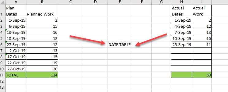
My data looks something like this, Planned is coming from one table and Actual from other which i have connected over date table.
I'll be ploting % values on weekend dates and by months Bins on Clustered column chart, or in table showing % work done that Weekend date or on the Month bin date.
Like here for example , In Sept Total Planned = 57 , Total Actual = 59 .So Total effort = (59/57)*100 = 103% work and for the month of Sept actual % = 47%. I am having difficulty preparing DAX for that.
Also for Running total, I just used the running total Quick measure for Planned , But for Actual, since it is dividing by itself by End of Sept running total is showing 100% where as it should be 47.58%
- Mark as New
- Bookmark
- Subscribe
- Mute
- Subscribe to RSS Feed
- Permalink
- Report Inappropriate Content
Hi @97gesex,
Share the link from where i can download your file.
Regards,
Ashish Mathur
http://www.ashishmathur.com
https://www.linkedin.com/in/excelenthusiasts/
- Mark as New
- Bookmark
- Subscribe
- Mute
- Subscribe to RSS Feed
- Permalink
- Report Inappropriate Content
Due to customer confidentiality I dont think I'll be able to share the file. This graph is just a small portion of an entire dashboard I've created.
- Mark as New
- Bookmark
- Subscribe
- Mute
- Subscribe to RSS Feed
- Permalink
- Report Inappropriate Content
Hi,
Share a dummy dataset.
Regards,
Ashish Mathur
http://www.ashishmathur.com
https://www.linkedin.com/in/excelenthusiasts/
- Mark as New
- Bookmark
- Subscribe
- Mute
- Subscribe to RSS Feed
- Permalink
- Report Inappropriate Content
Could you explain how to do that?
- Mark as New
- Bookmark
- Subscribe
- Mute
- Subscribe to RSS Feed
- Permalink
- Report Inappropriate Content
Hi,
Mock up your data in that file and then share it's download link.
Regards,
Ashish Mathur
http://www.ashishmathur.com
https://www.linkedin.com/in/excelenthusiasts/
- Mark as New
- Bookmark
- Subscribe
- Mute
- Subscribe to RSS Feed
- Permalink
- Report Inappropriate Content
You will need to use an additional column / conditional column into your table in order to calculate the %
(According tp the view you're interested)
Helpful resources

Microsoft Fabric Learn Together
Covering the world! 9:00-10:30 AM Sydney, 4:00-5:30 PM CET (Paris/Berlin), 7:00-8:30 PM Mexico City

Power BI Monthly Update - April 2024
Check out the April 2024 Power BI update to learn about new features.

| User | Count |
|---|---|
| 113 | |
| 100 | |
| 78 | |
| 76 | |
| 52 |
| User | Count |
|---|---|
| 144 | |
| 109 | |
| 108 | |
| 88 | |
| 61 |
