- Power BI forums
- Updates
- News & Announcements
- Get Help with Power BI
- Desktop
- Service
- Report Server
- Power Query
- Mobile Apps
- Developer
- DAX Commands and Tips
- Custom Visuals Development Discussion
- Health and Life Sciences
- Power BI Spanish forums
- Translated Spanish Desktop
- Power Platform Integration - Better Together!
- Power Platform Integrations (Read-only)
- Power Platform and Dynamics 365 Integrations (Read-only)
- Training and Consulting
- Instructor Led Training
- Dashboard in a Day for Women, by Women
- Galleries
- Community Connections & How-To Videos
- COVID-19 Data Stories Gallery
- Themes Gallery
- Data Stories Gallery
- R Script Showcase
- Webinars and Video Gallery
- Quick Measures Gallery
- 2021 MSBizAppsSummit Gallery
- 2020 MSBizAppsSummit Gallery
- 2019 MSBizAppsSummit Gallery
- Events
- Ideas
- Custom Visuals Ideas
- Issues
- Issues
- Events
- Upcoming Events
- Community Blog
- Power BI Community Blog
- Custom Visuals Community Blog
- Community Support
- Community Accounts & Registration
- Using the Community
- Community Feedback
Register now to learn Fabric in free live sessions led by the best Microsoft experts. From Apr 16 to May 9, in English and Spanish.
- Power BI forums
- Forums
- Get Help with Power BI
- Desktop
- Re: YTD Linechart comparison of different years
- Subscribe to RSS Feed
- Mark Topic as New
- Mark Topic as Read
- Float this Topic for Current User
- Bookmark
- Subscribe
- Printer Friendly Page
- Mark as New
- Bookmark
- Subscribe
- Mute
- Subscribe to RSS Feed
- Permalink
- Report Inappropriate Content
YTD Linechart comparison of different years
Hello,
I do have a Problem:
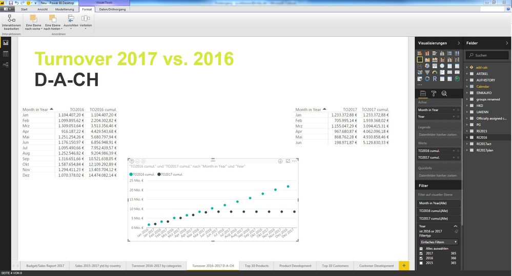
In this line chart there should be shown the cumulated turnover for the years 2016 and 2017. I have created a measure for the cumulated turnovers per year, because I want them to be shown month by month. Now in this case somehow only the cumulated turnover for 2017 is shown in the chart, the cumulated turnover for 2016 isn't even shown on the chart. Anyone a clue why this happens and why the cumulated turnover for 2016 isn't shown?
Solved! Go to Solution.
- Mark as New
- Bookmark
- Subscribe
- Mute
- Subscribe to RSS Feed
- Permalink
- Report Inappropriate Content
Create relationship between the new table and your calendar table using Date field. Then create YTD using the similar formula below and create Line chart as follows.
YTD = TOTALYTD(SUM(NewTable[field]),'Calendar'[Date])
Regards,
If this post helps, then please consider Accept it as the solution to help the other members find it more quickly.
- Mark as New
- Bookmark
- Subscribe
- Mute
- Subscribe to RSS Feed
- Permalink
- Report Inappropriate Content
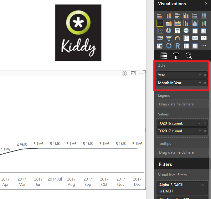
the drill-down button isn't working as expected. Like I said, I am getting dots for every single month of the years 2016 and 2017 for the cumulated turnover. But what I need instead are lines which connect every single month of the specific year.
- Mark as New
- Bookmark
- Subscribe
- Mute
- Subscribe to RSS Feed
- Permalink
- Report Inappropriate Content
@Paddhof1984,
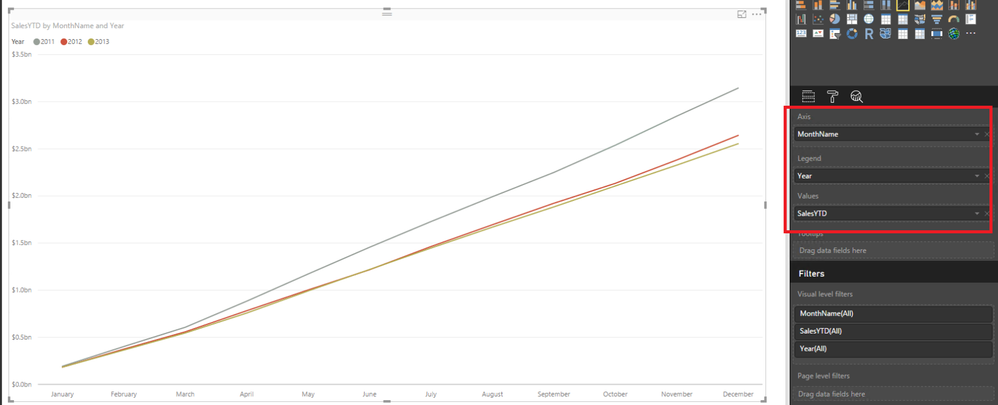
You would need to put Year in the first level when creating Line chart as shown in the screenshot below, otherwise you would get dots when you turn on drill down as the data for single month of different years is not linear, it is not possible to show it as line.
If you need to put Month in Year in the first level, please append the two tables in a single table, then create YTD, which is described in my first reply.
Regards,
Lydia
If this post helps, then please consider Accept it as the solution to help the other members find it more quickly.
- Mark as New
- Bookmark
- Subscribe
- Mute
- Subscribe to RSS Feed
- Permalink
- Report Inappropriate Content
@v-yuezhe-msft So there is no possibility to compare both cumulated turnovers month by month with the line chart, so that both turnover values increase for every single month and are, I should say" laid above each other?
- Mark as New
- Bookmark
- Subscribe
- Mute
- Subscribe to RSS Feed
- Permalink
- Report Inappropriate Content
@Paddhof1984,
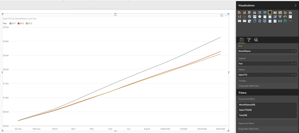
The only way is to append the two table in a single table, then create YTD and create Line chart by putting Month in Year to Axis and putting Year to Legend.
Regards,
If this post helps, then please consider Accept it as the solution to help the other members find it more quickly.
- Mark as New
- Bookmark
- Subscribe
- Mute
- Subscribe to RSS Feed
- Permalink
- Report Inappropriate Content
I did append both tables into one table. The issue here now is, that my measures for the cumulative turnover for both years are refering to the respective single table. But in this case I'd need the cumulative turnover relying on the new table to2016+2017act for each year for every month. Any Idea how to implement this?
- Mark as New
- Bookmark
- Subscribe
- Mute
- Subscribe to RSS Feed
- Permalink
- Report Inappropriate Content
Create relationship between the new table and your calendar table using Date field. Then create YTD using the similar formula below and create Line chart as follows.
YTD = TOTALYTD(SUM(NewTable[field]),'Calendar'[Date])
Regards,
If this post helps, then please consider Accept it as the solution to help the other members find it more quickly.
- Mark as New
- Bookmark
- Subscribe
- Mute
- Subscribe to RSS Feed
- Permalink
- Report Inappropriate Content
- Mark as New
- Bookmark
- Subscribe
- Mute
- Subscribe to RSS Feed
- Permalink
- Report Inappropriate Content
@Paddhof1984,
You can follow Eric's suggestion in this similar thread to append columns of your tables.
Regards,
If this post helps, then please consider Accept it as the solution to help the other members find it more quickly.
- Mark as New
- Bookmark
- Subscribe
- Mute
- Subscribe to RSS Feed
- Permalink
- Report Inappropriate Content
@Paddhof1984,
You should add Year field to your visuals as shown in the following screenshot. Without the Year field, Power BI Desktop can't determine which YTD to show. You can review the modified PBIX file to get details.
Another option is to append the RE2016 and RE2017act tables, then create YTD using TOTALYTD() function and create a line chart as shown in the screenshot below.
For more details about calculating YTD of different years, please review the following blog.
https://javierguillen.wordpress.com/2012/11/28/running-total-techniques-in-dax/
Regards,
If this post helps, then please consider Accept it as the solution to help the other members find it more quickly.
- Mark as New
- Bookmark
- Subscribe
- Mute
- Subscribe to RSS Feed
- Permalink
- Report Inappropriate Content
Hello @v-yuezhe-msft
I added the year from calendar as filter, but now the cumulated turnover is shown as dots instead of lines. Any suggestion?
- Mark as New
- Bookmark
- Subscribe
- Mute
- Subscribe to RSS Feed
- Permalink
- Report Inappropriate Content
@Paddhof1984 ,
Please review the PBIX file I send you. I create a YearMonth column in calendar table, and drag it to the Line chart.
Regards,
If this post helps, then please consider Accept it as the solution to help the other members find it more quickly.
- Mark as New
- Bookmark
- Subscribe
- Mute
- Subscribe to RSS Feed
- Permalink
- Report Inappropriate Content
thanks for your support. In this case this isn't what I need. What I need is the cumulated turnover to be shown and to be compared to turnover from other years. This new line chart, building up on the new YearMonth column does not show the cumulated turnover.
My last post shows what I need, but instead of dots I do need lines to be shown.
- Mark as New
- Bookmark
- Subscribe
- Mute
- Subscribe to RSS Feed
- Permalink
- Report Inappropriate Content
@Paddhof1984,
Click the third button to drill down the line chart. You can review the modified PBIX file to get more details.
Regards,
If this post helps, then please consider Accept it as the solution to help the other members find it more quickly.
- Mark as New
- Bookmark
- Subscribe
- Mute
- Subscribe to RSS Feed
- Permalink
- Report Inappropriate Content
Hi,
This seems a bit strange. Will you please share your DAX measures, or, even better, your pbix file ?
I notice that you have a visual filter on your line chart ("DACH"). It might come from this ?
- Mark as New
- Bookmark
- Subscribe
- Mute
- Subscribe to RSS Feed
- Permalink
- Report Inappropriate Content
Hello,
thanks for the hint. Right after I read your post I thought this might be the issue with the 2016 to cumulated not to be shown on the line chart. But I have removed the visual filter "DACH", but still there's only shown the turnover for 2017.
I do have two DAX-Measures:
TO2016 cumul. = TOTALYTD(SUM(RE2016[TO2016])|'Calendar'[Date])
TO2017 cumul. = TOTALYTD(SUM(RE2017act[TO2017])|'Calendar'[Date])
In case this souldn't help you in any ways, I'll share my pbix file with you. Thanks a lot.
- Mark as New
- Bookmark
- Subscribe
- Mute
- Subscribe to RSS Feed
- Permalink
- Report Inappropriate Content
Furthermore in case I am adding an additional Filter for year, if i choose 2016 and 2017 on the chart, the cumulated turnover for 2016 won't show up, only to for 2017, but if I deselect 2017 filter, 2016 is shown.
Any idea what this could be?
- Mark as New
- Bookmark
- Subscribe
- Mute
- Subscribe to RSS Feed
- Permalink
- Report Inappropriate Content
@Paddhof1984,
Please share the PBIX file for us to analyze. You can upload PBIX file to OneDrive and post shared link here.
Regards,
If this post helps, then please consider Accept it as the solution to help the other members find it more quickly.
- Mark as New
- Bookmark
- Subscribe
- Mute
- Subscribe to RSS Feed
- Permalink
- Report Inappropriate Content
Helpful resources

Microsoft Fabric Learn Together
Covering the world! 9:00-10:30 AM Sydney, 4:00-5:30 PM CET (Paris/Berlin), 7:00-8:30 PM Mexico City

Power BI Monthly Update - April 2024
Check out the April 2024 Power BI update to learn about new features.

| User | Count |
|---|---|
| 114 | |
| 100 | |
| 75 | |
| 73 | |
| 49 |
| User | Count |
|---|---|
| 145 | |
| 109 | |
| 109 | |
| 90 | |
| 64 |


