- Power BI forums
- Updates
- News & Announcements
- Get Help with Power BI
- Desktop
- Service
- Report Server
- Power Query
- Mobile Apps
- Developer
- DAX Commands and Tips
- Custom Visuals Development Discussion
- Health and Life Sciences
- Power BI Spanish forums
- Translated Spanish Desktop
- Power Platform Integration - Better Together!
- Power Platform Integrations (Read-only)
- Power Platform and Dynamics 365 Integrations (Read-only)
- Training and Consulting
- Instructor Led Training
- Dashboard in a Day for Women, by Women
- Galleries
- Community Connections & How-To Videos
- COVID-19 Data Stories Gallery
- Themes Gallery
- Data Stories Gallery
- R Script Showcase
- Webinars and Video Gallery
- Quick Measures Gallery
- 2021 MSBizAppsSummit Gallery
- 2020 MSBizAppsSummit Gallery
- 2019 MSBizAppsSummit Gallery
- Events
- Ideas
- Custom Visuals Ideas
- Issues
- Issues
- Events
- Upcoming Events
- Community Blog
- Power BI Community Blog
- Custom Visuals Community Blog
- Community Support
- Community Accounts & Registration
- Using the Community
- Community Feedback
Register now to learn Fabric in free live sessions led by the best Microsoft experts. From Apr 16 to May 9, in English and Spanish.
- Power BI forums
- Forums
- Get Help with Power BI
- Desktop
- Re: Y axis labels cut off in barchart
- Subscribe to RSS Feed
- Mark Topic as New
- Mark Topic as Read
- Float this Topic for Current User
- Bookmark
- Subscribe
- Printer Friendly Page
- Mark as New
- Bookmark
- Subscribe
- Mute
- Subscribe to RSS Feed
- Permalink
- Report Inappropriate Content
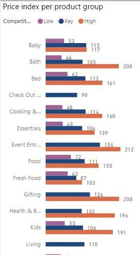
Y axis labels cut off in barchart
Of course I have limited space on my dashboard but I'd like to see the axis of my barchart.
Can I adjust that somewhere? I'm okay with looking at smaller barcharts, as long as I can see the full y axis
Solved! Go to Solution.
- Mark as New
- Bookmark
- Subscribe
- Mute
- Subscribe to RSS Feed
- Permalink
- Report Inappropriate Content
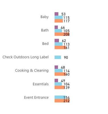
It's a pain, the axes text alignment is controlled by an algorithm and you can't fix it with a single visual
I was able to get the result by using two visuals, a single column table visual with right aligned text (trick is to adjust the row padding to space the table rows out the same amount) and the horizontally narrow bar chart visual with no axes, titles etc. You might want to add the legend by snipping the legend as a picture and reinserting - that way the legend doesn't get cropped as well.
You get the right result by juggling the table row padding, and adjusting the vertical size of the adjacent bar chart until the table rows line up with the respective bar chart categories.
Table Formatting
'Sparse' table style, grid outline colour 'White', Row padding = 12, title off, Field formatting for 'Category' field - Alignment = 'Right'
Second visual is a bar chart with no legend, no X,Y axes.
Here's the example file - hope that helps!
- Mark as New
- Bookmark
- Subscribe
- Mute
- Subscribe to RSS Feed
- Permalink
- Report Inappropriate Content
Hi @Anonymous,
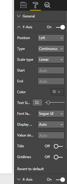
Lay out options for the Y-axis of visuals can be found in the format pane of the visual, see picture below:
If you enable the Y-axis it should show at all times. Hope this is what you searched for.
Regards,
L.Meijdam
Helpful resources

Microsoft Fabric Learn Together
Covering the world! 9:00-10:30 AM Sydney, 4:00-5:30 PM CET (Paris/Berlin), 7:00-8:30 PM Mexico City

Power BI Monthly Update - April 2024
Check out the April 2024 Power BI update to learn about new features.

| User | Count |
|---|---|
| 109 | |
| 98 | |
| 77 | |
| 66 | |
| 54 |
| User | Count |
|---|---|
| 144 | |
| 104 | |
| 100 | |
| 86 | |
| 64 |


