- Power BI forums
- Updates
- News & Announcements
- Get Help with Power BI
- Desktop
- Service
- Report Server
- Power Query
- Mobile Apps
- Developer
- DAX Commands and Tips
- Custom Visuals Development Discussion
- Health and Life Sciences
- Power BI Spanish forums
- Translated Spanish Desktop
- Power Platform Integration - Better Together!
- Power Platform Integrations (Read-only)
- Power Platform and Dynamics 365 Integrations (Read-only)
- Training and Consulting
- Instructor Led Training
- Dashboard in a Day for Women, by Women
- Galleries
- Community Connections & How-To Videos
- COVID-19 Data Stories Gallery
- Themes Gallery
- Data Stories Gallery
- R Script Showcase
- Webinars and Video Gallery
- Quick Measures Gallery
- 2021 MSBizAppsSummit Gallery
- 2020 MSBizAppsSummit Gallery
- 2019 MSBizAppsSummit Gallery
- Events
- Ideas
- Custom Visuals Ideas
- Issues
- Issues
- Events
- Upcoming Events
- Community Blog
- Power BI Community Blog
- Custom Visuals Community Blog
- Community Support
- Community Accounts & Registration
- Using the Community
- Community Feedback
Register now to learn Fabric in free live sessions led by the best Microsoft experts. From Apr 16 to May 9, in English and Spanish.
- Power BI forums
- Forums
- Get Help with Power BI
- Desktop
- Re: Timeline slicer & variable months
- Subscribe to RSS Feed
- Mark Topic as New
- Mark Topic as Read
- Float this Topic for Current User
- Bookmark
- Subscribe
- Printer Friendly Page
- Mark as New
- Bookmark
- Subscribe
- Mute
- Subscribe to RSS Feed
- Permalink
- Report Inappropriate Content
Timeline slicer & variable months
I'm using this visualization and I have down pat showing "current selected" data. What I'm wondering how to do is on the same page - show the current selected time period from the slicer (say in a bar graph) and have a bar right next to it that shows the previous unit of time that is selected. For instance if I have the month of August selected, I would want this bar graph to show August and July next to each other. If I changed the slicer to show year, I would want 2016 and 2015 to show on the graph. Is there a way to write DAX that goes back one time period based on what slice is selected from the slicer?
- Mark as New
- Bookmark
- Subscribe
- Mute
- Subscribe to RSS Feed
- Permalink
- Report Inappropriate Content
Hi @ngg4686,
Agree with CahabaData. When creating a measure to show data of previous year/quarter/month, you can use PREVIOUSYEAR function, PREVIOUSQUARTER function and PREVIOUSMONTH function . There is an example about how to show data of current quarter and previous quarter in this article for your reference.
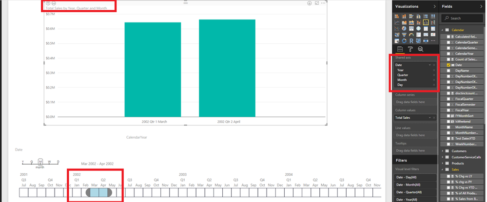
Besides, in your scenario, why not directly select date ranges in Timeline slicer and combine built-in date hierarchy of Power BI Desktop to show data in your graph? An example is shown in the following screenshot.
Thanks,
Lydia Zhang
If this post helps, then please consider Accept it as the solution to help the other members find it more quickly.
- Mark as New
- Bookmark
- Subscribe
- Mute
- Subscribe to RSS Feed
- Permalink
- Report Inappropriate Content
I believe one cannot put the cart in front of the horse - or in this case the slicer in front of the calculation - - - sorry for bad joke.....
In your data model where you now have value 'X' - you want also a measure/column along side with value 'X-prior year' (or whichever period). So that X and X-prior are side by side values. Then if you filter on X the X-prior value is available to you.
- Mark as New
- Bookmark
- Subscribe
- Mute
- Subscribe to RSS Feed
- Permalink
- Report Inappropriate Content
Is there a way that I can set a dynamic date heriarchy? If I have "week" selected, I want a bar graph to show week over week what is going on. If I change it to "Month" I want to see data aggregated by month. Basically in the bar graph "Axis" I would want something that looks at slicer to determine how to set the heirarchy.
- Mark as New
- Bookmark
- Subscribe
- Mute
- Subscribe to RSS Feed
- Permalink
- Report Inappropriate Content
When your granular row value is a date - the Power BI features can expand that date into its fields for week, month, quarter values.
You can use those period values for filtering & aggregating
Any value fields of that data model can be aggregated by those periods.
so I believe you can get what you seek if I understand your question......
Helpful resources

Microsoft Fabric Learn Together
Covering the world! 9:00-10:30 AM Sydney, 4:00-5:30 PM CET (Paris/Berlin), 7:00-8:30 PM Mexico City

Power BI Monthly Update - April 2024
Check out the April 2024 Power BI update to learn about new features.

| User | Count |
|---|---|
| 117 | |
| 107 | |
| 69 | |
| 68 | |
| 43 |
| User | Count |
|---|---|
| 148 | |
| 104 | |
| 102 | |
| 88 | |
| 66 |

