- Power BI forums
- Updates
- News & Announcements
- Get Help with Power BI
- Desktop
- Service
- Report Server
- Power Query
- Mobile Apps
- Developer
- DAX Commands and Tips
- Custom Visuals Development Discussion
- Health and Life Sciences
- Power BI Spanish forums
- Translated Spanish Desktop
- Power Platform Integration - Better Together!
- Power Platform Integrations (Read-only)
- Power Platform and Dynamics 365 Integrations (Read-only)
- Training and Consulting
- Instructor Led Training
- Dashboard in a Day for Women, by Women
- Galleries
- Community Connections & How-To Videos
- COVID-19 Data Stories Gallery
- Themes Gallery
- Data Stories Gallery
- R Script Showcase
- Webinars and Video Gallery
- Quick Measures Gallery
- 2021 MSBizAppsSummit Gallery
- 2020 MSBizAppsSummit Gallery
- 2019 MSBizAppsSummit Gallery
- Events
- Ideas
- Custom Visuals Ideas
- Issues
- Issues
- Events
- Upcoming Events
- Community Blog
- Power BI Community Blog
- Custom Visuals Community Blog
- Community Support
- Community Accounts & Registration
- Using the Community
- Community Feedback
Register now to learn Fabric in free live sessions led by the best Microsoft experts. From Apr 16 to May 9, in English and Spanish.
- Power BI forums
- Forums
- Get Help with Power BI
- Desktop
- Problem with Running total vizualisation
- Subscribe to RSS Feed
- Mark Topic as New
- Mark Topic as Read
- Float this Topic for Current User
- Bookmark
- Subscribe
- Printer Friendly Page
- Mark as New
- Bookmark
- Subscribe
- Mute
- Subscribe to RSS Feed
- Permalink
- Report Inappropriate Content
Problem with Running total vizualisation
Hi,
I am having a problem when graphically displaying my MTD running total sales.
I use the following Dax measure that I was able to come up with after reading the http://www.daxpatterns.com/cumulative-total article.
MTD Running Total Sales =
IF (
    MIN ( 'Calendar'[Date] )
        <= CALCULATE (
            MAX ( Sales[Date] );
            FILTER ( ALL ( Sales ); RELATED ( 'Calendar'[MonthOffset] ) = 0 )
        );
    CALCULATE (
        [Total Sales];
        FILTER (
            FILTER ( ALL ( 'Calendar' ); 'Calendar'[MonthOffset] = 0 );
            'Calendar'[Date] <= MAX ( 'Calendar'[Date] )
        )
    )
)
The Total Sales measure is just the explict measure for my Sales table (= SUM(Sales[Sales]))
My Calendar table provides offsets allowing me to easily create measure relative to the current date.
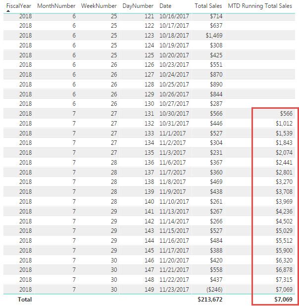
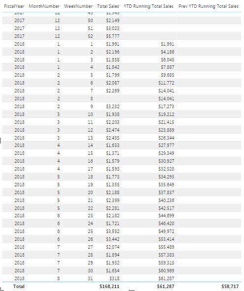
When displaying the result of my MTD Running Total Sales in a table, everything looks just fine, the values start and stop whenever they are supposed to:
Now, when displaying the same information using a line chart, using the Calendar[Date] on the X-Axis, everything looks just fine:
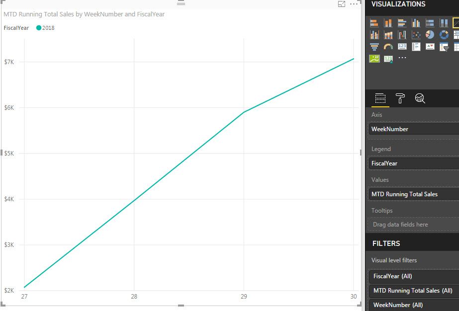
But when replacing the Dates with WeekNumbers (also coming from the Calendar table), here's what I get:
So it is basically displaying the last value calulated by the measure for weeks not part of the scope of the calculation.
I am not sure where the problem stands as the table displays things correcty and so does the line chart only when using the dates.
Any help here would be greatly appreciated.
Thanks!
- Mark as New
- Bookmark
- Subscribe
- Mute
- Subscribe to RSS Feed
- Permalink
- Report Inappropriate Content
I think your weeknumbers are across all the years and it is combining the data together for all the weeks from multiple years. if you add year and then week number and use drill down all level in hierarchary or create week number with year appended to it and then check.
Subscribe to the @PowerBIHowTo YT channel for an upcoming video on List and Record functions in Power Query!!
Learn Power BI and Fabric - subscribe to our YT channel - Click here: @PowerBIHowTo
If my solution proved useful, I'd be delighted to receive Kudos. When you put effort into asking a question, it's equally thoughtful to acknowledge and give Kudos to the individual who helped you solve the problem. It's a small gesture that shows appreciation and encouragement! ❤
Did I answer your question? Mark my post as a solution. Proud to be a Super User! Appreciate your Kudos 🙂
Feel free to email me with any of your BI needs.
- Mark as New
- Bookmark
- Subscribe
- Mute
- Subscribe to RSS Feed
- Permalink
- Report Inappropriate Content
Wah, that was quick!
Thank you so much, parry2k, adding the fiscal year did help in displaying the measure for the current fiscal year.
But my objective is to display lines for both current and previous fiscal year for comparison purposes.
Having the year added does not really allow me to do this as I would get something more like this:
Which is not ideal...
- Mark as New
- Bookmark
- Subscribe
- Mute
- Subscribe to RSS Feed
- Permalink
- Report Inappropriate Content
Aha, drop week number on x axis and year on legend. that will do it.
Subscribe to the @PowerBIHowTo YT channel for an upcoming video on List and Record functions in Power Query!!
Learn Power BI and Fabric - subscribe to our YT channel - Click here: @PowerBIHowTo
If my solution proved useful, I'd be delighted to receive Kudos. When you put effort into asking a question, it's equally thoughtful to acknowledge and give Kudos to the individual who helped you solve the problem. It's a small gesture that shows appreciation and encouragement! ❤
Did I answer your question? Mark my post as a solution. Proud to be a Super User! Appreciate your Kudos 🙂
Feel free to email me with any of your BI needs.
- Mark as New
- Bookmark
- Subscribe
- Mute
- Subscribe to RSS Feed
- Permalink
- Report Inappropriate Content
For some reason, I cannot drop Year on legend, it would not le me do it...
- Mark as New
- Bookmark
- Subscribe
- Mute
- Subscribe to RSS Feed
- Permalink
- Report Inappropriate Content
do you have more than one field in values? you have to have one field in values, can you send screen shot what kind of field you have on axis, value, legend?
Subscribe to the @PowerBIHowTo YT channel for an upcoming video on List and Record functions in Power Query!!
Learn Power BI and Fabric - subscribe to our YT channel - Click here: @PowerBIHowTo
If my solution proved useful, I'd be delighted to receive Kudos. When you put effort into asking a question, it's equally thoughtful to acknowledge and give Kudos to the individual who helped you solve the problem. It's a small gesture that shows appreciation and encouragement! ❤
Did I answer your question? Mark my post as a solution. Proud to be a Super User! Appreciate your Kudos 🙂
Feel free to email me with any of your BI needs.
- Mark as New
- Bookmark
- Subscribe
- Mute
- Subscribe to RSS Feed
- Permalink
- Report Inappropriate Content
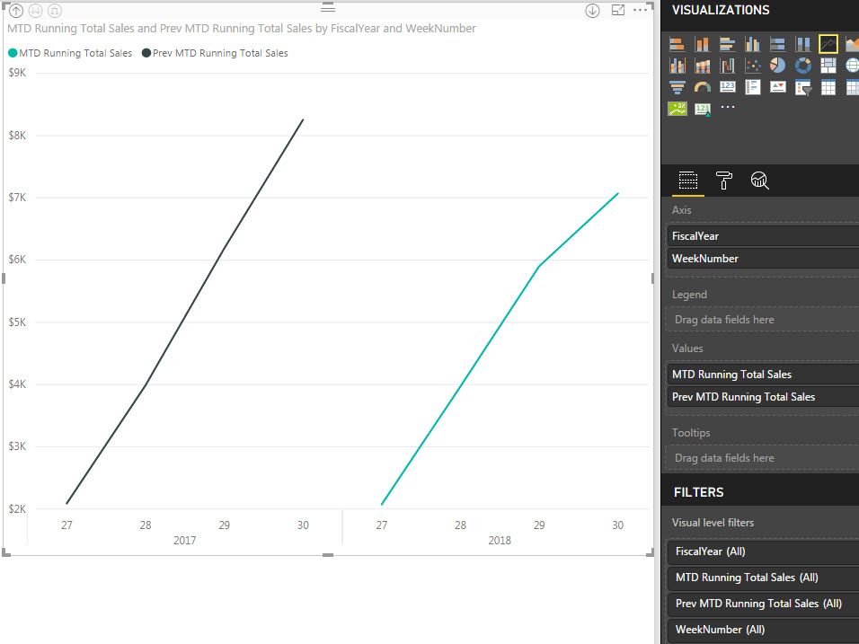
I have 2 values (the 2 measures I want to compare)
- MTD Running Total Sales
- Prev MTD Running Total Sales
Here's a screenshot:
- Mark as New
- Bookmark
- Subscribe
- Mute
- Subscribe to RSS Feed
- Permalink
- Report Inappropriate Content
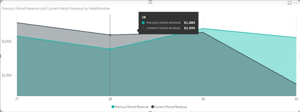
I do something very similar in another visualization using another set of measures and a Area Chart and it works just fine, without having to add the year as a legend.
So I tend to think there is something wrong with my Running Total measures...
- Mark as New
- Bookmark
- Subscribe
- Mute
- Subscribe to RSS Feed
- Permalink
- Report Inappropriate Content
can you try to remove one value and atleast test it by using year in legend and then we can talk about what else is going on.
there is no way that you can have two values and legend that is for sure. based on your original post, you just gave the example with one value and all the discussion was around that
Subscribe to the @PowerBIHowTo YT channel for an upcoming video on List and Record functions in Power Query!!
Learn Power BI and Fabric - subscribe to our YT channel - Click here: @PowerBIHowTo
If my solution proved useful, I'd be delighted to receive Kudos. When you put effort into asking a question, it's equally thoughtful to acknowledge and give Kudos to the individual who helped you solve the problem. It's a small gesture that shows appreciation and encouragement! ❤
Did I answer your question? Mark my post as a solution. Proud to be a Super User! Appreciate your Kudos 🙂
Feel free to email me with any of your BI needs.
- Mark as New
- Bookmark
- Subscribe
- Mute
- Subscribe to RSS Feed
- Permalink
- Report Inappropriate Content
You are right, sorry, let's go step by step.
Having only one value and the year in legend is working as expected.
- Mark as New
- Bookmark
- Subscribe
- Mute
- Subscribe to RSS Feed
- Permalink
- Report Inappropriate Content
ok, atleast we are on same page, now what next? 🙂
Subscribe to the @PowerBIHowTo YT channel for an upcoming video on List and Record functions in Power Query!!
Learn Power BI and Fabric - subscribe to our YT channel - Click here: @PowerBIHowTo
If my solution proved useful, I'd be delighted to receive Kudos. When you put effort into asking a question, it's equally thoughtful to acknowledge and give Kudos to the individual who helped you solve the problem. It's a small gesture that shows appreciation and encouragement! ❤
Did I answer your question? Mark my post as a solution. Proud to be a Super User! Appreciate your Kudos 🙂
Feel free to email me with any of your BI needs.
- Mark as New
- Bookmark
- Subscribe
- Mute
- Subscribe to RSS Feed
- Permalink
- Report Inappropriate Content
So what I am trying to accomplish here is to have a chart line displaying the previous and current fiscal year running total sales over the same period of time.
And to do so, I have the 2 following measures (note that in my original post, the measures where MTD and prev MTD, but as we just switched to a new fiscal month, I have to use the YTD version to get more data to display)
YTD Running Total Sales =
IF (
    MIN ( 'Calendar'[Date] )
        <= CALCULATE (
            MAX ( Sales[Date] );
            FILTER ( ALL ( Sales ); RELATED ( 'Calendar'[YearOffset] ) = 0 )
        );
    CALCULATE (
        [Total Sales];
        FILTER (
            FILTER ( ALL ( 'Calendar' ); 'Calendar'[YearOffset] = 0 );
            'Calendar'[Date] <= MAX ( 'Calendar'[Date] )
        )
    )
)
Prev YTD Running Total Sales =
VAR CurrentDayNumber =
    MAX ( YTDInfos[CurrentDayNumber] )
RETURN
    IF (
        MIN ( 'Calendar'[Date] )
            <= CALCULATE (
                MAX ( Sales[Date] );
                FILTER (
                    ALL ( Sales );
                    AND (
                        RELATED ( 'Calendar'[YearOffset] ) = -1;
                        RELATED ( 'Calendar'[DayNumber] ) <= CurrentDayNumber
                    )
                )
            );
        CALCULATE (
            [Total Sales];
            FILTER (
                FILTER (
                    ALL ( 'Calendar' );
                    AND ( 'Calendar'[YearOffset] = -1; 'Calendar'[DayNumber] <= CurrentDayNumber )
                );
                'Calendar'[Date] <= MAX ( 'Calendar'[Date] )
            )
        )
    )
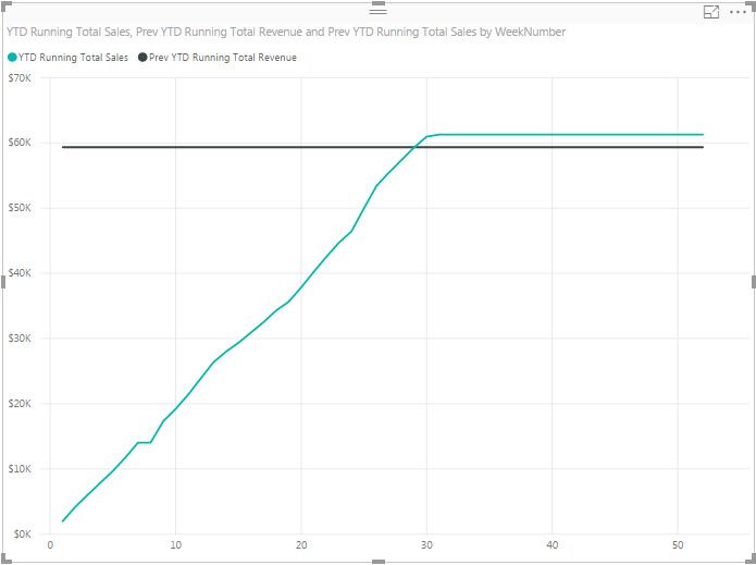
When displaying those 2 measures in the same Line Chart using the week number on the X-Axis, here is what I get:
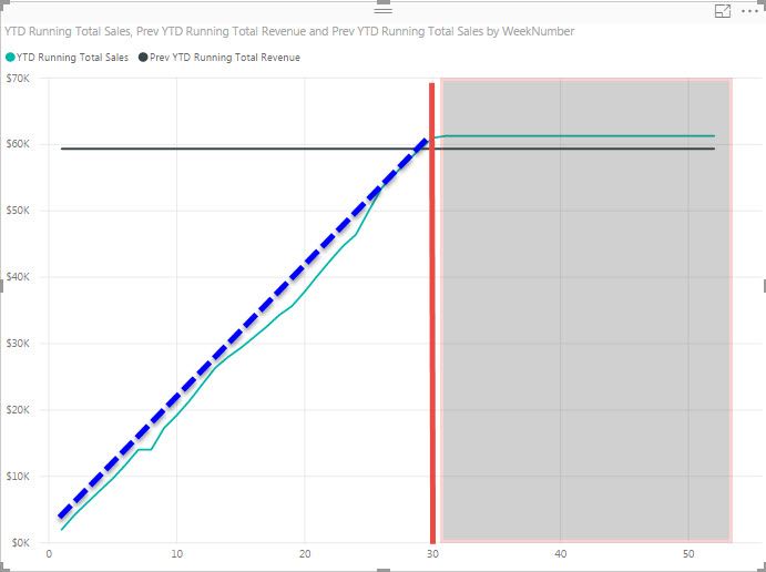
When what I would like to get is more something like this:
Meaning the weeks on the right side of the red line to be removed and the previous year to be displayed correctly (blue dotted line, instead of the black constant line).
I don't understand why the Chart line is displaying things like this when the same data displayed in a table looks perfect.
- Mark as New
- Bookmark
- Subscribe
- Mute
- Subscribe to RSS Feed
- Permalink
- Report Inappropriate Content
here is the thing, you cannot compare two values and also have legend. either you have to remove one value and use legend.
Subscribe to the @PowerBIHowTo YT channel for an upcoming video on List and Record functions in Power Query!!
Learn Power BI and Fabric - subscribe to our YT channel - Click here: @PowerBIHowTo
If my solution proved useful, I'd be delighted to receive Kudos. When you put effort into asking a question, it's equally thoughtful to acknowledge and give Kudos to the individual who helped you solve the problem. It's a small gesture that shows appreciation and encouragement! ❤
Did I answer your question? Mark my post as a solution. Proud to be a Super User! Appreciate your Kudos 🙂
Feel free to email me with any of your BI needs.
- Mark as New
- Bookmark
- Subscribe
- Mute
- Subscribe to RSS Feed
- Permalink
- Report Inappropriate Content
I have 2 values:
- Mark as New
- Bookmark
- Subscribe
- Mute
- Subscribe to RSS Feed
- Permalink
- Report Inappropriate Content
you cannot have two values if you want to use legend, remove one and then try with year in legend, also in that case you can remove year from x axis.
Subscribe to the @PowerBIHowTo YT channel for an upcoming video on List and Record functions in Power Query!!
Learn Power BI and Fabric - subscribe to our YT channel - Click here: @PowerBIHowTo
If my solution proved useful, I'd be delighted to receive Kudos. When you put effort into asking a question, it's equally thoughtful to acknowledge and give Kudos to the individual who helped you solve the problem. It's a small gesture that shows appreciation and encouragement! ❤
Did I answer your question? Mark my post as a solution. Proud to be a Super User! Appreciate your Kudos 🙂
Feel free to email me with any of your BI needs.
Helpful resources

Microsoft Fabric Learn Together
Covering the world! 9:00-10:30 AM Sydney, 4:00-5:30 PM CET (Paris/Berlin), 7:00-8:30 PM Mexico City

Power BI Monthly Update - April 2024
Check out the April 2024 Power BI update to learn about new features.

| User | Count |
|---|---|
| 107 | |
| 98 | |
| 78 | |
| 65 | |
| 60 |
| User | Count |
|---|---|
| 148 | |
| 113 | |
| 97 | |
| 84 | |
| 67 |
