- Power BI forums
- Updates
- News & Announcements
- Get Help with Power BI
- Desktop
- Service
- Report Server
- Power Query
- Mobile Apps
- Developer
- DAX Commands and Tips
- Custom Visuals Development Discussion
- Health and Life Sciences
- Power BI Spanish forums
- Translated Spanish Desktop
- Power Platform Integration - Better Together!
- Power Platform Integrations (Read-only)
- Power Platform and Dynamics 365 Integrations (Read-only)
- Training and Consulting
- Instructor Led Training
- Dashboard in a Day for Women, by Women
- Galleries
- Community Connections & How-To Videos
- COVID-19 Data Stories Gallery
- Themes Gallery
- Data Stories Gallery
- R Script Showcase
- Webinars and Video Gallery
- Quick Measures Gallery
- 2021 MSBizAppsSummit Gallery
- 2020 MSBizAppsSummit Gallery
- 2019 MSBizAppsSummit Gallery
- Events
- Ideas
- Custom Visuals Ideas
- Issues
- Issues
- Events
- Upcoming Events
- Community Blog
- Power BI Community Blog
- Custom Visuals Community Blog
- Community Support
- Community Accounts & Registration
- Using the Community
- Community Feedback
Register now to learn Fabric in free live sessions led by the best Microsoft experts. From Apr 16 to May 9, in English and Spanish.
- Power BI forums
- Forums
- Get Help with Power BI
- Desktop
- Re: Plotting Curves by Group
- Subscribe to RSS Feed
- Mark Topic as New
- Mark Topic as Read
- Float this Topic for Current User
- Bookmark
- Subscribe
- Printer Friendly Page
- Mark as New
- Bookmark
- Subscribe
- Mute
- Subscribe to RSS Feed
- Permalink
- Report Inappropriate Content
Plotting Curves by Group
I am puzzled with a task that is easy to do in excel but I don’t know how to do it in power BI and need your help. Basically I have 3 fields X, Y, Z in a table and I want to plot Y against X group by Z. Say there are 5 distinct values of Z, then thd resulting visual would have 5 curves of Y against X. The visual will also reflect all slicers placed on the same tab. Any tips? Thanks!
Solved! Go to Solution.
- Mark as New
- Bookmark
- Subscribe
- Mute
- Subscribe to RSS Feed
- Permalink
- Report Inappropriate Content
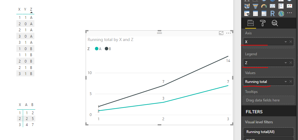
Hi @Sweetcapitan,
Please create a measure like below:
Running total =
CALCULATE (
    SUM ( 'Plotting Curves'[Y] ),
    FILTER (
        ALLEXCEPT ( 'Plotting Curves', 'Plotting Curves'[Z] ),
        'Plotting Curves'[X] <= MAX ( 'Plotting Curves'[X] )
    )
)
Then, add corresponding fields and above measure into a line chart.
Best regards,
Yuliana Gu
If this post helps, then please consider Accept it as the solution to help the other members find it more quickly.
- Mark as New
- Bookmark
- Subscribe
- Mute
- Subscribe to RSS Feed
- Permalink
- Report Inappropriate Content
Sure, any chance of some sample data + a screenshot showing how it would look if you used Excel. This will make it easier build (plus help clarify any questions)
- Mark as New
- Bookmark
- Subscribe
- Mute
- Subscribe to RSS Feed
- Permalink
- Report Inappropriate Content
Thanks Phil!
Here is the data.
Y is the response so the outcomes are Y (1) or N (0).
X is time of response.
Z is the test group. The data here shows 2 groups - A and B.
| time | resp | group |
| X | Y | Z |
| 1 | 1 | A |
| 2 | 0 | A |
| 2 | 1 | A |
| 2 | 0 | A |
| 2 | 1 | A |
| 2 | 0 | A |
| 3 | 1 | A |
| 3 | 0 | A |
| 3 | 1 | A |
| 3 | 0 | A |
| 3 | 1 | A |
| 3 | 0 | A |
| 3 | 1 | A |
| 3 | 0 | A |
| 1 | 1 | B |
| 1 | 0 | B |
| 1 | 1 | B |
| 1 | 0 | B |
| 2 | 1 | B |
| 2 | 0 | B |
| 2 | 1 | B |
| 2 | 1 | B |
| 2 | 1 | B |
| 2 | 1 | B |
| 3 | 1 | B |
| 3 | 1 | B |
| 3 | 1 | B |
| 3 | 1 | B |
| 3 | 1 | B |
| 3 | 1 | B |
| 3 | 1 | B |
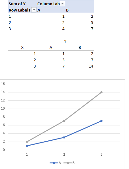
in Excel I would create a pivot table to summarize the results to get two series (A and B) of responses against time (table 1). Then I would cumulate it as table 2 and feed it to create the final chart, which is the visual I would like to create in Power BI. Thanks!
- Mark as New
- Bookmark
- Subscribe
- Mute
- Subscribe to RSS Feed
- Permalink
- Report Inappropriate Content
Hi @Sweetcapitan,
Please create a measure like below:
Running total =
CALCULATE (
    SUM ( 'Plotting Curves'[Y] ),
    FILTER (
        ALLEXCEPT ( 'Plotting Curves', 'Plotting Curves'[Z] ),
        'Plotting Curves'[X] <= MAX ( 'Plotting Curves'[X] )
    )
)
Then, add corresponding fields and above measure into a line chart.
Best regards,
Yuliana Gu
If this post helps, then please consider Accept it as the solution to help the other members find it more quickly.
- Mark as New
- Bookmark
- Subscribe
- Mute
- Subscribe to RSS Feed
- Permalink
- Report Inappropriate Content
Ah ha, I got it! Thanks a lot @v-yulgu-msft!
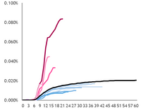
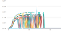
Now I encounter another issue. Since each test is conducted at different time, the length of response curve varies (chart 1). When I plotted the curve with the help of your answer, I got chart 2 below - basically the curve drop to zero where there is no data at the response date (x axis). How should I solve this?
Helpful resources

Microsoft Fabric Learn Together
Covering the world! 9:00-10:30 AM Sydney, 4:00-5:30 PM CET (Paris/Berlin), 7:00-8:30 PM Mexico City

Power BI Monthly Update - April 2024
Check out the April 2024 Power BI update to learn about new features.

| User | Count |
|---|---|
| 109 | |
| 96 | |
| 77 | |
| 66 | |
| 53 |
| User | Count |
|---|---|
| 144 | |
| 105 | |
| 102 | |
| 89 | |
| 63 |


