- Power BI forums
- Updates
- News & Announcements
- Get Help with Power BI
- Desktop
- Service
- Report Server
- Power Query
- Mobile Apps
- Developer
- DAX Commands and Tips
- Custom Visuals Development Discussion
- Health and Life Sciences
- Power BI Spanish forums
- Translated Spanish Desktop
- Power Platform Integration - Better Together!
- Power Platform Integrations (Read-only)
- Power Platform and Dynamics 365 Integrations (Read-only)
- Training and Consulting
- Instructor Led Training
- Dashboard in a Day for Women, by Women
- Galleries
- Community Connections & How-To Videos
- COVID-19 Data Stories Gallery
- Themes Gallery
- Data Stories Gallery
- R Script Showcase
- Webinars and Video Gallery
- Quick Measures Gallery
- 2021 MSBizAppsSummit Gallery
- 2020 MSBizAppsSummit Gallery
- 2019 MSBizAppsSummit Gallery
- Events
- Ideas
- Custom Visuals Ideas
- Issues
- Issues
- Events
- Upcoming Events
- Community Blog
- Power BI Community Blog
- Custom Visuals Community Blog
- Community Support
- Community Accounts & Registration
- Using the Community
- Community Feedback
Register now to learn Fabric in free live sessions led by the best Microsoft experts. From Apr 16 to May 9, in English and Spanish.
- Power BI forums
- Forums
- Get Help with Power BI
- Desktop
- Re: Pared down graph view based on filter
- Subscribe to RSS Feed
- Mark Topic as New
- Mark Topic as Read
- Float this Topic for Current User
- Bookmark
- Subscribe
- Printer Friendly Page
- Mark as New
- Bookmark
- Subscribe
- Mute
- Subscribe to RSS Feed
- Permalink
- Report Inappropriate Content
Pared down graph view based on filter
Hello,
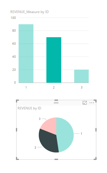
I would like to know if this is possible. I have a bar graph and a pie chart. When you select an item on the pie chart the relationship view in the bar graph changes to relfect the relationship to the selected data in the pie chart. However, the bar chart has many data points. All the unrelated data points are just made more transparent instead of being removed from the view.
Is there a way to not display information in a chart that is being filtered by related data in another chart? This would be great because then you wouldn't have to use the slider bar to scroll down to the remaining data that was relationally still relevent.
Thank you.
- Mark as New
- Bookmark
- Subscribe
- Mute
- Subscribe to RSS Feed
- Permalink
- Report Inappropriate Content
Hi @davidson929,
I don't know if you have already solved this but as you can see below if you do the following you will have what you need:
1 - Choose chart
2 - Format bar
3 - Edit Interactions
4 - On the other visuals in the page you will have options to change the interactivity in the charts - Filter; Highlight (default); None
Please check the print below, as you can see how image 3 after chosing the filter the bart chart only shows the value of the select values in the pie chart the others are removed.
Regards,
MFelix
Regards
Miguel Félix
Did I answer your question? Mark my post as a solution!
Proud to be a Super User!
Check out my blog: Power BI em Português- Mark as New
- Bookmark
- Subscribe
- Mute
- Subscribe to RSS Feed
- Permalink
- Report Inappropriate Content
Hi @davidson929,
Have you resolved your problem? If you have, in order to help more people can find workwroud form here, please mark the helpful reply as answer. Thanks for understanding.
Best Regards,
Angelia
- Mark as New
- Bookmark
- Subscribe
- Mute
- Subscribe to RSS Feed
- Permalink
- Report Inappropriate Content
Hi @davidson929,
Based on my understanding, I create a example and test.
1. Create the bar chart and pie chart using same fields. When we select one filed one chart, it will highlighted in another table, while other are still exist invisual, they are not removed.
2. Create the bar chart and pie chart using fields come from different tables. But there is a relationship between. It display the same result when I select one value in chart.
I am still confusing your scenario, what's the mean of "All the unrelated data points are just made more transparent instead of being removed from the view" Could you please share more details or .pbix file for analysis.
Best Regards,
Angelia
- Mark as New
- Bookmark
- Subscribe
- Mute
- Subscribe to RSS Feed
- Permalink
- Report Inappropriate Content
In the Power BI Desktop select modeling option in the ribbon, then select interactions (1st button) when you do that if you select one chart the others are highligted and there are a few options that show, chosd the filter to use your chart as a slicer.
Regards
Mfelix
Regards
Miguel Félix
Did I answer your question? Mark my post as a solution!
Proud to be a Super User!
Check out my blog: Power BI em PortuguêsHelpful resources

Microsoft Fabric Learn Together
Covering the world! 9:00-10:30 AM Sydney, 4:00-5:30 PM CET (Paris/Berlin), 7:00-8:30 PM Mexico City

Power BI Monthly Update - April 2024
Check out the April 2024 Power BI update to learn about new features.

| User | Count |
|---|---|
| 107 | |
| 99 | |
| 78 | |
| 64 | |
| 58 |
| User | Count |
|---|---|
| 148 | |
| 111 | |
| 94 | |
| 84 | |
| 67 |


