- Power BI forums
- Updates
- News & Announcements
- Get Help with Power BI
- Desktop
- Service
- Report Server
- Power Query
- Mobile Apps
- Developer
- DAX Commands and Tips
- Custom Visuals Development Discussion
- Health and Life Sciences
- Power BI Spanish forums
- Translated Spanish Desktop
- Power Platform Integration - Better Together!
- Power Platform Integrations (Read-only)
- Power Platform and Dynamics 365 Integrations (Read-only)
- Training and Consulting
- Instructor Led Training
- Dashboard in a Day for Women, by Women
- Galleries
- Community Connections & How-To Videos
- COVID-19 Data Stories Gallery
- Themes Gallery
- Data Stories Gallery
- R Script Showcase
- Webinars and Video Gallery
- Quick Measures Gallery
- 2021 MSBizAppsSummit Gallery
- 2020 MSBizAppsSummit Gallery
- 2019 MSBizAppsSummit Gallery
- Events
- Ideas
- Custom Visuals Ideas
- Issues
- Issues
- Events
- Upcoming Events
- Community Blog
- Power BI Community Blog
- Custom Visuals Community Blog
- Community Support
- Community Accounts & Registration
- Using the Community
- Community Feedback
Register now to learn Fabric in free live sessions led by the best Microsoft experts. From Apr 16 to May 9, in English and Spanish.
- Power BI forums
- Forums
- Get Help with Power BI
- Desktop
- Need help in R Visual
- Subscribe to RSS Feed
- Mark Topic as New
- Mark Topic as Read
- Float this Topic for Current User
- Bookmark
- Subscribe
- Printer Friendly Page
- Mark as New
- Bookmark
- Subscribe
- Mute
- Subscribe to RSS Feed
- Permalink
- Report Inappropriate Content
Need help in R Visual
Hi Everyone,
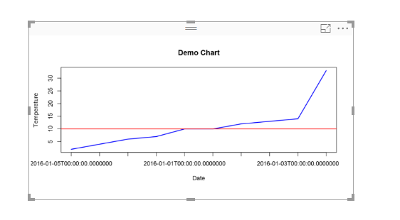
I am in process of creatiing a R Visual in which i need to change color of line above threshold.
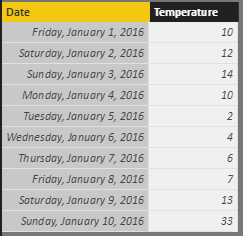
So far, i have written below script to genrate the visual uploaded below. Can someone help me to get my desired result i.e If my threshold is breahed/surpassed, color of line should change.
If this can be achived using traditional Power BI visuals then that suggestion is also welcome.
Here is my code and visual created so far.
plot(dataset$Temperature,type="l",lwd=2,
xaxt="n",col="blue",
xlab="Date",ylab="Temperature",
main="Demo Chart")
axis(1,at=1:length(dataset$Date),labels=dataset$Date)
abline(h=dataset$TargetTemperature,col="red")
Edit 1: Sorry for tagging you guys. Kindly help if anybody knows.
@v-haibl-msft
@v-huizhn-msft
@Seth_C_Bauer
Solved! Go to Solution.
- Mark as New
- Bookmark
- Subscribe
- Mute
- Subscribe to RSS Feed
- Permalink
- Report Inappropriate Content
Try below R code. Multiple colours works for points i.e. col = ifelse(temperature >15,"blue","red") etc but does not work for line charts in base R plot.
plot(dataset$Temperature,type = "l",col = "blue")
abline(h=10,col = "red")
clip(0,100,0,10)
lines(dataset$Temperature, col='green', type='l')
Helpful resources

Microsoft Fabric Learn Together
Covering the world! 9:00-10:30 AM Sydney, 4:00-5:30 PM CET (Paris/Berlin), 7:00-8:30 PM Mexico City

Power BI Monthly Update - April 2024
Check out the April 2024 Power BI update to learn about new features.

| User | Count |
|---|---|
| 113 | |
| 97 | |
| 80 | |
| 69 | |
| 59 |
| User | Count |
|---|---|
| 150 | |
| 119 | |
| 104 | |
| 87 | |
| 67 |


