- Power BI forums
- Updates
- News & Announcements
- Get Help with Power BI
- Desktop
- Service
- Report Server
- Power Query
- Mobile Apps
- Developer
- DAX Commands and Tips
- Custom Visuals Development Discussion
- Health and Life Sciences
- Power BI Spanish forums
- Translated Spanish Desktop
- Power Platform Integration - Better Together!
- Power Platform Integrations (Read-only)
- Power Platform and Dynamics 365 Integrations (Read-only)
- Training and Consulting
- Instructor Led Training
- Dashboard in a Day for Women, by Women
- Galleries
- Community Connections & How-To Videos
- COVID-19 Data Stories Gallery
- Themes Gallery
- Data Stories Gallery
- R Script Showcase
- Webinars and Video Gallery
- Quick Measures Gallery
- 2021 MSBizAppsSummit Gallery
- 2020 MSBizAppsSummit Gallery
- 2019 MSBizAppsSummit Gallery
- Events
- Ideas
- Custom Visuals Ideas
- Issues
- Issues
- Events
- Upcoming Events
- Community Blog
- Power BI Community Blog
- Custom Visuals Community Blog
- Community Support
- Community Accounts & Registration
- Using the Community
- Community Feedback
Register now to learn Fabric in free live sessions led by the best Microsoft experts. From Apr 16 to May 9, in English and Spanish.
- Power BI forums
- Forums
- Get Help with Power BI
- Desktop
- Re: Multi-Year Timeline
- Subscribe to RSS Feed
- Mark Topic as New
- Mark Topic as Read
- Float this Topic for Current User
- Bookmark
- Subscribe
- Printer Friendly Page
- Mark as New
- Bookmark
- Subscribe
- Mute
- Subscribe to RSS Feed
- Permalink
- Report Inappropriate Content
Multi-Year Timeline
I am looking to present a sequence of data points each attached to a date. I am looking to group them by month and present them in date order. The dates start in May last year and end in June this year
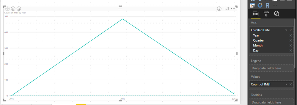
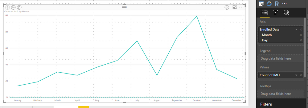
Unfortunately when I try and present it using a line chart I can either view by year or by month - and when I view by month I cannot start the chart at the first month - it always starts in January. How can I filter by month and have months display consecutively, rather than merging them across years?
Solved! Go to Solution.
- Mark as New
- Bookmark
- Subscribe
- Mute
- Subscribe to RSS Feed
- Permalink
- Report Inappropriate Content
@RobFlandersWhen you remove the year from the Date you are now asking to only see things in Month buckets so data from every Month of January will be groupd, every February etc, so in your case the values from May of 16 and May of 17 will be combined together in the 'May' data point.
If you stick with the Line chart with Year and Month levels selected and then use the Drill Down arrow you can go to the next level down. Be sure you use the correct Drill Down option!!!
- Mark as New
- Bookmark
- Subscribe
- Mute
- Subscribe to RSS Feed
- Permalink
- Report Inappropriate Content
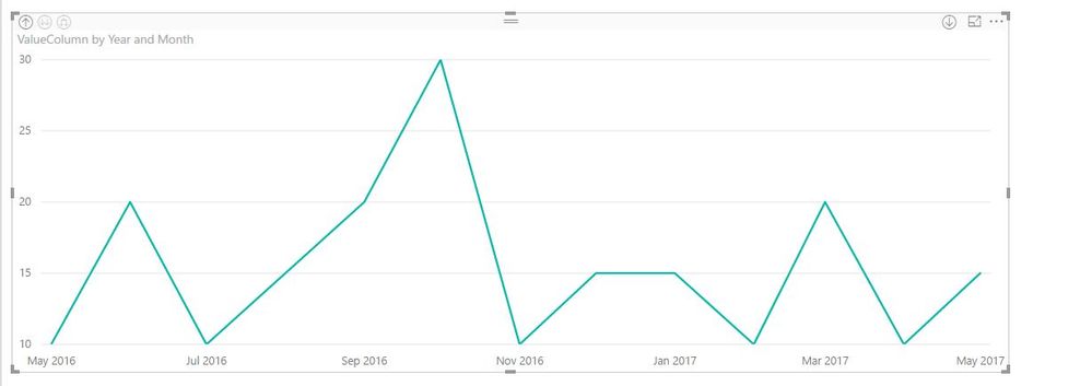
@robofski Thanks for the response - it appears I need to do as you say and "Expand all down one level in the Hierachy". However, I now have an image that looks like this:
Something is clearly wrong with the sequencing of a number of the months - not sure why.
- Mark as New
- Bookmark
- Subscribe
- Mute
- Subscribe to RSS Feed
- Permalink
- Report Inappropriate Content
@RobFlanders Any chance you can share a sample of the data, that looks strange?
- Mark as New
- Bookmark
- Subscribe
- Mute
- Subscribe to RSS Feed
- Permalink
- Report Inappropriate Content
@robofski No sorry - there's a reason the pictures are heavily cropped!
The plot appears to assume that January 2017 is directly after January 2016, and Dec 2016 is directly after Dec 2015. I'll try some alternative plots.
Thanks for your help!
- Mark as New
- Bookmark
- Subscribe
- Mute
- Subscribe to RSS Feed
- Permalink
- Report Inappropriate Content
I received similar goofy results when drilling down the date hierarchy.
What is the best way to handle this?
Thank you
- Mark as New
- Bookmark
- Subscribe
- Mute
- Subscribe to RSS Feed
- Permalink
- Report Inappropriate Content
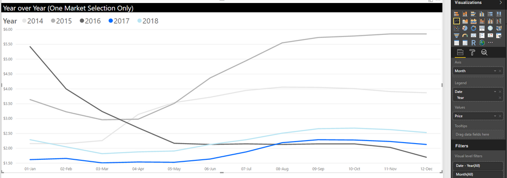
Try this... We have 'Month' as it's own column in our raw data as text labeled '01-Jan', '02-Jan', etc (you can easy get Power BI to create this with copyign and splitting your data and using mass transforms.) We then graph our data by (text) Month and use Year from our real formatted Date column as the legend. Values is Price (or whatever you want to graph up and down).
P.S. You only have 2 years right now, so colors aren't critical, but see below where we 'fade' from old to current then go alternative colrs for future.
Hope this helps,
Forrest
Please give Kudos or Mark as a Solution!
https://www.linkedin.com/in/forrest-hill-04480730/
Proud to give back to the community!
Thank You!
Helpful resources

Microsoft Fabric Learn Together
Covering the world! 9:00-10:30 AM Sydney, 4:00-5:30 PM CET (Paris/Berlin), 7:00-8:30 PM Mexico City

Power BI Monthly Update - April 2024
Check out the April 2024 Power BI update to learn about new features.

| User | Count |
|---|---|
| 107 | |
| 98 | |
| 77 | |
| 66 | |
| 53 |
| User | Count |
|---|---|
| 144 | |
| 104 | |
| 100 | |
| 86 | |
| 64 |


