- Power BI forums
- Updates
- News & Announcements
- Get Help with Power BI
- Desktop
- Service
- Report Server
- Power Query
- Mobile Apps
- Developer
- DAX Commands and Tips
- Custom Visuals Development Discussion
- Health and Life Sciences
- Power BI Spanish forums
- Translated Spanish Desktop
- Power Platform Integration - Better Together!
- Power Platform Integrations (Read-only)
- Power Platform and Dynamics 365 Integrations (Read-only)
- Training and Consulting
- Instructor Led Training
- Dashboard in a Day for Women, by Women
- Galleries
- Community Connections & How-To Videos
- COVID-19 Data Stories Gallery
- Themes Gallery
- Data Stories Gallery
- R Script Showcase
- Webinars and Video Gallery
- Quick Measures Gallery
- 2021 MSBizAppsSummit Gallery
- 2020 MSBizAppsSummit Gallery
- 2019 MSBizAppsSummit Gallery
- Events
- Ideas
- Custom Visuals Ideas
- Issues
- Issues
- Events
- Upcoming Events
- Community Blog
- Power BI Community Blog
- Custom Visuals Community Blog
- Community Support
- Community Accounts & Registration
- Using the Community
- Community Feedback
Register now to learn Fabric in free live sessions led by the best Microsoft experts. From Apr 16 to May 9, in English and Spanish.
- Power BI forums
- Forums
- Get Help with Power BI
- Desktop
- Logarithmic scaled scatter chart?
- Subscribe to RSS Feed
- Mark Topic as New
- Mark Topic as Read
- Float this Topic for Current User
- Bookmark
- Subscribe
- Printer Friendly Page
- Mark as New
- Bookmark
- Subscribe
- Mute
- Subscribe to RSS Feed
- Permalink
- Report Inappropriate Content
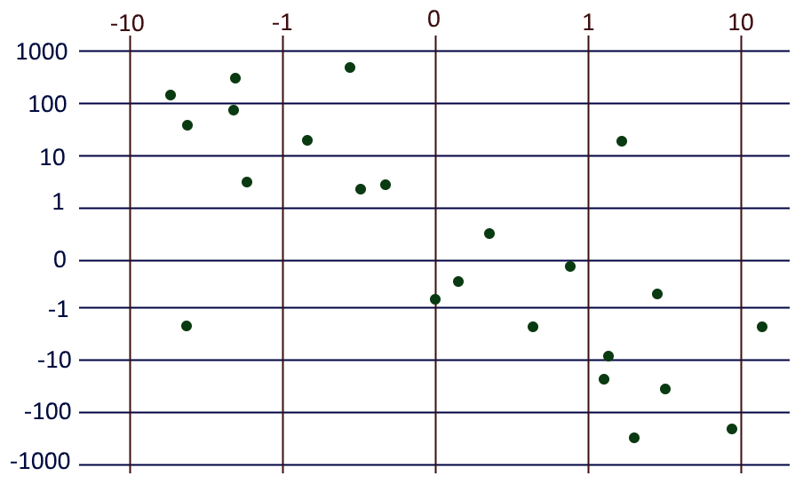
Logarithmic scaled scatter chart?
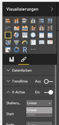
I am pretty new to Power BI and have some trouble with a scatter chart. The x-axis should be logarithmic scaled but I can only set it to linear.
What am I doing wrong?
PS: It's a german installation of Power BI Desktop and all updates are installed.
- Mark as New
- Bookmark
- Subscribe
- Mute
- Subscribe to RSS Feed
- Permalink
- Report Inappropriate Content
from what I can see the base graphs in Power BI aren't particularly flexible, but that's fine, because they've included support for R.
This means you can use the ggplot2 library, and so can customise pretty much everything you could ever want to (and quite a few things you wouldn't).
What you need to do
Click on the R symbol under visualisations
Select the fields you want to chart
paste this code into the R script editor section
library(ggplot2)
names(dataset) <- gsub(" ","",names(dataset)) #only needed if you have spaces in field names

g <- ggplot(dataset,aes(x=PUT_X_FIELD_HERE,y=PUT_Y_FIELD_HERE))
g <- g + geom_point(color="#D0021A") #change the #D0021A to whatever colour you want
g <- g + scale_x_log10(label=function(x){return(x))} #you could change this bit if you wanted to display (for example) the log values on the axis instead of the raw values
 ,limits=c(which.min(dataset$PUT_X_FIELD_HERE>0),max(dataset$PUT_X_FIELD_HERE)) #this is the bit that actually does the work
g <- g + scale_y_log10(label=function(y){return(y))}
 ,limits=c(which.min(dataset$PUT_X_FIELD_HERE>0),max(dataset$PUT_Y_FIELD_HERE))
g <- g + coord_equal() #this forces the graph to be square. Delete if that's not what you want
g <- g + ggtitle("PUT GRAPH TITLE HERE")+labs(x="X AXIS LABEL GOES HERE",y="Y AXIS LABEL GOES HERE")
g <- g + theme(plot.title = element_text(size=20,face="bold",margin=margin(10,0,10,0)))

g
replacing PUT_X_FIELD_HERE with whatever your x field is called, without spaces, and likewise for y.
This might seem like taking a sledgehammer to crack a walnut, but you'll find that doing anything non-standard is significantly less hassle in R in the long run.
If you need any details on what the elements of ggplot actually do, I found this cheatsheet really helpful when I was learning this.
clarification:
g <- g + scale_x_log10(label=function(x){return(x))},limits=c(which.min(dataset$PUT_X_FIELD_HERE>0),max(dataset$PUT_X_FIELD_HERE))
this bit is doing the actual work here, and is basically saying "make x a log scale between the lowest positive x value (to avoid the log(0) issue) and the highest value"
- Mark as New
- Bookmark
- Subscribe
- Mute
- Subscribe to RSS Feed
- Permalink
- Report Inappropriate Content
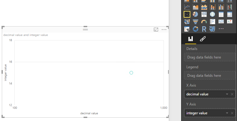
Can you check the data type that you're using for the x-axis? I'm using whole numbers in the example below and seeing the option to change the scale from linear to log. If you're not able to get it to work, one other workaround would be to create an additional column with the log value, then use that in the scatter plot.
Thanks,
Sam Lester (MSFT)
- Mark as New
- Bookmark
- Subscribe
- Mute
- Subscribe to RSS Feed
- Permalink
- Report Inappropriate Content
The column is of type decimal but I tried it with a fixed decimal and an integer column too. It comes from a Stored Procedure from a MS SQL Server, there it is a decimal(18,2).
An additional column which calculates the logarithm should be possible but shows the axis not the logarithm too? So it wouldn’t be good readable for a customer.
- Mark as New
- Bookmark
- Subscribe
- Mute
- Subscribe to RSS Feed
- Permalink
- Report Inappropriate Content
Hi @Koopakiller,
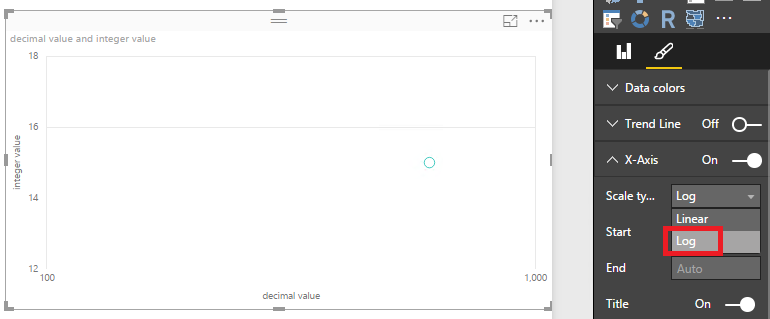
Based on my test in Power BI Desktop version 2.36.4434.381 , if the data stored in SQL Server database is decimal(18.2), when we get data from this data source, and place the decimal data type field in X-axis, the "Log" option is available in Scale Type property. See:
In your scenario, I would suggest you download and install the latest Power BI Desktop version to check if issue persists.
If you have any question, please feel free to ask.
Best Regards,
Qiuyun Yu
If this post helps, then please consider Accept it as the solution to help the other members find it more quickly.
- Mark as New
- Bookmark
- Subscribe
- Mute
- Subscribe to RSS Feed
- Permalink
- Report Inappropriate Content
Hi @v-qiuyu-msft,
thanks for your reply. I installed the newest version, but this time in English. Now I can use Log as the axis type.
For now, I need only a chart with positive logarithmic shown values. I would like to know if it is possible to configure a chart to something like that?
I tried to use two columns with positive and negative values but that does not work. The Log option is missing again.
But it seems to be no problem if the values are all negative.
- Mark as New
- Bookmark
- Subscribe
- Mute
- Subscribe to RSS Feed
- Permalink
- Report Inappropriate Content
Hi @Koopakiller,
BAsed on my test, if X-axis and Y-axis values contain negative values, and we have placed field in Details or Legend, the "Log" will disappear under Scale Type option. Please check if you have added any filed in Details or Legend properties.
Best Regards,
Qiuyun Yu
If this post helps, then please consider Accept it as the solution to help the other members find it more quickly.
- Mark as New
- Bookmark
- Subscribe
- Mute
- Subscribe to RSS Feed
- Permalink
- Report Inappropriate Content
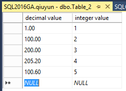
I tried to add a new data source with some negative and positive numbers and set the X and Y Source of a scatter chart. I did not set a detail or legend field but the Log option is still not available. If I set a legend or details field it still not appears.
- Mark as New
- Bookmark
- Subscribe
- Mute
- Subscribe to RSS Feed
- Permalink
- Report Inappropriate Content
Hi @Koopakiller,
In a scatter chart, if only X Axis and Y Axis properties have values(both negative and positive), only one data point displays in the chart as it's aggregated. In this scenario, Log option is available for X Axis Scatter type. But if we placed any field in Details or Legend property, Log option is not available. Please check attached .PBIX file.
Best Regards,
Qiuyun Yu
If this post helps, then please consider Accept it as the solution to help the other members find it more quickly.
- Mark as New
- Bookmark
- Subscribe
- Mute
- Subscribe to RSS Feed
- Permalink
- Report Inappropriate Content
Hi all,
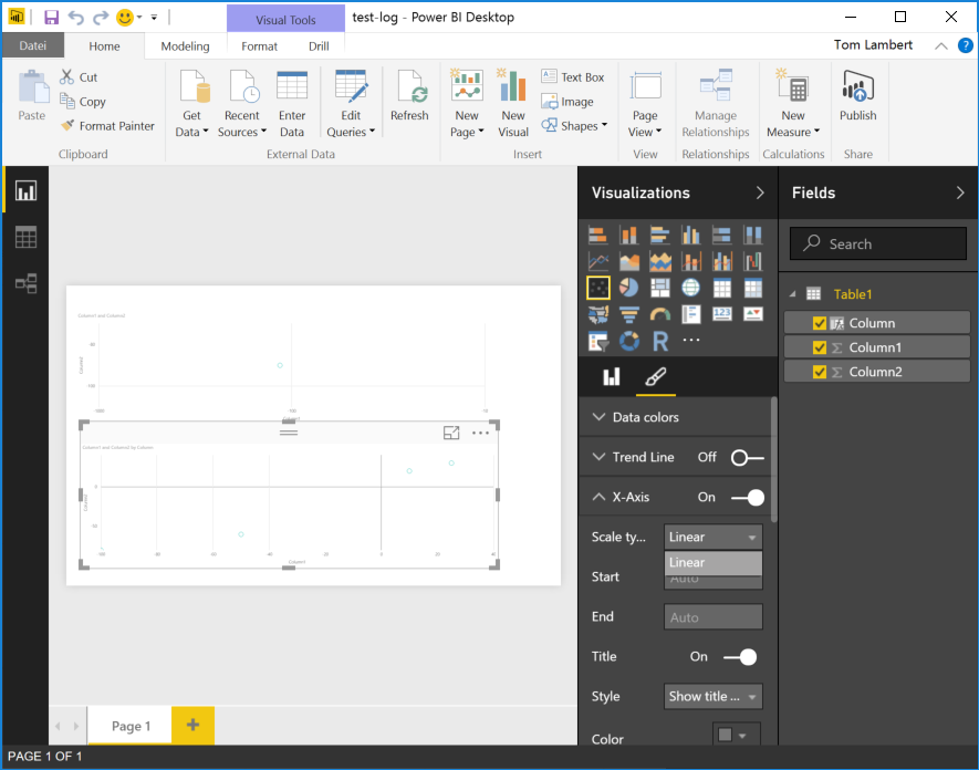
I downloaded your file and selected the lower chart. The available scaling types for x-axis is still only "Linear":
If I remove "Column" from Details, I was able to set the scale type to Log. So it works how you described it. My mistake was that I included a 0 in my test data.
But I did not understand why I cannot set Details or Legend to use Log. Is there any explanation?
Thanks a lot! Some time ago I played a little bit with R so it should be possible to me to use the script visual. After a short test I think it is more easy to use the R element instead of the build-in scatter chart for me. It is not so easy to figure out what I want but it is more powerful.
- Mark as New
- Bookmark
- Subscribe
- Mute
- Subscribe to RSS Feed
- Permalink
- Report Inappropriate Content
The column is of type decimal but I tested it with a fixed decimal and an integer too. The column comes from a SQL Stored Procedure, there it is a
decimal(18, 2)
In case I calculate the logarithmic value in another column, the shown value at the axis is the logarithmic value too, right? So it would not be good readable.
Helpful resources

Microsoft Fabric Learn Together
Covering the world! 9:00-10:30 AM Sydney, 4:00-5:30 PM CET (Paris/Berlin), 7:00-8:30 PM Mexico City

Power BI Monthly Update - April 2024
Check out the April 2024 Power BI update to learn about new features.

| User | Count |
|---|---|
| 110 | |
| 97 | |
| 78 | |
| 63 | |
| 55 |
| User | Count |
|---|---|
| 143 | |
| 109 | |
| 89 | |
| 84 | |
| 66 |
