- Power BI forums
- Updates
- News & Announcements
- Get Help with Power BI
- Desktop
- Service
- Report Server
- Power Query
- Mobile Apps
- Developer
- DAX Commands and Tips
- Custom Visuals Development Discussion
- Health and Life Sciences
- Power BI Spanish forums
- Translated Spanish Desktop
- Power Platform Integration - Better Together!
- Power Platform Integrations (Read-only)
- Power Platform and Dynamics 365 Integrations (Read-only)
- Training and Consulting
- Instructor Led Training
- Dashboard in a Day for Women, by Women
- Galleries
- Community Connections & How-To Videos
- COVID-19 Data Stories Gallery
- Themes Gallery
- Data Stories Gallery
- R Script Showcase
- Webinars and Video Gallery
- Quick Measures Gallery
- 2021 MSBizAppsSummit Gallery
- 2020 MSBizAppsSummit Gallery
- 2019 MSBizAppsSummit Gallery
- Events
- Ideas
- Custom Visuals Ideas
- Issues
- Issues
- Events
- Upcoming Events
- Community Blog
- Power BI Community Blog
- Custom Visuals Community Blog
- Community Support
- Community Accounts & Registration
- Using the Community
- Community Feedback
Register now to learn Fabric in free live sessions led by the best Microsoft experts. From Apr 16 to May 9, in English and Spanish.
- Power BI forums
- Forums
- Get Help with Power BI
- Desktop
- Re: Line and Clustered Column Chart
- Subscribe to RSS Feed
- Mark Topic as New
- Mark Topic as Read
- Float this Topic for Current User
- Bookmark
- Subscribe
- Printer Friendly Page
- Mark as New
- Bookmark
- Subscribe
- Mute
- Subscribe to RSS Feed
- Permalink
- Report Inappropriate Content
Line and Clustered Column Chart
Hi.
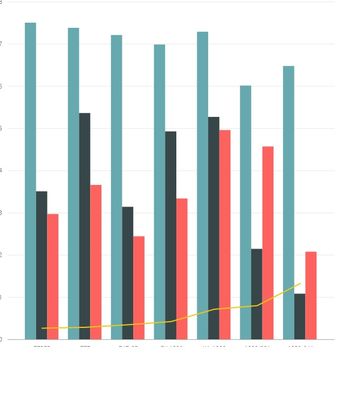
I am currently using the Line and Cluster Column chart within one of my reports (see below). Ideally I want the Line element of this chart to show discrete values only and not a continous line.
For each grouping in the chart (can be seen by the green/black/red bars) on the second Y-axis I want to plot a discrete value so effectivly only one plot per grouping. This chart joins the discrete points into a line.
I aprreciate that this chart is designed to work this way, does anyone know of any other available visuals which would allow me to do what I want?
- Mark as New
- Bookmark
- Subscribe
- Mute
- Subscribe to RSS Feed
- Permalink
- Report Inappropriate Content
Hi @dax_bee,
>>For each grouping in the chart (can be seen by the green/black/red bars) on the second Y-axis I want to plot a discrete value so effectivly only one plot per grouping. This chart joins the discrete points into a line.
Did you want to switch the same color bar to one group, right?
If this is a case, you can try to exchange the Shared axis and Column series fields of "line and clustered column chart".
Regards,
Xiaoxin Sheng
If this post helps, please consider accept as solution to help other members find it more quickly.
- Mark as New
- Bookmark
- Subscribe
- Mute
- Subscribe to RSS Feed
- Permalink
- Report Inappropriate Content
Hi Xiaoxin
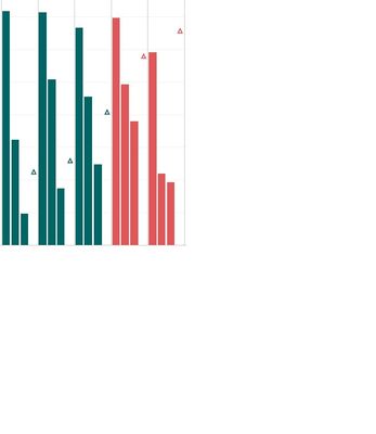
Ideally I am looking for a chart which will generate the following. The line being replaced by discrete points (in this example triangles)
- Mark as New
- Bookmark
- Subscribe
- Mute
- Subscribe to RSS Feed
- Permalink
- Report Inappropriate Content
Hi @dax_bee,
>> The line being replaced by discrete points (in this example triangles)
I think the issue may related to your formula which store on the line value, it not appeared on my side.
Regards,
Xiaoxin Sheng
If this post helps, please consider accept as solution to help other members find it more quickly.
- Mark as New
- Bookmark
- Subscribe
- Mute
- Subscribe to RSS Feed
- Permalink
- Report Inappropriate Content
Hi Xiaoxin.
There may be a little confusion here. Ideally I am looking for a chart which displays both Chart & discrete points (not line). If as per your comments you feel you have an example of this please post an image.
Thanks.
- Mark as New
- Bookmark
- Subscribe
- Mute
- Subscribe to RSS Feed
- Permalink
- Report Inappropriate Content
Hi @dax_bee,
Sure, below is my sample file:
Source table:
Table = ADDCOLUMNS(CALENDAR(DATE(2016,1,1),DATE(2016,12,31)),"Month",FORMAT([Date],"mmmm"),"Day",FORMAT([Date],"dddd"),"Amount",RANDBETWEEN(0,100))
Notice: I add the filter to filter first three months, the line value is the average of amount.
Regards,
Xiaoxin Sheng
If this post helps, please consider accept as solution to help other members find it more quickly.
- Mark as New
- Bookmark
- Subscribe
- Mute
- Subscribe to RSS Feed
- Permalink
- Report Inappropriate Content
Hi Xiaoxin.
Appreciate the update, but as per my previous comments the requirement is a bar chart + discrete points on a seperate Y-axis. Your solution is currently acheivable with the out of the box "Bar & Line chart".
If you re-read the thread this may provide you with greater clarity as to the issue I have.
Thanks.
- Mark as New
- Bookmark
- Subscribe
- Mute
- Subscribe to RSS Feed
- Permalink
- Report Inappropriate Content
Not aware of one. You will probably have to do some kind of R visual to get what you want.
@ me in replies or I'll lose your thread!!!
Instead of a Kudo, please vote for this idea
Become an expert!: Enterprise DNA
External Tools: MSHGQM
YouTube Channel!: Microsoft Hates Greg
Latest book!: The Definitive Guide to Power Query (M)
DAX is easy, CALCULATE makes DAX hard...
Helpful resources

Microsoft Fabric Learn Together
Covering the world! 9:00-10:30 AM Sydney, 4:00-5:30 PM CET (Paris/Berlin), 7:00-8:30 PM Mexico City

Power BI Monthly Update - April 2024
Check out the April 2024 Power BI update to learn about new features.

| User | Count |
|---|---|
| 112 | |
| 100 | |
| 80 | |
| 64 | |
| 57 |
| User | Count |
|---|---|
| 145 | |
| 111 | |
| 92 | |
| 84 | |
| 66 |


