- Power BI forums
- Updates
- News & Announcements
- Get Help with Power BI
- Desktop
- Service
- Report Server
- Power Query
- Mobile Apps
- Developer
- DAX Commands and Tips
- Custom Visuals Development Discussion
- Health and Life Sciences
- Power BI Spanish forums
- Translated Spanish Desktop
- Power Platform Integration - Better Together!
- Power Platform Integrations (Read-only)
- Power Platform and Dynamics 365 Integrations (Read-only)
- Training and Consulting
- Instructor Led Training
- Dashboard in a Day for Women, by Women
- Galleries
- Community Connections & How-To Videos
- COVID-19 Data Stories Gallery
- Themes Gallery
- Data Stories Gallery
- R Script Showcase
- Webinars and Video Gallery
- Quick Measures Gallery
- 2021 MSBizAppsSummit Gallery
- 2020 MSBizAppsSummit Gallery
- 2019 MSBizAppsSummit Gallery
- Events
- Ideas
- Custom Visuals Ideas
- Issues
- Issues
- Events
- Upcoming Events
- Community Blog
- Power BI Community Blog
- Custom Visuals Community Blog
- Community Support
- Community Accounts & Registration
- Using the Community
- Community Feedback
Register now to learn Fabric in free live sessions led by the best Microsoft experts. From Apr 16 to May 9, in English and Spanish.
- Power BI forums
- Forums
- Get Help with Power BI
- Desktop
- KPI visual - Low is good
- Subscribe to RSS Feed
- Mark Topic as New
- Mark Topic as Read
- Float this Topic for Current User
- Bookmark
- Subscribe
- Printer Friendly Page
- Mark as New
- Bookmark
- Subscribe
- Mute
- Subscribe to RSS Feed
- Permalink
- Report Inappropriate Content
KPI visual - Low is good
Hello to all ,
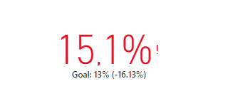
I need to setup some KPI visuals for KPIs which lower is better (for example MIR - marketing investment ration). I found in Format option to set Lower is good, but when I need show Distance it doesnt work correctly. When my goal is 13 % and reality is 15,1 % i can see this:
Red text and exclamation mark is fine, however Distance show me "-16.13%" but it should be "+16.13%", because 15,1% is by 16,13% higher then 13%. Minus sigh actually creates an impression that 13% is by 16,13% lower then 15,1% (and its wrong - in this case is 13,9%). Am I right?
I am kinda desperate, because I am not able to find any visuals to show KPI with percentage diference which would work properly. Custom visuals unfortunately dont support national number formating (thousand and decimal separators), otherwise KPI Indicator custome visuals would be perfect for me.
Any ideas?
Best & thanks,
Jiri
- Mark as New
- Bookmark
- Subscribe
- Mute
- Subscribe to RSS Feed
- Permalink
- Report Inappropriate Content
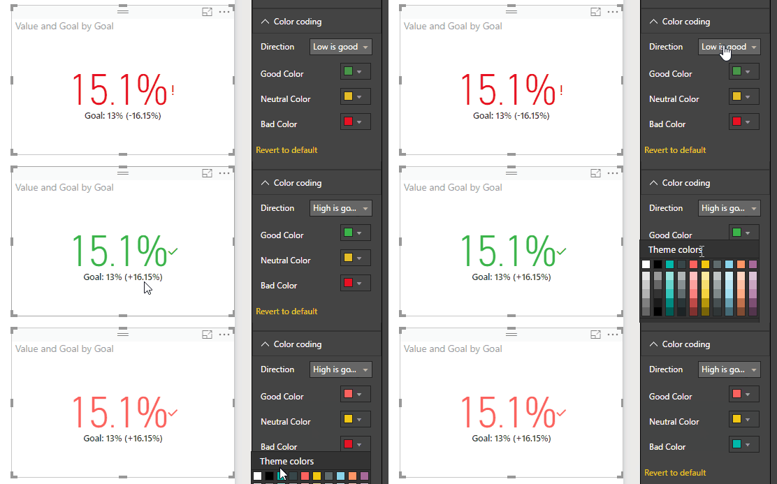
You are getting the distance negative because you selected low is good!
If you want the distance positive change back to high is good and reverse the color coding!
But yes I see the problem then you get a check mark (which can't be adjusted)
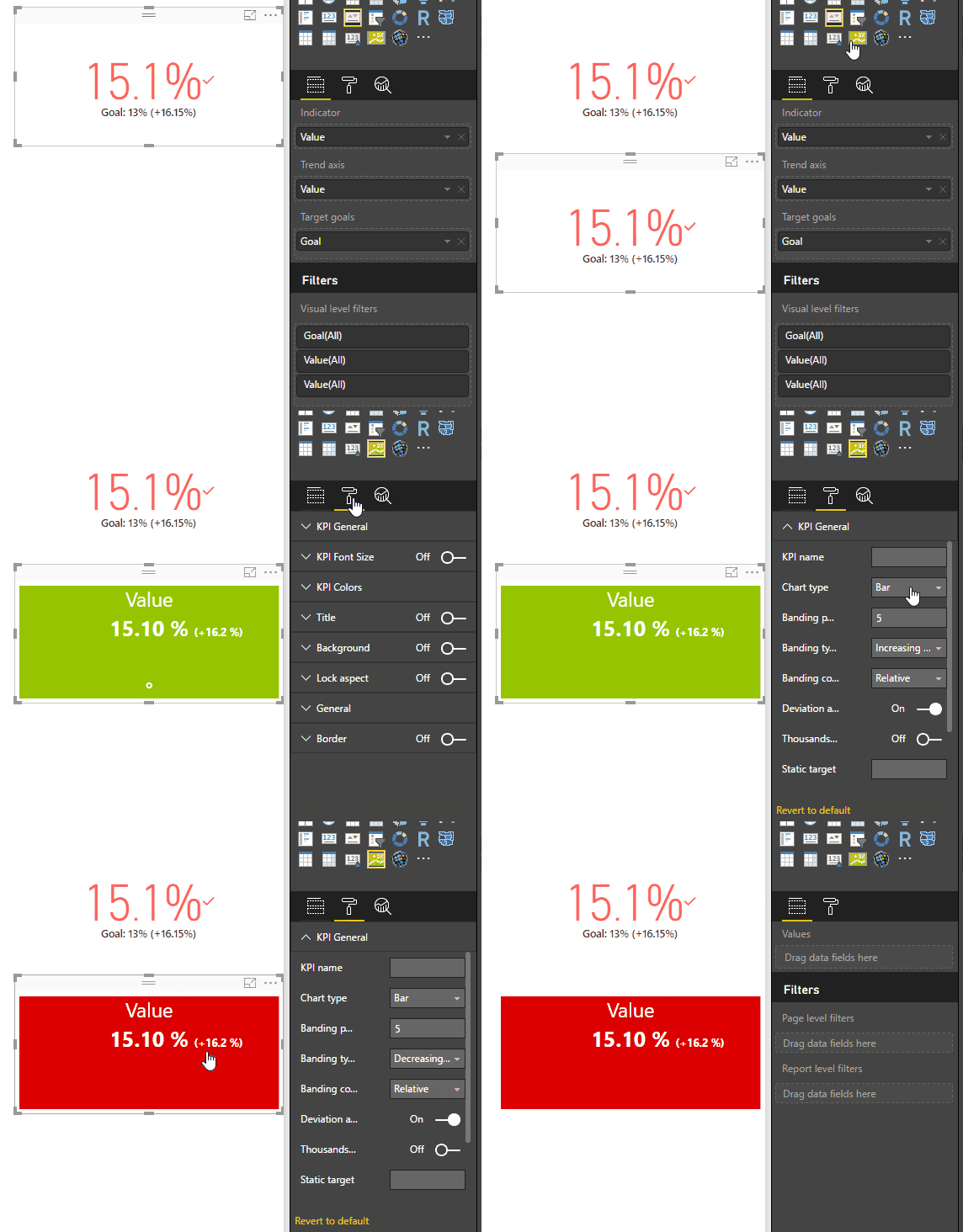
EDIT: Well the Custom KPI Indicator seems to take care of this
https://app.powerbi.com/visuals/show/KPIStatusWithHistory1446562283967
- Mark as New
- Bookmark
- Subscribe
- Mute
- Subscribe to RSS Feed
- Permalink
- Report Inappropriate Content
I think it is a matter of perspective. You are -16.33% away from your goal of 13%. Yes lower is better but you are still 16.33% "below" your goal. Whether it should work that way is another question but I can see arguments both ways.
@ me in replies or I'll lose your thread!!!
Instead of a Kudo, please vote for this idea
Become an expert!: Enterprise DNA
External Tools: MSHGQM
YouTube Channel!: Microsoft Hates Greg
Latest book!: The Definitive Guide to Power Query (M)
DAX is easy, CALCULATE makes DAX hard...
- Mark as New
- Bookmark
- Subscribe
- Mute
- Subscribe to RSS Feed
- Permalink
- Report Inappropriate Content
Hey @Greg_Deckler and @Sean,
Thanks for you replies.
At first, I was thinking its matter of perspective as you said, but more I think about it I am sure its misleading and mathematically wrong how it works now. Quickly I can write two reasons:
- you are effectively above your goal (13%) by 16,15% - I cannot find case when I would interpret this as "we are below goal". Trust me, I tried to defend this way of interpretation to myself (which would be more comfortable that solving this problem on community as I am not english native speaker 🙂 ) , but I wasnt successful. Or can you find way how to interpret this?
- you can hide "Goal" - in this case you get red 15.1% witch exclamation mark and below it you can see (-16.15%) which will be surely intepret as "you are bellow goal by 16.15%" (in this case consumer of report would think goal is 18,01%...). Yes, U dont have to hide "Goal", however when Goal isnt effectively goal, but its value from past day/week/month/year you have to, because there is no way, how change this label.
ad KPI Indicator custom visuals - yes, here it works corretly (according to my opinion), but as I wrote above, custom visuals operate on library which doesnt currently support number formatting (according to one of developers of PBI custom visuals - (not this one)), which is block for us 😞
Best & thx,
Jiri
- Mark as New
- Bookmark
- Subscribe
- Mute
- Subscribe to RSS Feed
- Permalink
- Report Inappropriate Content
Hi @jiri_siroky,
You have understand how it works, right? Goals - when set to On, the visual displays the goal and the distance from the goal as a percentage. If you set the high is good in Color coding, it your value is high the goal, it will show positive. Otherwise, the result is opposite. For your result, you must set "low is good" in Color coding. 16.15%=(15.1%(value)-13%(goal))/13%(goal).
Please feel free to ask if you have any other issue. If you have resolved it, please mark the helpful reply as answer, more people will benefit it.
Thanks,
Angelia
- Mark as New
- Bookmark
- Subscribe
- Mute
- Subscribe to RSS Feed
- Permalink
- Report Inappropriate Content
Hi @v-huizhn-msft,
yeah, I get it, but problem is when I set "Low is good" and value is 15,1% and goal is 13%, visual shows me distance as "-16,13%", however result should be "+16,13%" (as you write) - I explained it above.
So I think it's a bug.
Jiri
- Mark as New
- Bookmark
- Subscribe
- Mute
- Subscribe to RSS Feed
- Permalink
- Report Inappropriate Content
Hi @jiri_siroky,
It's not a bug. Please see the @Sean posted. When you set low is god. The value is better as smaller(13% is better than 15.1%), so there is 16.13% differance to goal, so the result is negative. Wish this explaination is clear.
Best Regards,
Angelia
- Mark as New
- Bookmark
- Subscribe
- Mute
- Subscribe to RSS Feed
- Permalink
- Report Inappropriate Content
Hi @v-huizhn-msft,
yes, 15,1% is by 16,13% higher then 13%. So it should be +16,13%.
In your explanation, how would it work when value would be 10,9%? It's at distance to goal by 16,13% (from 13%) as well. So distance would be -16,13% from both 10,9% and 15,1%. When "Goal" is hidden, only variation in KPI visual would be color and exclamation/check mark which doesnt seem righ.
Other explanation - you know your goal (13%) and distance from goal (-16,15%). With these two informations, how would you ever be able to recognize if actual value is 10,9% or 15,1%
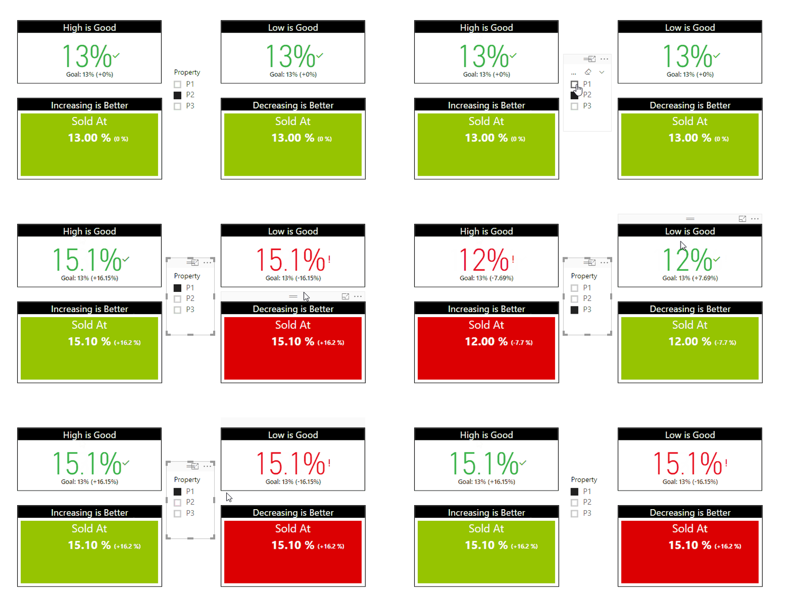
In @Sean post, he shows how custom visual KPI Indicator works with these values and it works correctly IMHO. Unfortunately custom visuals are not suported for .ppt export and dont support number formattiing, so its not option for us.
Best,
Jiri
- Mark as New
- Bookmark
- Subscribe
- Mute
- Subscribe to RSS Feed
- Permalink
- Report Inappropriate Content
Hi @jiri_siroky,
If goal is 13%, and you set the Color coding as "High is Good". If the distance is +16.15%(positive), you actual value is 15.1%. If the distance is -16.15%(negative), you actual value is 10.9%. Conversly, the result is opposite.
In addition, the first of solution @Sean posted is a KPI visual in Power BI desktop. The second part is custom visual.
Thanks,
Angelia
- Mark as New
- Bookmark
- Subscribe
- Mute
- Subscribe to RSS Feed
- Permalink
- Report Inappropriate Content
Hi @v-huizhn-msft,
so you say that when "Low is Good" is set, goal is 13% and value is 10,9%, then distance is "+16,15%"? But this cannot be right, its mathematically wrong!
Distance between 10,9% is always less than 13% by 16,15%, so there has to be -. Similarly 15,1% is always higher than 13% by 16,15%, so there has to be +. Option between "Low is Good" and "High is Good" should affect just color and check/exclamation mark, not a math. sign.
I understand what you mean that when value is better than plan, there should be + and when value is worst than plan, there should be -. However minus sign doesnt have to be interpreted as negative, resp. bad. It can easily be positive, resp. good. And its even common practice in other BI tools for Low is Good KPIs. KPI Indicator works that way too.
I dont understand reference on @Sean post, because in first part he just demonstrates, how to solve +/- issue by change color in "High is Good" mode, but finds out then there is issue with check/exclamation marks. In second part he shows that KPI Indicator custom visual works correctly. Basicly he confirms what I am saying all the time.
Best,
Jiri
- Mark as New
- Bookmark
- Subscribe
- Mute
- Subscribe to RSS Feed
- Permalink
- Report Inappropriate Content
Okay hopefully an example may help explain the issue better ![]()
Imagine you are acquiring different properties that have asking prices.
Think of the 13% GOAL as the limit of what you are authorized to go over the asking price with no need to contact management!
That's why Low is Good! (so if you have $1,000 asking price you can go up to $1,130 immediately on the spot)
However lets say in this case there's more interest in this property and you have to acquire it!
So you call and get an authorization to slowly go up to say 18% over the asking price
So you start bidding higher in steps and you end up getting the asset for 15.1% over the asking price
Therefore you end up paying 15.1% premium on the asking price in total
So you went OVER the 13% you are allowed PLUS additional and that's why we need the + sign and in red!
It does seem that the Low is Good setting on the built-in KPI should be adjusted
I may copy and paste this post in the Issues Forum later
BTW (I have other issues with the built-in KPI that I've been delaying posting about... hopefully soon)
- Mark as New
- Bookmark
- Subscribe
- Mute
- Subscribe to RSS Feed
- Permalink
- Report Inappropriate Content
Helpful resources

Microsoft Fabric Learn Together
Covering the world! 9:00-10:30 AM Sydney, 4:00-5:30 PM CET (Paris/Berlin), 7:00-8:30 PM Mexico City

Power BI Monthly Update - April 2024
Check out the April 2024 Power BI update to learn about new features.

| User | Count |
|---|---|
| 114 | |
| 99 | |
| 83 | |
| 70 | |
| 60 |
| User | Count |
|---|---|
| 150 | |
| 115 | |
| 104 | |
| 89 | |
| 65 |


