- Power BI forums
- Updates
- News & Announcements
- Get Help with Power BI
- Desktop
- Service
- Report Server
- Power Query
- Mobile Apps
- Developer
- DAX Commands and Tips
- Custom Visuals Development Discussion
- Health and Life Sciences
- Power BI Spanish forums
- Translated Spanish Desktop
- Power Platform Integration - Better Together!
- Power Platform Integrations (Read-only)
- Power Platform and Dynamics 365 Integrations (Read-only)
- Training and Consulting
- Instructor Led Training
- Dashboard in a Day for Women, by Women
- Galleries
- Community Connections & How-To Videos
- COVID-19 Data Stories Gallery
- Themes Gallery
- Data Stories Gallery
- R Script Showcase
- Webinars and Video Gallery
- Quick Measures Gallery
- 2021 MSBizAppsSummit Gallery
- 2020 MSBizAppsSummit Gallery
- 2019 MSBizAppsSummit Gallery
- Events
- Ideas
- Custom Visuals Ideas
- Issues
- Issues
- Events
- Upcoming Events
- Community Blog
- Power BI Community Blog
- Custom Visuals Community Blog
- Community Support
- Community Accounts & Registration
- Using the Community
- Community Feedback
Register now to learn Fabric in free live sessions led by the best Microsoft experts. From Apr 16 to May 9, in English and Spanish.
- Power BI forums
- Forums
- Get Help with Power BI
- Desktop
- Re: Joining dates at different granularities
- Subscribe to RSS Feed
- Mark Topic as New
- Mark Topic as Read
- Float this Topic for Current User
- Bookmark
- Subscribe
- Printer Friendly Page
- Mark as New
- Bookmark
- Subscribe
- Mute
- Subscribe to RSS Feed
- Permalink
- Report Inappropriate Content
Joining dates at different granularities
Hi
I have two SQL queries from different databases.
Database A contains hourly price data
Database B contains daily price data
I need to create a chart showing the total hourly price by multiplying the hourly price with the daily price. So the daily price effectively needs to be repeated 24 times a day so that it can be multiplied to the hourly price.
I have a calendartable but I can't figure out how to join them but to be able to use hourly granularity in tables and charts.
thanks very much in advance
DATABASE A - hourly price
DATETIME VALUE
01/01/2017 00:00:00 45.45
01/01/2017 01:00:00 34.56
01/01/2017 02:00:00 43.34
DATABASE B - daily price
DATETIME VALUE
01/01/2017 00:00:00 15.67
02/01/2017 00:00:00 13.56
- Mark as New
- Bookmark
- Subscribe
- Mute
- Subscribe to RSS Feed
- Permalink
- Report Inappropriate Content
Hi @Anonymous
I think I follow what you need.
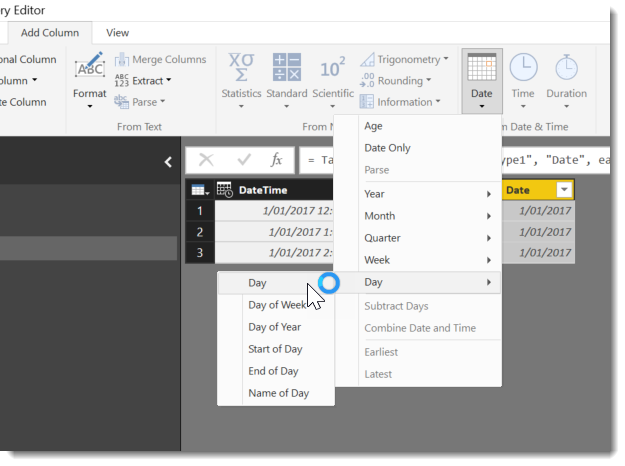
What I did was add a new column to the HourlyPrice table that only contained the date. I did this using the Add Date column in the query editor
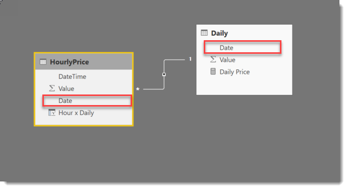
This allowed me to create a relationship between the HourlyPrice and DailyPrice tables based on my new HourlyDate.Date column and the date column already in the Daily table
With this in place I added this calculated measure to the Daily table
Daily Price = CALCULATE(SUM(Daily[Value]))
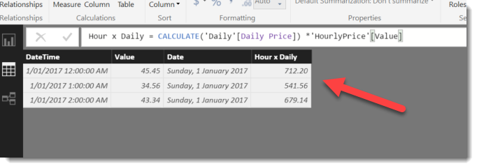
Which I then used in a new calculated column on the Hourly table
Hour x Daily = CALCULATE('Daily'[Daily Price]) *'HourlyPrice'[Value]This is the result based on your sample data.
Are we getting close?
- Mark as New
- Bookmark
- Subscribe
- Mute
- Subscribe to RSS Feed
- Permalink
- Report Inappropriate Content
Hi Phil
Thanks for the quick reply. I think it's almost there but it's not quite getting to where I wanted. Perhaps my example was too simple so wasn't quite covering what was needed
I've uploaded some data here over three tabs
https://www.dropbox.com/s/wusqsxeyt3tyeh2/powerBImixeddates.xlsx?dl=0
What I need to end up with an hourly data series to create a spark spread ( the theoretical profit of running a power plant in case you are interested!)
The formula is: HourlyPowerPrice - ((DailyGas[VALUE] + DailyCarbon[VALUE]*0.202)/0.55
I tried to apply your suggestions but am hitting a problem. I managed to relate the charts via the date as suggested.
The daily values are different for each day but what I am getting is then an average of the daily values over the whole time series rather than a distinct price for each day.
Does that make sense?
I am very grateful for any pointers
Helpful resources

Microsoft Fabric Learn Together
Covering the world! 9:00-10:30 AM Sydney, 4:00-5:30 PM CET (Paris/Berlin), 7:00-8:30 PM Mexico City

Power BI Monthly Update - April 2024
Check out the April 2024 Power BI update to learn about new features.

| User | Count |
|---|---|
| 110 | |
| 95 | |
| 76 | |
| 65 | |
| 51 |
| User | Count |
|---|---|
| 146 | |
| 109 | |
| 106 | |
| 88 | |
| 61 |


