- Power BI forums
- Updates
- News & Announcements
- Get Help with Power BI
- Desktop
- Service
- Report Server
- Power Query
- Mobile Apps
- Developer
- DAX Commands and Tips
- Custom Visuals Development Discussion
- Health and Life Sciences
- Power BI Spanish forums
- Translated Spanish Desktop
- Power Platform Integration - Better Together!
- Power Platform Integrations (Read-only)
- Power Platform and Dynamics 365 Integrations (Read-only)
- Training and Consulting
- Instructor Led Training
- Dashboard in a Day for Women, by Women
- Galleries
- Community Connections & How-To Videos
- COVID-19 Data Stories Gallery
- Themes Gallery
- Data Stories Gallery
- R Script Showcase
- Webinars and Video Gallery
- Quick Measures Gallery
- 2021 MSBizAppsSummit Gallery
- 2020 MSBizAppsSummit Gallery
- 2019 MSBizAppsSummit Gallery
- Events
- Ideas
- Custom Visuals Ideas
- Issues
- Issues
- Events
- Upcoming Events
- Community Blog
- Power BI Community Blog
- Custom Visuals Community Blog
- Community Support
- Community Accounts & Registration
- Using the Community
- Community Feedback
Register now to learn Fabric in free live sessions led by the best Microsoft experts. From Apr 16 to May 9, in English and Spanish.
- Power BI forums
- Forums
- Get Help with Power BI
- Desktop
- Graphic visual with Moving Annual Total values
- Subscribe to RSS Feed
- Mark Topic as New
- Mark Topic as Read
- Float this Topic for Current User
- Bookmark
- Subscribe
- Printer Friendly Page
- Mark as New
- Bookmark
- Subscribe
- Mute
- Subscribe to RSS Feed
- Permalink
- Report Inappropriate Content
Graphic visual with Moving Annual Total values
Hi!
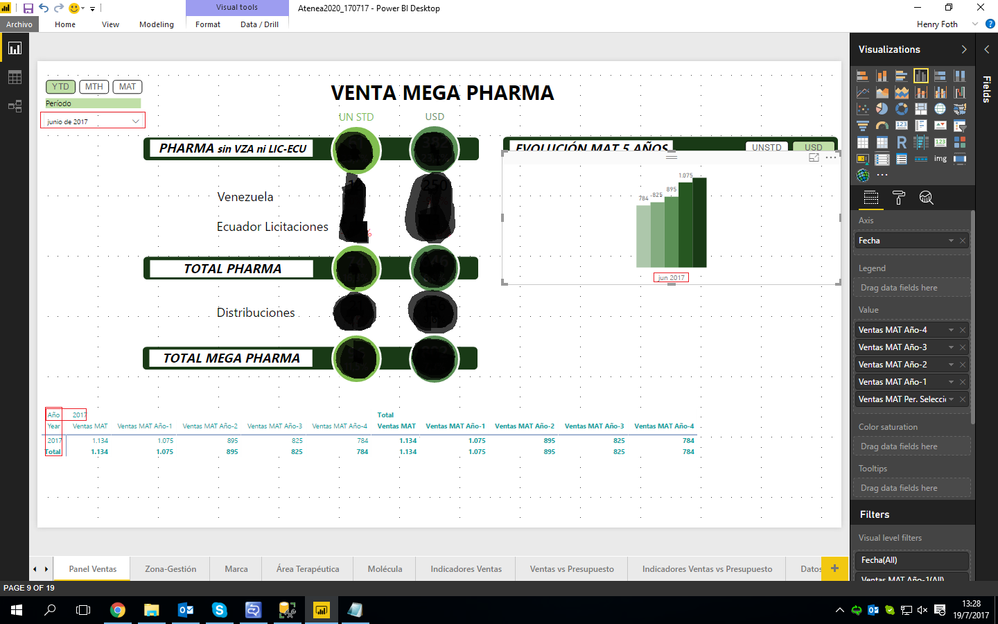
I'm trying to make a report that has a graphic visual to show an evolution of moving annual total sales for 5 years. I made 5 measures, one for each year.
In the report, I have a date selector that references a master table with dates. This master table is related to the facts table and whas used to perform the 5 moving annual total measures.
So, in the graphic visual I put the Date as axis and the 5 measures as values. The problem that I have, is that the 5 columns and together and shown all in the same year.
How can I make it to show seperate columns for each measure and by its respective year?
The main measure is this:
Ventas MAT =
SWITCH(
	VALUES(
		'Selector Medida'[Medida]
	);
	"USD";
	CALCULATE(
		DIVIDE(
			SUM(
				'Ventas Mensuales'[USD]
			);
			1000
		);
		DATESINPERIOD(
			'Período a Analizar'[Fecha];
			LASTDATE(
				'Período a Analizar'[Fecha]
			);
			-1;
			YEAR
		)
	);
	"UNSTD";
	CALCULATE(
		DIVIDE(
			SUM(
				'Ventas Mensuales'[UNSTD]
			);
			1000
		);
		DATESINPERIOD(
			'Período a Analizar'[Fecha];
			LASTDATE(
				'Período a Analizar'[Fecha]
			);
			-1;
			YEAR
		)
	)
)
And for every previous year I made this:
Ventas MAT Año-1 =
CALCULATE(
	'Medidas VentasMPh'[Ventas MAT];
	DATESINPERIOD(
		'Período a Analizar'[Fecha];
		LASTDATE(
			DATEADD(
				'Período a Analizar'[Fecha];
				-1;
				YEAR
			)
		);
		-1;
		YEAR
	)
)
And this is how the report looks like:
Thanks in advance!
- Mark as New
- Bookmark
- Subscribe
- Mute
- Subscribe to RSS Feed
- Permalink
- Report Inappropriate Content
@Anonymous,
Firstly, you can follow the guide in the blogs below to create a Moving Annual Total measure.
https://www.microsoftpressstore.com/articles/article.aspx?p=2228441&seqNum=2
http://www.dash-intel.com/powerbi/modeling_date_functions.php
Secondly, create a new table using DAX below. Please note that there is no relationship between the new table and your original table.
Date = ADDCOLUMNS(CALENDAR(DATE(2010,1,1),DATE(2017,12,30)),"Year",YEAR([Date]),"Month",MONTH([Date]),"YearMonth",FORMAT([Date],"YYYYMM"))
Thirdly, create a measure in your original table, drag the measure to the visual level filter of your bar chart and set its value to “not blank”
checkmeasure = IF(MAX(YourOriginalTable[Year])>(MAX('Date'[Year])-5)&&MAX(YourOriginalTable[Year])<=MAX('Date'[Year]),IF(MAX(YourOriginalTable[Month])=MAX('Date'[Month]),1,BLANK()),BLANK())
At last, create a slicer using the YearMonth column of the new Date table, then use it to filter your bar chart.
Regards,
Lydia
If this post helps, then please consider Accept it as the solution to help the other members find it more quickly.
Helpful resources

Microsoft Fabric Learn Together
Covering the world! 9:00-10:30 AM Sydney, 4:00-5:30 PM CET (Paris/Berlin), 7:00-8:30 PM Mexico City

Power BI Monthly Update - April 2024
Check out the April 2024 Power BI update to learn about new features.

| User | Count |
|---|---|
| 114 | |
| 99 | |
| 83 | |
| 70 | |
| 61 |
| User | Count |
|---|---|
| 149 | |
| 114 | |
| 107 | |
| 89 | |
| 67 |

