- Power BI forums
- Updates
- News & Announcements
- Get Help with Power BI
- Desktop
- Service
- Report Server
- Power Query
- Mobile Apps
- Developer
- DAX Commands and Tips
- Custom Visuals Development Discussion
- Health and Life Sciences
- Power BI Spanish forums
- Translated Spanish Desktop
- Power Platform Integration - Better Together!
- Power Platform Integrations (Read-only)
- Power Platform and Dynamics 365 Integrations (Read-only)
- Training and Consulting
- Instructor Led Training
- Dashboard in a Day for Women, by Women
- Galleries
- Community Connections & How-To Videos
- COVID-19 Data Stories Gallery
- Themes Gallery
- Data Stories Gallery
- R Script Showcase
- Webinars and Video Gallery
- Quick Measures Gallery
- 2021 MSBizAppsSummit Gallery
- 2020 MSBizAppsSummit Gallery
- 2019 MSBizAppsSummit Gallery
- Events
- Ideas
- Custom Visuals Ideas
- Issues
- Issues
- Events
- Upcoming Events
- Community Blog
- Power BI Community Blog
- Custom Visuals Community Blog
- Community Support
- Community Accounts & Registration
- Using the Community
- Community Feedback
Register now to learn Fabric in free live sessions led by the best Microsoft experts. From Apr 16 to May 9, in English and Spanish.
- Power BI forums
- Forums
- Get Help with Power BI
- Desktop
- Continuous hierarchy axis
- Subscribe to RSS Feed
- Mark Topic as New
- Mark Topic as Read
- Float this Topic for Current User
- Bookmark
- Subscribe
- Printer Friendly Page
- Mark as New
- Bookmark
- Subscribe
- Mute
- Subscribe to RSS Feed
- Permalink
- Report Inappropriate Content
Continuous hierarchy axis
Hi,
I am trying to do a line chart from 15min data. The problem comes when I want to see accumulated hourly values. That's fine to be done with hierarchy axis (custom levels = weekday, hour), but the axis is never continuous, it's always categorical when drilling down with hierarchy. This means that a scroll bar will apear and will never autoscale...
I have seen a similar problem in another post as well, no answer yet:
https://community.powerbi.com/t5/Desktop/How-to-create-a-Continuous-custom-Date-Hierarchy/m-p/380691
Is there any way to have a continuous hierarchy axis?
- Mark as New
- Bookmark
- Subscribe
- Mute
- Subscribe to RSS Feed
- Permalink
- Report Inappropriate Content
Hi @aarola,
With current information, it is hard for us to understand your requirement. Could you please share us your pbix file with One Drive or Google Drive if possible?
If you can't, please share us some sample data which we can copy and paste directly and its corresponding expected result. So that we can get a right direction and provide more proper suggestions.
Thanks,
Xi Jin.
- Mark as New
- Bookmark
- Subscribe
- Mute
- Subscribe to RSS Feed
- Permalink
- Report Inappropriate Content
Hi,
Of course. I'm sorry I didn't explain properly all the problem. I attach some pictures, I will prepare some example file as well.
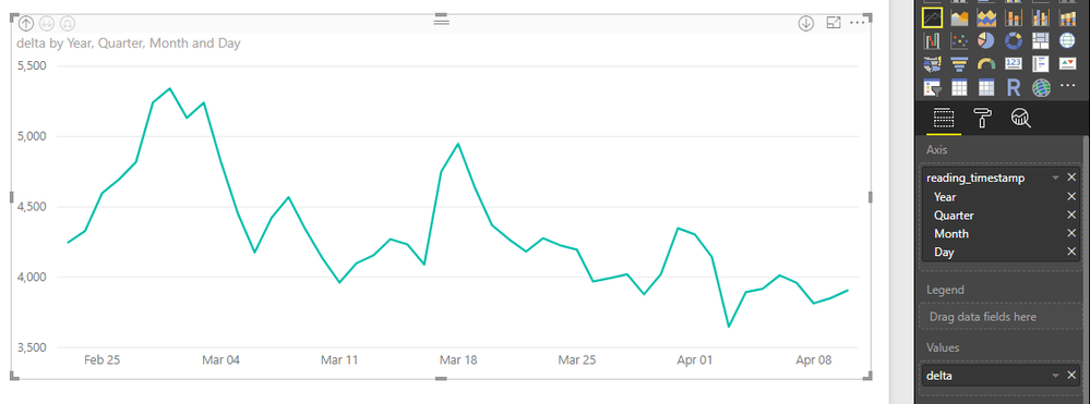
This is how the chart looks like if I use the inline hierarchy (directly from a single date format column):
This is so good, as the axis is "continuous" type and then the axis does not need to show all the values in the axis.
However, I have hourly data (and even 15 min frequency data), not only daily. Inline hierarchy cannot drill lower than daily frequency, so that's not enough.
The alternative is to build a custom hierarchy, with different columns: year, month, day, hour, minute.
I have built those columns in the same main table.
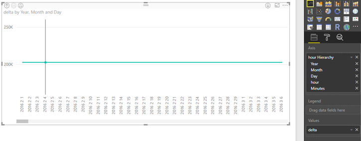
This is how it looks with this custom hierarchy, drilling down to "day":
As you see, the axis now is trying to show all the values in the table. This happens because this is a "categorical" type axis.
Axis type appears as "categorical" when custom hierarchy is used, and it cannot be changed to continuous.
Many thanks
- Mark as New
- Bookmark
- Subscribe
- Mute
- Subscribe to RSS Feed
- Permalink
- Report Inappropriate Content
Hi @aarola,
=> The alternative is to build a custom hierarchy, with different columns: year, month, day, hour, minute.
So you have defined a custom hierarchy. Then how did you define the hour and minute?
With only screenshots, it help little to troubleshoot you issue. If it is possible, please share us your pbix file.
And I have found a relevant thread which is Hourly Level date hierarchy. Please make a reference, see if it helps.
https://community.powerbi.com/t5/Desktop/Date-Hierarchy-at-Hourly-Level/td-p/210538
Thanks,
Xi Jin.
Helpful resources

Microsoft Fabric Learn Together
Covering the world! 9:00-10:30 AM Sydney, 4:00-5:30 PM CET (Paris/Berlin), 7:00-8:30 PM Mexico City

Power BI Monthly Update - April 2024
Check out the April 2024 Power BI update to learn about new features.

| User | Count |
|---|---|
| 117 | |
| 105 | |
| 69 | |
| 67 | |
| 43 |
| User | Count |
|---|---|
| 148 | |
| 103 | |
| 103 | |
| 88 | |
| 66 |


