- Power BI forums
- Updates
- News & Announcements
- Get Help with Power BI
- Desktop
- Service
- Report Server
- Power Query
- Mobile Apps
- Developer
- DAX Commands and Tips
- Custom Visuals Development Discussion
- Health and Life Sciences
- Power BI Spanish forums
- Translated Spanish Desktop
- Power Platform Integration - Better Together!
- Power Platform Integrations (Read-only)
- Power Platform and Dynamics 365 Integrations (Read-only)
- Training and Consulting
- Instructor Led Training
- Dashboard in a Day for Women, by Women
- Galleries
- Community Connections & How-To Videos
- COVID-19 Data Stories Gallery
- Themes Gallery
- Data Stories Gallery
- R Script Showcase
- Webinars and Video Gallery
- Quick Measures Gallery
- 2021 MSBizAppsSummit Gallery
- 2020 MSBizAppsSummit Gallery
- 2019 MSBizAppsSummit Gallery
- Events
- Ideas
- Custom Visuals Ideas
- Issues
- Issues
- Events
- Upcoming Events
- Community Blog
- Power BI Community Blog
- Custom Visuals Community Blog
- Community Support
- Community Accounts & Registration
- Using the Community
- Community Feedback
Register now to learn Fabric in free live sessions led by the best Microsoft experts. From Apr 16 to May 9, in English and Spanish.
- Power BI forums
- Forums
- Get Help with Power BI
- Desktop
- Re: Combining 2 Consecutive Measures (Historical a...
- Subscribe to RSS Feed
- Mark Topic as New
- Mark Topic as Read
- Float this Topic for Current User
- Bookmark
- Subscribe
- Printer Friendly Page
- Mark as New
- Bookmark
- Subscribe
- Mute
- Subscribe to RSS Feed
- Permalink
- Report Inappropriate Content
Combining 2 Consecutive Measures (Historical and Projected)
I have two measures that both work individually however I cannot seem to combine, or graph together.
I have two tables, one with historical and one with projections.
I was able to summarize the historical data into a weighted index using the following measure:
HistoricalIndex = 100 * calculate(productx(Temp,1 + [HistoricalMeasure]),filter(all(temp),countrows(filter(Temp, earlier(Temp[DateFixed]) <= Temp[DateFixed]))))
Where Temp is a table made from the distinct values of monthly dates from our historical database, and HistoricalMeasure calculates a weighted % change MoM.
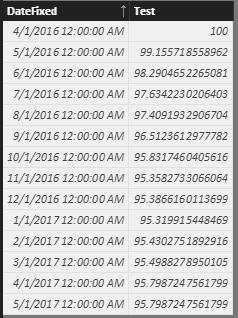
This works well, as shown below. (Test column is just calculate([Historical Index]) )
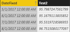
Then I made a table and measure that picks up where the historical values left off, and shows our next 3 month projections.
ProjIndex = calculate([HistoricalIndex]) * calculate(productx(Temp2,1 + [ProjectionMeasure]),filter(all(Temp2),countrows(filter(Temp2, earlier(Temp2[DateFixed]) <= Temp2[DateFixed]))))
This does the same as the first measure, except it picks up where the historical data left off, with the same value for May.
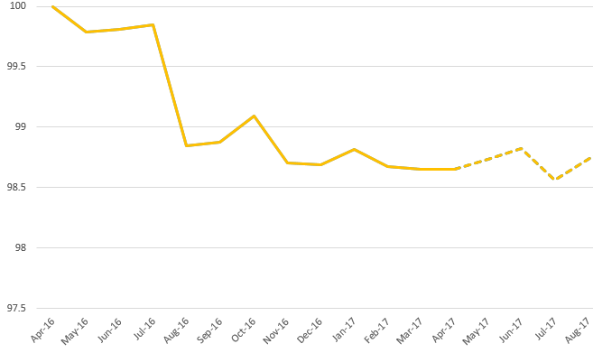
Now I would like to combine both of these in a graph, preferably as 2 lines as I would in excel, something like this:
When I try to make a new date table with the distinct values between the two, and use that as an axis for the graph it doesn't seem to work out. Any ideas?
Solved! Go to Solution.
- Mark as New
- Bookmark
- Subscribe
- Mute
- Subscribe to RSS Feed
- Permalink
- Report Inappropriate Content
The issue was that when the second measure uses the first one as a baseline in a separate table (with dates not connected), it calculates the final value for the first date and then uses that constant as the base for the rest of the measure. However, once you relate the dates to a table to combine them, I no longer get that final constant, and get a blank, as the first measure doesn't calculate as anything for the dates of the second measure.
I fixed this by keeping the historical measure as it was, and changing the projected measure to cover both the historical and projected portion. Then putting the historical as the line on top on the graph, so the only visible portion of the projected line is the actual projections.
- Mark as New
- Bookmark
- Subscribe
- Mute
- Subscribe to RSS Feed
- Permalink
- Report Inappropriate Content
The table with the dates that you use for the axis need to be one for both tables so you have Temp1 and Temp2 should be only Temp and this.one related with both tables, since both have two measures with adjacent dates this would.give you the chart you are looling for when combining the 2 measures in one chart.
Regards,
MFelix
Regards
Miguel Félix
Did I answer your question? Mark my post as a solution!
Proud to be a Super User!
Check out my blog: Power BI em Português- Mark as New
- Bookmark
- Subscribe
- Mute
- Subscribe to RSS Feed
- Permalink
- Report Inappropriate Content
@MFelix ,
Thanks for your response. I have tried this and unfortunately It does not work.
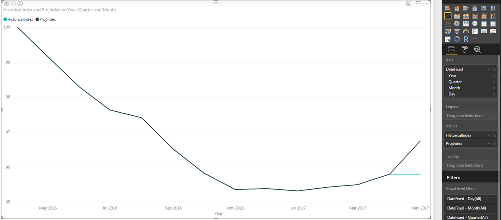
When I make a New Table that has all the dates between the two ranges (and relate those tables), use that as the axis, and plot the two measures this is what I get.
If I plot either of them individually on the axis of their individual table it comes out fine. But when I try to graph them on this index it does not work, and it doesn't even show the projection dates.
- Mark as New
- Bookmark
- Subscribe
- Mute
- Subscribe to RSS Feed
- Permalink
- Report Inappropriate Content
HI @askelton,
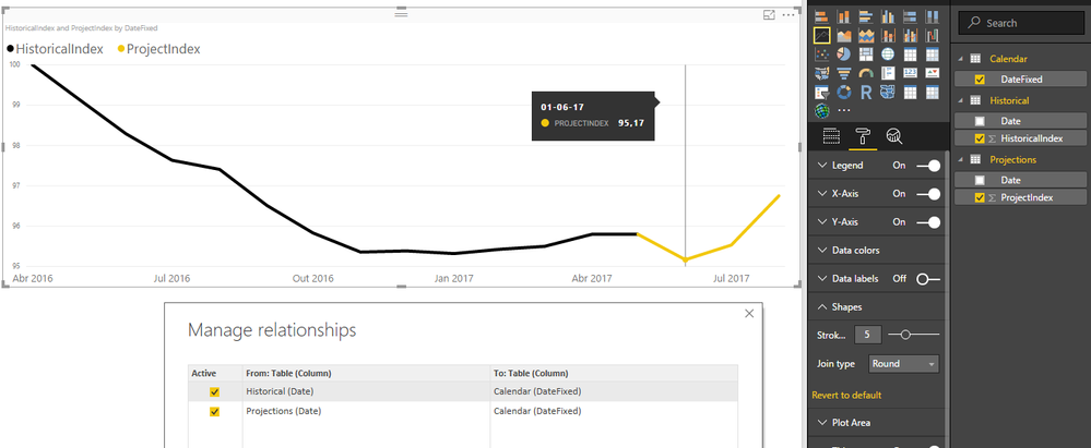
I made a sample of your data an tried the solution I gave you and as you can see the result is as expected, the only thing I cannot copy is the measures since I don't have the full layout of you setup, and did it with the values you placed in your images, however I believe that the result may be also achievable in your part.
Assumptions on my setup:
- 2 Tables - 1 Historical - 1 Projections
- 1 Calendar - This is made from a combination of unique values from Date column of the two previous tables
- Relationship One to Many
- Calendar[DateFixed] (One) -> Historical[Date] (Many)
- Calendar[DateFixed] (One) -> Projections[Date] (Many)
- Don't make filter for both sides
- Axis of chart is the Calendar[DateFixed] column
- Both Measures are placed in the lines
How do you have your calendar table made? How is it related with thew other tables?
I believe that you are getting this type of chart because of the way the calendar and the two other tables are related.
Regards,
MFelix
Regards
Miguel Félix
Did I answer your question? Mark my post as a solution!
Proud to be a Super User!
Check out my blog: Power BI em Português- Mark as New
- Bookmark
- Subscribe
- Mute
- Subscribe to RSS Feed
- Permalink
- Report Inappropriate Content
The issue was that when the second measure uses the first one as a baseline in a separate table (with dates not connected), it calculates the final value for the first date and then uses that constant as the base for the rest of the measure. However, once you relate the dates to a table to combine them, I no longer get that final constant, and get a blank, as the first measure doesn't calculate as anything for the dates of the second measure.
I fixed this by keeping the historical measure as it was, and changing the projected measure to cover both the historical and projected portion. Then putting the historical as the line on top on the graph, so the only visible portion of the projected line is the actual projections.
- Mark as New
- Bookmark
- Subscribe
- Mute
- Subscribe to RSS Feed
- Permalink
- Report Inappropriate Content
'and changing the projected measure to cover both the historical and projected portion.'
PLease explain how you did that measure? I need as well such a dynamix measure including both - historical values up to yesterday - last historic valuw, and projected values up to the end of month - and it's replacing each day - when fact value appears.
- Mark as New
- Bookmark
- Subscribe
- Mute
- Subscribe to RSS Feed
- Permalink
- Report Inappropriate Content
how does the tables relate with the calendar table?
Regards
Miguel Félix
Did I answer your question? Mark my post as a solution!
Proud to be a Super User!
Check out my blog: Power BI em Português- Mark as New
- Bookmark
- Subscribe
- Mute
- Subscribe to RSS Feed
- Permalink
- Report Inappropriate Content
Hi @askelton,
Then you can use the USERRELATIONSHIP formula to make the calculation.
Regards
Miguel Félix
Did I answer your question? Mark my post as a solution!
Proud to be a Super User!
Check out my blog: Power BI em PortuguêsHelpful resources

Microsoft Fabric Learn Together
Covering the world! 9:00-10:30 AM Sydney, 4:00-5:30 PM CET (Paris/Berlin), 7:00-8:30 PM Mexico City

Power BI Monthly Update - April 2024
Check out the April 2024 Power BI update to learn about new features.

| User | Count |
|---|---|
| 115 | |
| 100 | |
| 89 | |
| 68 | |
| 61 |
| User | Count |
|---|---|
| 150 | |
| 120 | |
| 100 | |
| 87 | |
| 68 |
