- Power BI forums
- Updates
- News & Announcements
- Get Help with Power BI
- Desktop
- Service
- Report Server
- Power Query
- Mobile Apps
- Developer
- DAX Commands and Tips
- Custom Visuals Development Discussion
- Health and Life Sciences
- Power BI Spanish forums
- Translated Spanish Desktop
- Power Platform Integration - Better Together!
- Power Platform Integrations (Read-only)
- Power Platform and Dynamics 365 Integrations (Read-only)
- Training and Consulting
- Instructor Led Training
- Dashboard in a Day for Women, by Women
- Galleries
- Community Connections & How-To Videos
- COVID-19 Data Stories Gallery
- Themes Gallery
- Data Stories Gallery
- R Script Showcase
- Webinars and Video Gallery
- Quick Measures Gallery
- 2021 MSBizAppsSummit Gallery
- 2020 MSBizAppsSummit Gallery
- 2019 MSBizAppsSummit Gallery
- Events
- Ideas
- Custom Visuals Ideas
- Issues
- Issues
- Events
- Upcoming Events
- Community Blog
- Power BI Community Blog
- Custom Visuals Community Blog
- Community Support
- Community Accounts & Registration
- Using the Community
- Community Feedback
Register now to learn Fabric in free live sessions led by the best Microsoft experts. From Apr 16 to May 9, in English and Spanish.
- Power BI forums
- Forums
- Get Help with Power BI
- Desktop
- Re: Column in clustered column chart shows the gra...
- Subscribe to RSS Feed
- Mark Topic as New
- Mark Topic as Read
- Float this Topic for Current User
- Bookmark
- Subscribe
- Printer Friendly Page
- Mark as New
- Bookmark
- Subscribe
- Mute
- Subscribe to RSS Feed
- Permalink
- Report Inappropriate Content
Column in clustered column chart shows the grand total, not the # per type
Hi,
I am new to Power BI and have created my first few dashboards. I am stuck at one thing today:
I want to compare two pieces of data in a Clustered Column Chart.
The data comes from two different tables.
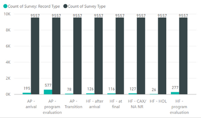
One table has the number of cases/issues created from surveys per survey type (for ex. one survey type is 'AP arrival' as you can see in the screen shot). The graph shows those numbers correctly (the green column) and I can see how many there are per type.
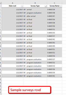
The other table shows how many surveys we have received overall (from which the 'cases/issues' originate). It also has the same survey types (for ex. AP arrival ) as you can see in the screen shot, but it just gives me the TOTAL number of surveys (9557); not the number per survey type. For example, there are 1159 AP Arrival surveys.
1/ i want to see how many surveys we have received, and then # of cases/issues for the same survey type, in columns next to each other
2/ next step would be to change it from numbers to %, i.e. out of X number of "AP arrival" surveys, this % created a case/issue.
I created a tile which shows how many surveys we received per type and it worked fine, it is when I try to combine the two, that it doesn't work. It could be that the survey type is not identical but I should at least be able to get the numbers per type; not just the total.
I hope I was able to explain this so that it makes sense. My first community post and appreciate all the help I can get - in as much detail as possible.
Thank you,
Gisela
Solved! Go to Solution.
- Mark as New
- Bookmark
- Subscribe
- Mute
- Subscribe to RSS Feed
- Permalink
- Report Inappropriate Content
Hi @Gisela,
The steps are:
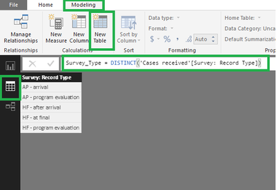
- Create a table with Survey_Type
- This can be made with an auxiliar table that you create automatically
- Create a table with Distinct values in the modeling part:
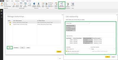
- Create a relationship between this new table and the two other tables:
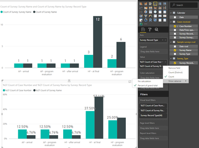
- Add the vlaues to your chart:
- Axis - Survey Type (Survey_Type - Table)
- Values - Count Survey Name (Cases received - Table)
- Values - Count Survey Name (Sample surveys rcvd - Table)
- Replicate the graph above but chose for each of the count a percentage of the grand total
To add a file choose the option link and add a URL for a onedrive, google drive, dropbox, wetransfer.... to have the file shared.
Hoe this is helpfull and if you need anything more please tell me.
Regards,
MFelix
Regards
Miguel Félix
Did I answer your question? Mark my post as a solution!
Proud to be a Super User!
Check out my blog: Power BI em Português- Mark as New
- Bookmark
- Subscribe
- Mute
- Subscribe to RSS Feed
- Permalink
- Report Inappropriate Content
Hi @Gisela,
when you have two distinct tables and want to create a single graph if you don't have anything connection between both of them then the values from the table were you have the X-axis values will be OK and the values from the other table will the total row count since the values aren´t related what you need to do is:
- Create a table with Survey Type
- Make a relationship between the Survey Type and the other two tables
- Add the Survey Type to your X-Axis
- Add the data values from the other two tables to your visual
The other question you can do it with the Quick measure options.
If you can share just a small sample of both tables I can make a small manual with all the steps for you to duplicate.
Regards,
MFelix
MFelix
Regards
Miguel Félix
Did I answer your question? Mark my post as a solution!
Proud to be a Super User!
Check out my blog: Power BI em Português- Mark as New
- Bookmark
- Subscribe
- Mute
- Subscribe to RSS Feed
- Permalink
- Report Inappropriate Content
Thank you @MFelix - amazing to have a resource like this.
I have attached two small samples.
I really appreciate your help.
Thank you,
Gisela
- Mark as New
- Bookmark
- Subscribe
- Mute
- Subscribe to RSS Feed
- Permalink
- Report Inappropriate Content
( I didn't know how to attach a file... i only see photos and video and link)
- Mark as New
- Bookmark
- Subscribe
- Mute
- Subscribe to RSS Feed
- Permalink
- Report Inappropriate Content
Hi @Gisela,
The steps are:
- Create a table with Survey_Type
- This can be made with an auxiliar table that you create automatically
- Create a table with Distinct values in the modeling part:
- Create a relationship between this new table and the two other tables:
- Add the vlaues to your chart:
- Axis - Survey Type (Survey_Type - Table)
- Values - Count Survey Name (Cases received - Table)
- Values - Count Survey Name (Sample surveys rcvd - Table)
- Replicate the graph above but chose for each of the count a percentage of the grand total
To add a file choose the option link and add a URL for a onedrive, google drive, dropbox, wetransfer.... to have the file shared.
Hoe this is helpfull and if you need anything more please tell me.
Regards,
MFelix
Regards
Miguel Félix
Did I answer your question? Mark my post as a solution!
Proud to be a Super User!
Check out my blog: Power BI em Português- Mark as New
- Bookmark
- Subscribe
- Mute
- Subscribe to RSS Feed
- Permalink
- Report Inappropriate Content
Hello, I read your answer, and it was really helpful, I have a similar issue but the X - axis is dates. How should I make that work? Both tables have different dates associated with the data and they are not matching.
- Mark as New
- Bookmark
- Subscribe
- Mute
- Subscribe to RSS Feed
- Permalink
- Report Inappropriate Content
@MFelix IT WORKED!!!!
Thank you so much for your very clear instructions - I was able to follow them and after a little trial and error, I have my chart! AND I learned something new (manage relationships for example).
Much appreciated.
Thank you, Gisela
- Mark as New
- Bookmark
- Subscribe
- Mute
- Subscribe to RSS Feed
- Permalink
- Report Inappropriate Content
One more question: Is it possible to set it up the % differently, as follows:
For ex.
I have 100 surveys of type AP - ARRIVAL, and out of those 20 generated a case (these are the two columns I have). I would like to show that 20% of the AP - AT ARRIVAL surveys generated a case.
I.e the % should be out of the # of surveys of that type, not out of ALL surveys.
Thank you,
Gisela
- Mark as New
- Bookmark
- Subscribe
- Mute
- Subscribe to RSS Feed
- Permalink
- Report Inappropriate Content
Hi @Gisela,
If I understand your question correctly you should do a measure like this:
% Measure =
DIVIDE (
    DISTINCTCOUNT ( 'Cases received'[Survey: Survey Name] ),
    DISTINCTCOUNT ( 'Sample surveys rcvd'[Survey Name] )
)
Regards,
MFelix
Regards
Miguel Félix
Did I answer your question? Mark my post as a solution!
Proud to be a Super User!
Check out my blog: Power BI em PortuguêsHelpful resources

Microsoft Fabric Learn Together
Covering the world! 9:00-10:30 AM Sydney, 4:00-5:30 PM CET (Paris/Berlin), 7:00-8:30 PM Mexico City

Power BI Monthly Update - April 2024
Check out the April 2024 Power BI update to learn about new features.

| User | Count |
|---|---|
| 109 | |
| 98 | |
| 77 | |
| 66 | |
| 54 |
| User | Count |
|---|---|
| 144 | |
| 104 | |
| 100 | |
| 86 | |
| 64 |
